#
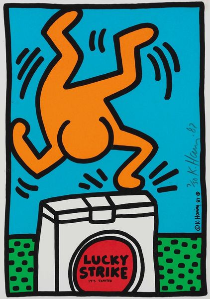
neo-pop
Copyright: Modern Artists: Artvee
Curator: Alright, let's turn our attention to "International Youth Year," a print by Keith Haring from 1985. It's rendered as a linocut with vibrant acrylic paint, a classic Haring combination. What springs to mind when you first see it? Editor: First thought? Upward energy. That simple blue figure, all sharp angles and optimism, he’s not just holding up that pink sun; he's celebrating the possibility of tomorrow. The scale of the sun looming feels weighty, but he’s making light of it, no sweat. Curator: Indeed, the radiant sun—often seen as a life-giving force or enlightenment—paired with youth evokes a potent message of promise, doesn't it? Considering the historical context, the UN designated 1985 as the "International Youth Year" to bring awareness to the role young people play in society and to encourage their participation. Editor: Ah, see, that explains the sun as responsibility, opportunity even! But look at that grid beneath, almost like paving stones. It gives me this subtle feeling of being grounded, as if even with all that possibility, they are still connected to something tangible and real. Makes it more than just bubblegum pop, somehow. Curator: And isn't that quintessentially Haring? Beneath the playful exterior, his works are often laced with symbolic gravity, even cultural anxiety. In many cultures the radiant solar disc often represents renewal and guidance; he seems to be offering youth a world to shoulder and a world to illuminate. Editor: It's almost archetypal in a way, that reaching, those simple lines. Reminds me of cave paintings. Maybe that's why it resonates so deeply. Curator: I think you’ve hit upon something essential. The raw directness, it taps into a visual language we’ve known for millennia, doesn’t it? Even down to how it was made, the simple tools necessary to print something, gives a very back to basics appeal. Editor: I just love that a work that on the surface appears so bright and hopeful, also whispers about legacy, responsibility, the weight of future generations... I look at it now, and it’s impossible to see just bubblegum. Curator: A reminder of how potent visual symbols are in transmitting profound meaning through generations. Thanks for that fresh perspective.
Comments
No comments
Be the first to comment and join the conversation on the ultimate creative platform.
More like this