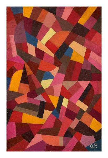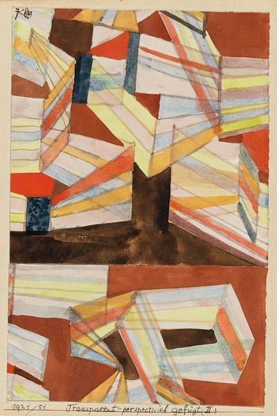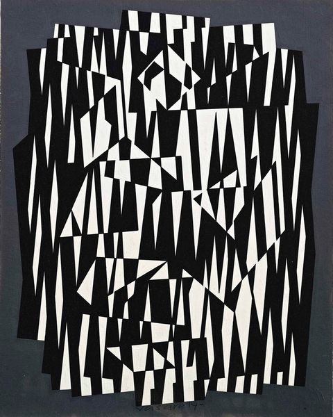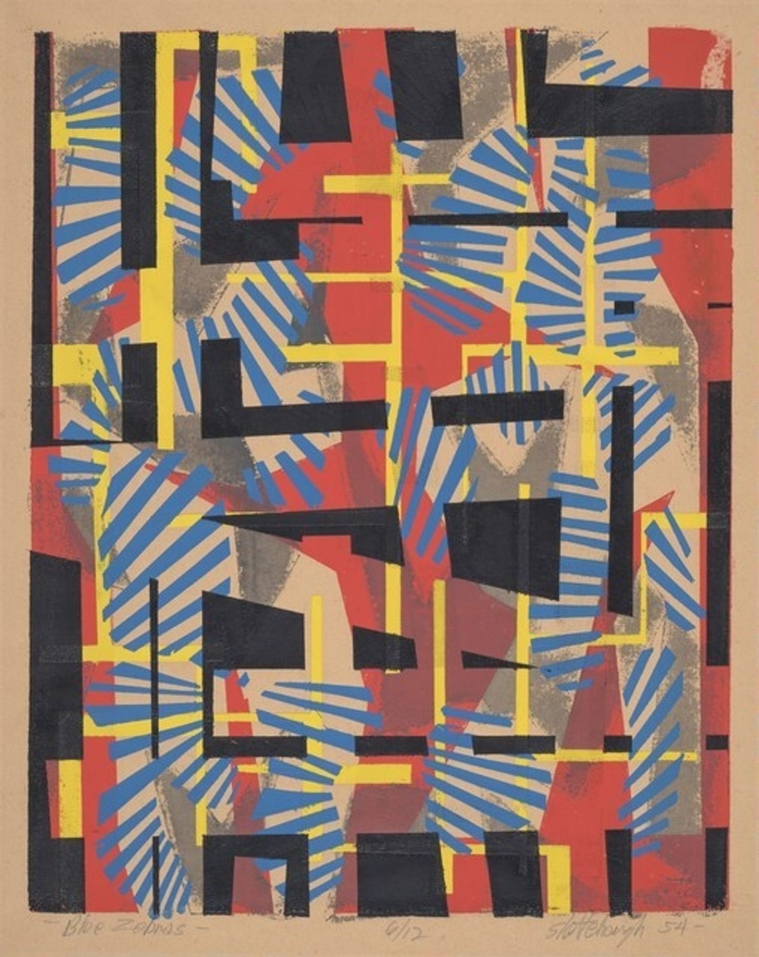
1954
Blue Zebras
Listen to curator's interpretation
Curatorial notes
Curator: We’re looking at Thomas Chester Slettehaugh’s print, "Blue Zebras," created in 1954. Editor: What a captivating jumble! The composition almost feels… frantic, doesn’t it? The energetic lines and bold colours practically vibrate off the surface. Curator: Yes, precisely! The interplay of black, red, yellow, and blue presents a vibrant clash. Notice how Slettehaugh manipulates geometric forms – stripes, rectangles, semi-circles - to create both unity and dissonance. He has explored post-impressionist and abstraction. Editor: I can certainly see the abstraction at play here. But given its creation during the mid-century, I am thinking, what cultural sentiments of the period are evoked through this imagery? Was it a reflection on social upheaval or the rigid formalism creeping into urban architecture at the time? Curator: Interesting point. On one level, it could be considered as part of a modernist exploration into non-representational art. The repetitive nature of the striped pattern hints at industrialization and mechanization – the relentless rhythm of modern life. However, it deviates from this with a more relaxed treatment, and an interplay with a range of softer tertiary colours which adds levity. Editor: And that title: "Blue Zebras"—what’s your take on its significance? I’m interested in understanding the intersection of nature and industrial motif, perhaps reflecting post-war environmental concerns? Curator: The title is provocative, of course. The blue of the zebras certainly disrupts our expectations, which invites us to challenge convention. Beyond that, the animal itself could function as a kind of mirror. As striped and patterned creatures that gather as a herd, zebras might even have offered an early warning on the danger to environmental convention from rapid urban development and cultural homogenisation in mid-century society. Editor: It does offer considerable food for thought! This piece manages to capture the spirit of both calculated design and spontaneous creativity. Curator: It certainly does. It makes us see the unexpected and contemplate the role of visual conventions in the creation of meaning and experience. Editor: A delightful and chaotic blend! It underscores how shapes, colours, and themes intertwine to offer not just something aesthetically pleasing but sociologically insightful too.