#
abstract-expressionism
# print
#
pop art
#
form
#
geometric
#
pop-art
#
line
#
cityscape
#
modernism
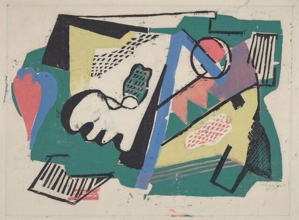
Dimensions: image: 302 x 200 mm sheet: 357 x 250 mm
Copyright: National Gallery of Art: CC0 1.0
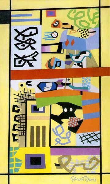
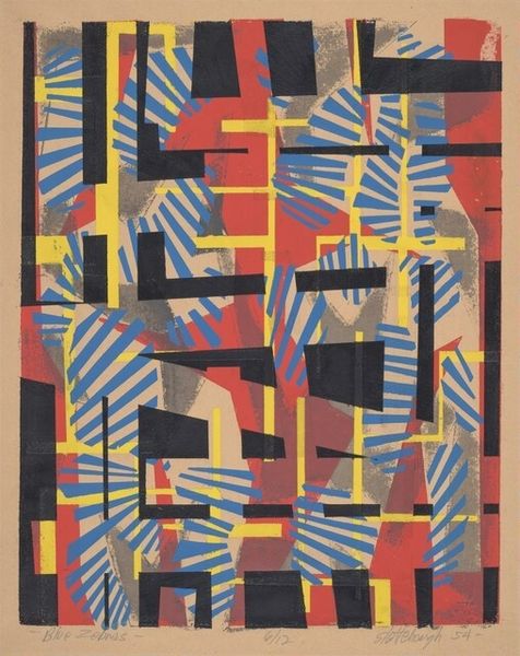
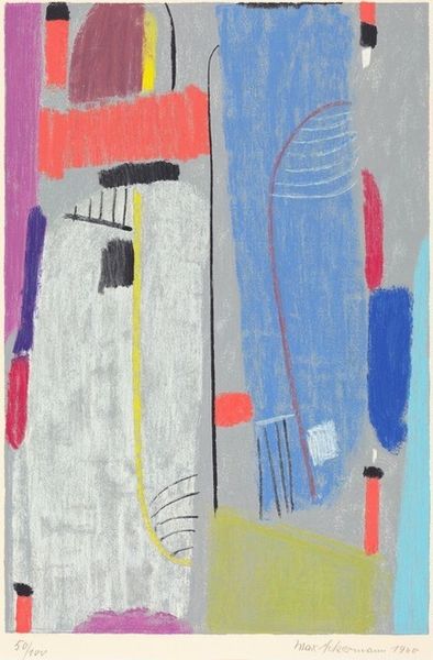
Pat Vaccaro made this print, Urban Eclipse, sometime in the 20th century, probably using a lithographic process to build up layers of flat color. It's this layering and the way the colors interact that really grabs me. The piece is all about shapes bumping up against each other: blues, reds and yellows creating this sense of depth, a kind of push and pull. Look at the way Vaccaro uses color to create a mood - the blues are cool and calming, while the reds and yellows give off a sense of energy. See that funny off-white circle near the top? It’s not quite a circle, and the red mark inside is off-center, sort of like an eclipse. This feels related to the earlier work of Stuart Davis, who also used bold colors and simplified shapes. But Vaccaro brings his own sensibility, creating a unique conversation. Ultimately, the piece remains an open question, and that’s what makes it so interesting.
Comments
No comments
Be the first to comment and join the conversation on the ultimate creative platform.
More like this