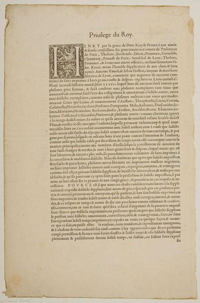
1640
Franstalig voorwoord
Crispijn van de (II) Passe
1597 - 1670Location
RijksmuseumListen to curator's interpretation
Curatorial notes
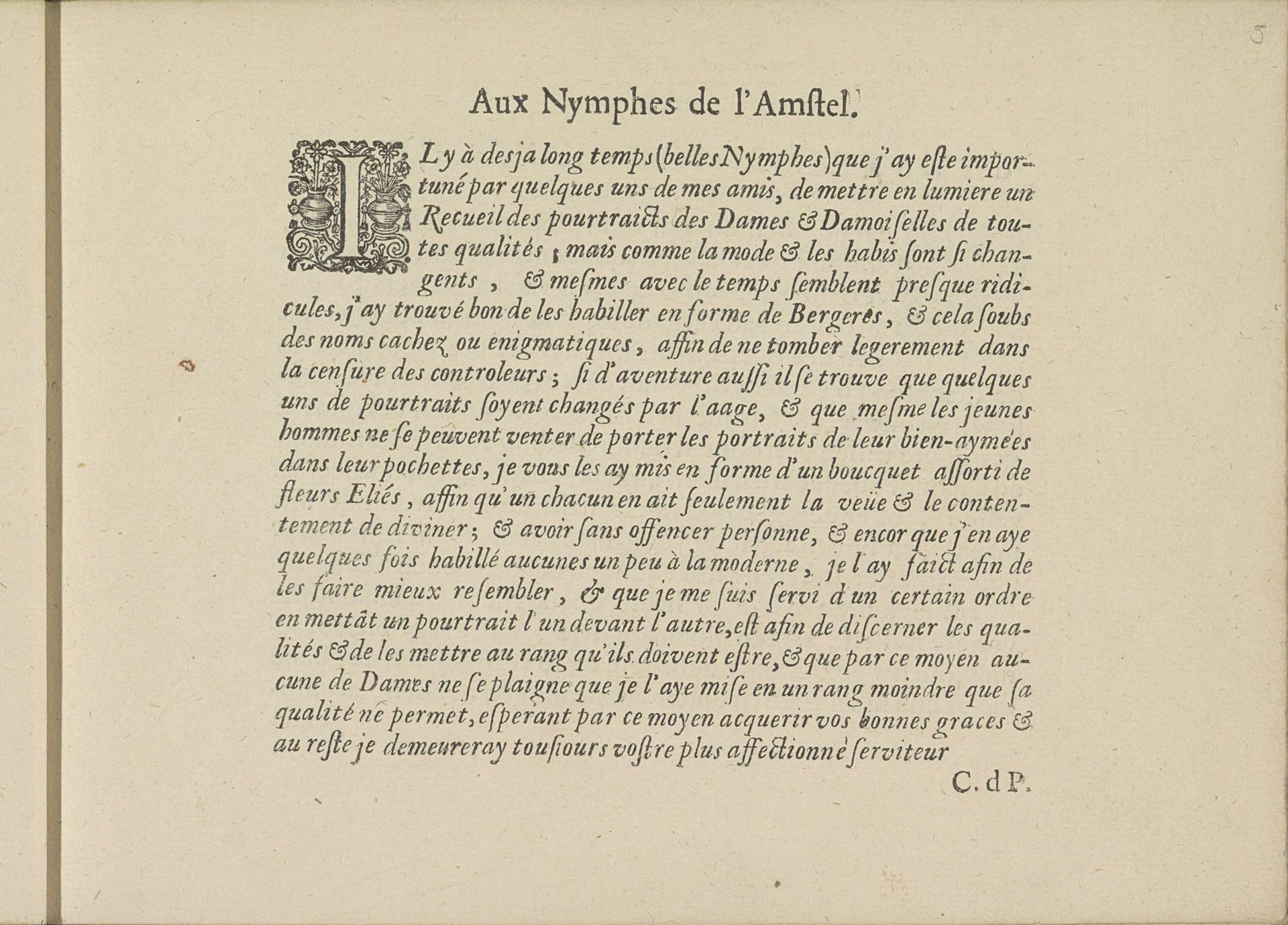
Curator: Look at this engraving by Crispijn van de Passe the Younger, titled "Franstalig voorwoord," dating back to 1640. The materials employed are print and typography, found within the Rijksmuseum collection. Editor: Immediately, my eyes are drawn to the density of the text, and how little pictorial relief is granted; but that embellished "L" at the very start promises some ornamental design. I wonder if the artist intentionally evokes a claustrophobic sensation to underscore the seriousness of the text? Curator: In its historical context, engravings were often commissioned to disseminate information and celebrate important figures or events, offering broad public accessibility. It played a key role in the 17th century when mass media didn't exist. Consider how this Preface functioned as an invitation and justification for what follows the illustrated "pourtraids." Editor: From a purely compositional stance, the lettering, organized like dense, even blocks, shows an interest in visual texture akin to tapestry. The flourished script certainly emphasizes a need for decorum within what would have surely been a status-conscious clientele. Curator: What strikes me is the implied reader here. It speaks of dames and damoiselles and references fashion in ways that must flatter even as they perhaps condescend toward those who desire their portraits to be "up to date." The "Preface" carefully constructs a courtly space for the viewer-reader. Editor: It does possess an almost intimate, exclusive aura—akin to uncovering a treasured, but sealed, letter among historical artefacts, where its content whispers stories that may be either confessional or cryptic. That ornate 'L,' then, becomes the entry to this enclosed, esoteric world. Curator: Agreed; beyond its functional origins, this engraving prompts introspection about societal hierarchies and aspirations conveyed through printed imagery. It mirrors broader power dynamics of its epoch. Editor: Analyzing this work leaves one acutely conscious of language as an intentional structure, crafted through conscious technique. I leave feeling reflective of what formal limitations may convey if done with intent.