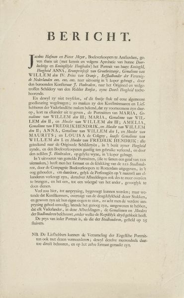
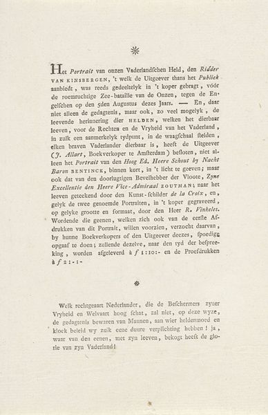
Adres van de notaris Olzati om de 15 afgezette predikanten in hun functie te herstellen, 1796 1796
0:00
0:00
print, etching, paper
#
script typeface
#
neoclacissism
#
aged paper
#
dutch-golden-age
# print
#
typeface
#
etching
#
paper
#
fading type
Dimensions: height 330 mm, width 192 mm
Copyright: Rijks Museum: Open Domain
Editor: We’re looking at “Address of notary Olzati to restore the 15 dismissed preachers to their office, 1796,” a print etching on paper made in 1796 by J. Olzati. What immediately strikes me is the aged quality of the paper. It feels like I am reading an actual historical document. What do you make of this artwork? Curator: The intrinsic interest lies in the interplay of texture and typography. Consider how the density of the script typeface commands visual attention. Note the calculated arrangements of letterforms—observe their relationship, their individual contribution to a structural and textual integrity. Editor: I see what you mean about the typography. Is the style of lettering significant? Curator: Indeed. The deliberate execution of the typeface suggests an adherence to formal conventions, while the degradation of the paper adds a layer of complexity, creating a visual dialogue between intention and entropy. How do you feel the content contributes to the formal qualities of this piece? Editor: I think the aged and fragile look adds authenticity. It seems to reinforce that this is an old document that has survived. It makes me wonder about the story behind this. Curator: The ‘story’ is present, but in our analysis, it takes a backseat to the compositional strategies at play. Do you observe how the verticality and linear elements within the print evoke an upward motion? Editor: I hadn’t noticed that at first, but I see it now! This conversation changed my perspective. I focused on the content, and missed many of the qualities of the art! Curator: Precisely. There's always another structural element or interplay that remains to be deciphered.
Comments
No comments
Be the first to comment and join the conversation on the ultimate creative platform.
More like this