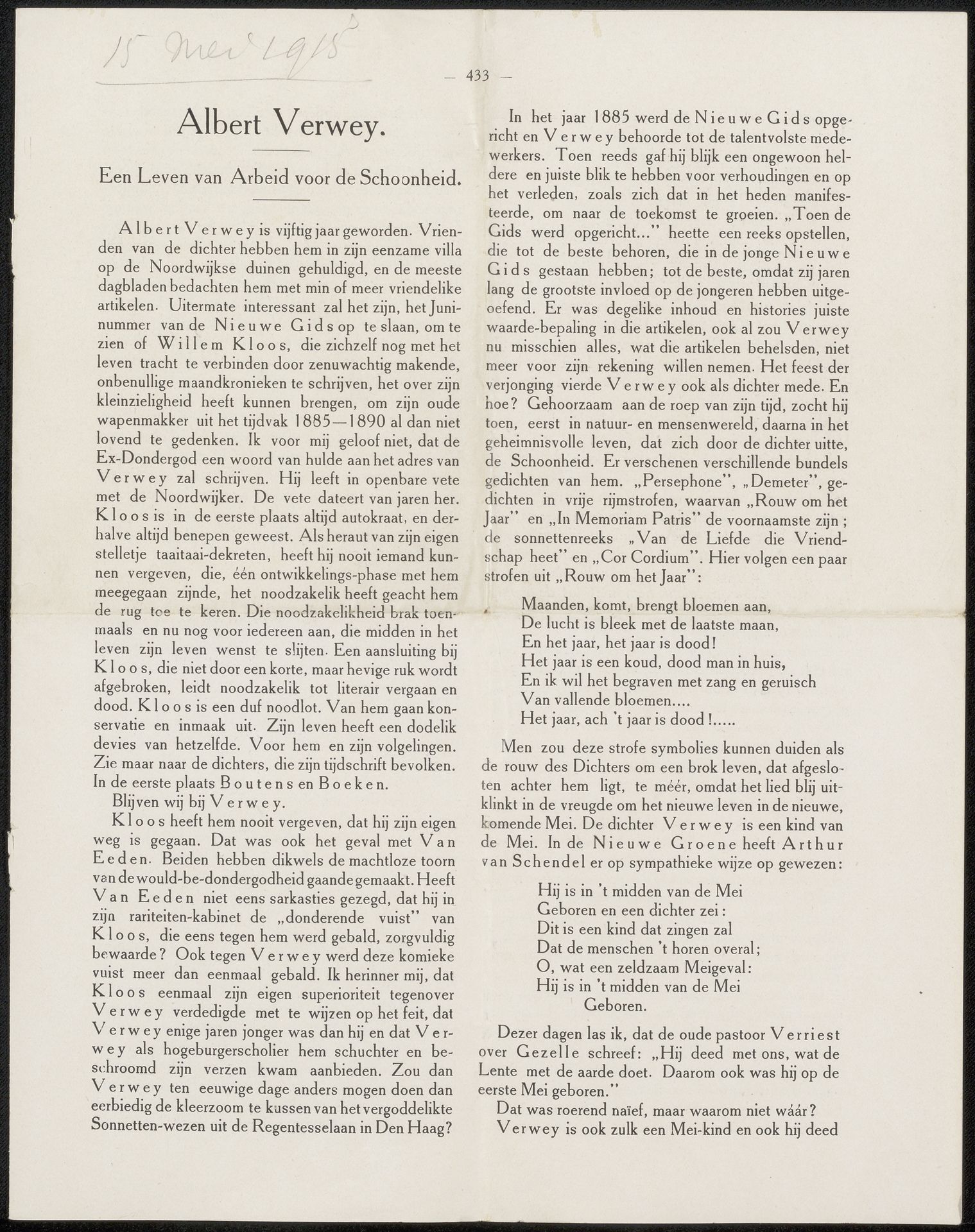
after 1915
Artikel uit archief Philip Zilcken
Listen to curator's interpretation
Curatorial notes
This is a page from Philip Zilcken's archive about Albert Verwey, printed sometime around May 1915. What strikes me here is how the words form dense blocks, like a field of dark marks on the page. It reminds me that writing, like painting, is a physical act, a process of applying material to a surface. Look closely, and you'll notice the texture of the paper, the way the ink bleeds slightly into the fibers. It's not a perfectly smooth surface, there's a kind of lived-in quality that feels intimate. I am drawn to the way the rigid columns of text create a sense of order but within them each letter and word seems to push against this structure, a little bit messy, a little bit alive. This page reminds me of the work of Cy Twombly, whose scrawling, handwritten marks also blur the line between writing and drawing. Both this page and Twombly's work invite us to see language as something more than just a means of communication; it's also a form of art, a way of making marks on the world.