drawing, paper, pen
#
drawing
#
hand-lettering
#
hand drawn type
#
hand lettering
#
paper
#
hand-drawn typeface
#
pen work
#
sketchbook drawing
#
pen
#
handwritten font
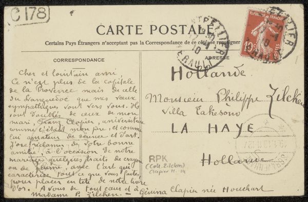
Copyright: Rijks Museum: Open Domain
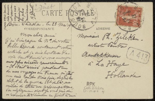
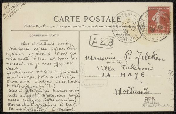
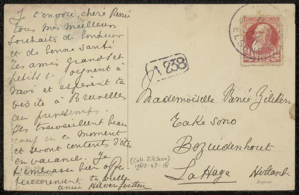
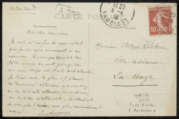
Curator: This is a prentbriefkaart, or printed postcard, sent to Philip Zilcken sometime before 1914, likely pen on paper by Eugénie Clapier-Houchart. The casual, handwritten quality gives a unique intimacy. Editor: Yes, immediately, there’s something intensely personal about seeing that handwritten script, a window into a different era, an ephemeral connection. It's as if I am receiving a message from the past. Curator: Notice the spatial relationships, though, between the hand-drawn type and the commercially printed portions, like the "Carte Postale" header. The tension there between formal structure and personal expression. Also observe the careful alignment of lines versus the apparent spontaneous handwriting below it. Editor: The handwriting carries an air of fragility, the ephemeral quality reinforced by its inherent vulnerability. These are personal thoughts set down on something as light and delicate as paper. The cancellation stamp with its date really hits home that temporal quality. Curator: Let's look at the stamp more structurally. See how the circular cancellation stamp with the date intersects the rectangular form of the postage stamp? These overlaying shapes establish an active and engaging rhythm. Editor: Beyond just rhythm, that intersection highlights how physical objects act as witnesses to history and social exchange. The iconography is there for anyone to unpack. A postage stamp, defaced with use and transit... A beautiful image! Curator: Consider the relationship between text as pure form and text as linguistic content. How does that contribute to its function as a prentbriefkaart? Editor: Right, it's form AND function—that script and its arrangement point to that symbolic intent. A snapshot of someone writing about requesting paper. Incredible! Curator: Looking again structurally, that tension holds the postcard's dynamic quality and expresses so much. It moves well. Editor: I'm drawn to that beautiful handwriting and the request, hinting at a longer story. It humanizes both the sender and the recipient across decades.
Comments
No comments
Be the first to comment and join the conversation on the ultimate creative platform.
More like this