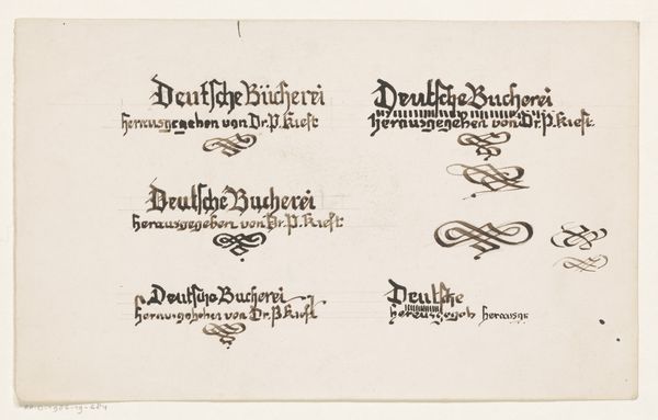
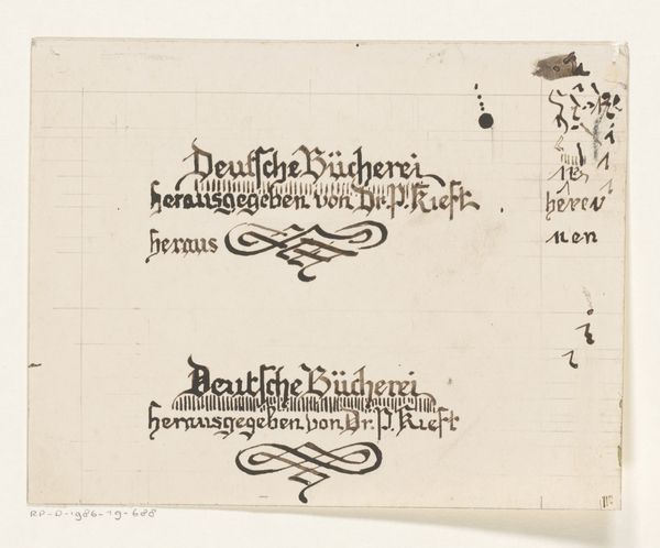
Letterontwerp voor een boek gepubliceerd door dr. P. Kieft 1884 - 1952
0:00
0:00
drawing, graphic-art, paper, typography, ink
#
drawing
#
graphic-art
#
art-nouveau
#
ink paper printed
#
paper
#
typography
#
ink
#
pen-ink sketch
#
modernism
Dimensions: height 104 mm, width 201 mm
Copyright: Rijks Museum: Open Domain
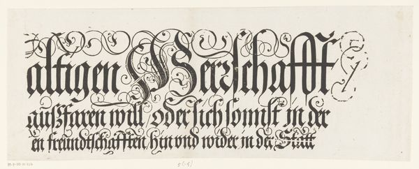
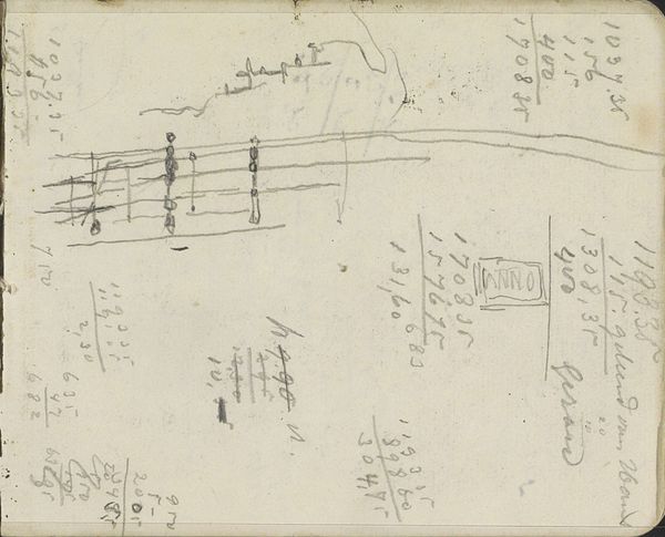
This letter design for a book published by Dr. P. Kieft was made by Reinier Willem Petrus de Vries, but we don't know exactly when. Look at how the letters are formed with these heavy strokes, typical of Fraktur fonts. It’s as if each letter is constructed through a series of deliberate, forceful gestures, and it really speaks to the process of creating something by hand, stroke by stroke. Then there's the flourish in the center, this loopy, swirling design. It's a moment of pure ornamentation, a break from the rigid structure of the text above. See how the ink pools and darkens in the curves, giving it a tactile, almost three-dimensional quality? There’s something very ‘Klimt’ about that swirling pattern! Maybe the artist was looking at some turn-of-the-century Viennese art? Anyway, it reminds us that art is always in conversation, borrowing and riffing off ideas across time.
Comments
No comments
Be the first to comment and join the conversation on the ultimate creative platform.
More like this