Dimensions: height 375 mm, width 285 mm, thickness 25 mm
Copyright: Rijks Museum: Open Domain
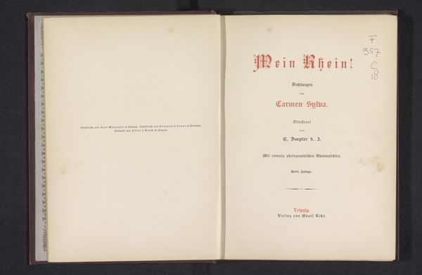
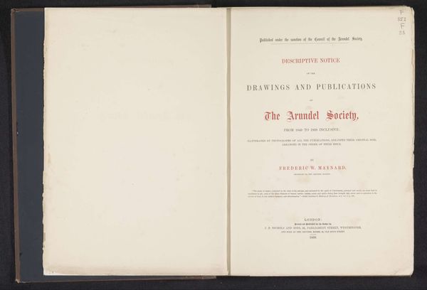
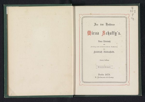
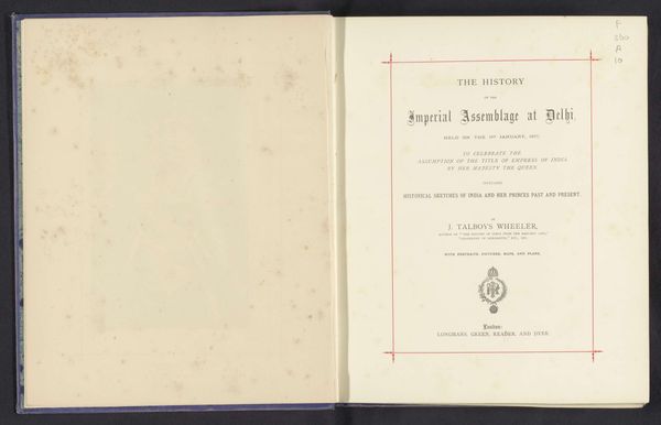
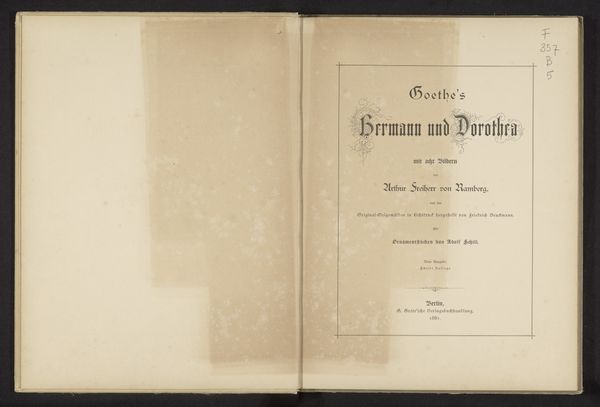
Curator: Here we have the title page of "Das Buch von der Königin Luise," or "The Book of Queen Louise," dating back to 1883, the work of Georg Horn. It’s a striking example of typography from the late 19th century. Editor: It strikes me immediately as quite austere. The off-white background and simple border give it a formal, almost academic feel, but the typography itself introduces some nice contrasting elements. Curator: Indeed. Queen Louise held a particular importance in German collective memory, representing a certain kind of stoic, nationalistic virtue, which the book sought to commemorate. How do you feel that narrative relates to what the artist achieves here? Editor: Well, in terms of symbolism, the use of the Blackletter font, or "gothic script", gives the lettering a weighty presence, rooting it in a historical German identity and a medieval aesthetic that aligns perfectly with Queen Louise's romanticized image. I’m interested in this connection between form and message. Curator: The choice of typography certainly emphasizes this, harkening back to a perceived golden age. If you look closer, there’s a real duality presented in the font. Note, for example, the intertwined foliage which merges the organic with the more rigid structure of the font itself. Editor: I also see a kind of quiet rebellion against industrialization. Hand-drawn elements within typography push back against mass production and the loss of unique craftsmanship. The serifs and swashes remind us that this was made by human hands. It embodies a yearning for a past perhaps idealized, but undeniably resonant. Curator: Absolutely. The late 19th century witnessed a surge in nationalistic sentiment, and printing became a key way of disseminating such values, visually anchoring a shared past to create unity. It presents a clear example of using imagery to craft identity. Editor: Examining this work offers a valuable glimpse into how design choices—consciously or unconsciously—reinforce larger cultural and political narratives. It pushes us to think about how art actively contributes to constructing identity and nationhood. Curator: It encourages us to think of graphic design itself as an active agent in the building of cultural narratives and national projects. Editor: Exactly. This seemingly simple title page encapsulates complex ideas about identity, nationhood, and the relationship between history and modernity, providing a deeper context that challenges a simplified vision of Queen Louise.
Comments
No comments
Be the first to comment and join the conversation on the ultimate creative platform.
