Album : verzameling van afbeeldingen der merkwaardigste voorwerpen, ingezonden voor de tentoonstelling van oudheden, gehouden te Delft, in Julij en Augustus 1863 1863
0:00
0:00
graphic-art, print
#
script typeface
#
graphic-art
#
script typography
# print
#
hand drawn type
#
personal journal design
#
personal sketchbook
#
hand-drawn typeface
#
stylized text
#
thick font
#
history-painting
#
delicate typography
#
academic-art
#
historical font
Dimensions: height 330 mm, width 250 mm, thickness 8 mm
Copyright: Rijks Museum: Open Domain
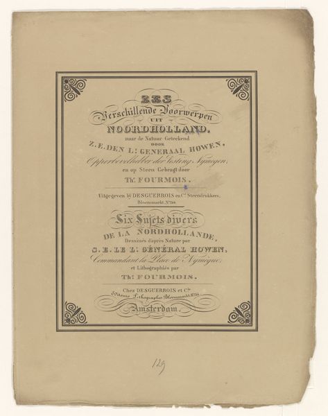
Editor: This graphic art print, titled "Album: verzameling van afbeeldingen der merkwaardigste voorwerpen, ingezonden voor de tentoonstelling van oudheden, gehouden te Delft, in Julij en Augustus 1863," created in 1863 by H.C. Rogge, has a somewhat official look, due to the stylized typography. What strikes you when you look at this cover page? Curator: The lettering and decorative framing elements suggest a conscious attempt to link the *idea* of an album with the historical weight of the items it documents. Note the hand-drawn typeface and script typography—they create a fascinating tension. How does this tension speak to the role of visual display for objects deemed worthy of exhibition? Editor: So the artist isn't just presenting information; they're also creating a particular *feeling* about history and objects? Curator: Precisely! Consider the elaborate borders surrounding the text; they borrow from classical motifs but are rendered with a distinct 19th-century sensibility. It's about invoking a sense of established tradition, giving these ‘oudheden’ – or antiquities - an almost mythic significance. What purpose might that serve for the viewer of the time? Editor: Perhaps it was a way to legitimize the importance of the exhibition and the objects displayed. Curator: Exactly. It's about constructing a visual narrative that elevates everyday items to symbols of national identity and cultural memory. Now, how do you think our understanding of “antiquities” has shifted since 1863, looking back from our present moment? Editor: It’s fascinating to consider how perceptions of historical artifacts and design change over time. The cover gives insight to period interpretation. Curator: Indeed, it speaks volumes about how each generation seeks to define and redefine its relationship to the past.
Comments
No comments
Be the first to comment and join the conversation on the ultimate creative platform.
