print, photography, typography
script typography
paperlike
hand drawn type
personal journal design
photography
typography
hand-drawn typeface
thick font
publication mockup
delicate typography
academic-art
thin font
small font
Dimensions: height 302 mm, width 232 mm, thickness 3 mm
Copyright: Rijks Museum: Open Domain
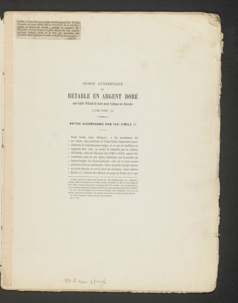
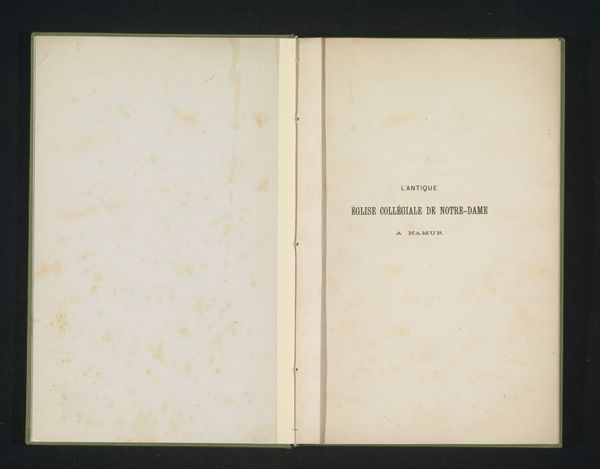
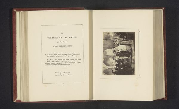
Editor: Here we have "Report on the Total Solar Eclipse of April 6, 1875," a print published in 1878. The title page is quite striking, with a very clean layout, a balance between the negative space and text blocks, almost austere. What stands out to you? Curator: Note the stark juxtaposition of the blank, cool-toned left page and the densely lettered, warmer-toned right. The texture of the paper itself is also important; see how the fibres create a subtle grid, almost like a musical score on which the typography is arranged. The variations in font weight contribute to the visual hierarchy. Do you see how that functions? Editor: Yes, the title is bolder, immediately grabbing your attention, and then the eye moves down to the smaller text identifying the authors and publisher. What about the handwritten marks in the upper corner? Do they disrupt the visual balance, or add another layer? Curator: Consider them a form of marginalia, a later intervention into the structure of the print. Their function, however, disrupts the intended design. Notice, too, how the very slight misalignment of the printed text within the page creates a subtle tension. Do you find that enhances or detracts from the overall composition? Editor: I hadn't noticed that before! I think the slight imperfection adds a sense of human touch to an otherwise very formal presentation. It's a bit more…dynamic. Curator: Precisely. The relationship between precision and imperfection, intention and accident—these are critical to understanding the piece's aesthetic complexity. The subtle interplay elevates the document beyond mere reportage. Editor: That makes me appreciate how the artist uses both formal and informal elements together. It’s much more intricate than it initially appears. Curator: Indeed. Paying close attention to these intrinsic formal qualities allows for a deeper reading and appreciation.
Comments
No comments
Be the first to comment and join the conversation on the ultimate creative platform.