tempera, painting
#
byzantine-art
#
narrative-art
#
tempera
#
painting
#
oil painting
#
history-painting
Copyright: Orthodox Icons,Fair Use
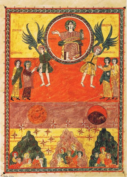
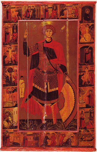
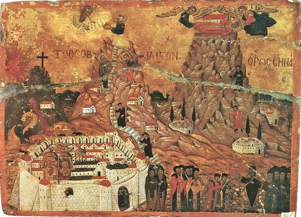
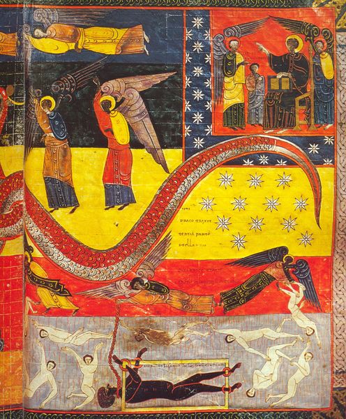
Curator: "Simeon Stylites the Elder and Simeon Stylites the Younger," a tempera painting from 1699, attributed to the Orthodox Icons collection. At first glance, the painting is very visually crowded. The symmetry gives some sense of harmony, but the sheer amount of figures and activity feels… chaotic? What is your assessment of the painting's formal composition? Editor: Well, if we focus on the architecture first, there is this stark contrast between the two saints who are enclosed by those tall, cylinder pillars, and the chaotic, earthly plane teeming with people at the bottom. Curator: Precisely. Note how the columns draw our eyes upwards, creating a vertical rhythm that opposes the horizontal sprawl of human activity below. How does the artist use colour to further reinforce this hierarchical arrangement? Editor: It seems like gold tones are mostly reserved for the top plane to indicate its holy quality, and there are varying degrees of saturated red down below in the human world. So the colour reflects the spiritual elevation toward the heavens versus earthly concerns. Curator: The deliberate deployment of colour supports your observation. Moreover, examine the geometric nature of the overall structure—two verticals bisecting a complex array of geometric figures within a somewhat rigidly designed landscape. Could one view the two Stylites columns almost as semiotic bars? Editor: Yes, I think so. The eye initially wants to view this painting holistically. But the architecture demands we compartmentalize its message and engage it section by section. I think I can look at these Orthodox Icons differently from now on. Curator: I'm glad to offer you new lens, and, if anything, it provides a case study into what we've discussed thus far.
Comments
No comments
Be the first to comment and join the conversation on the ultimate creative platform.
More like this