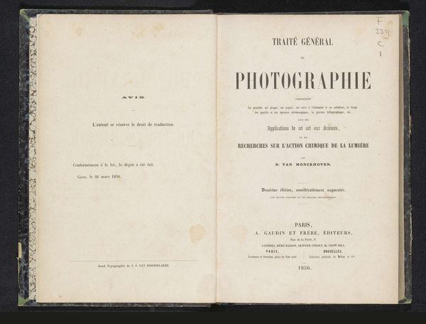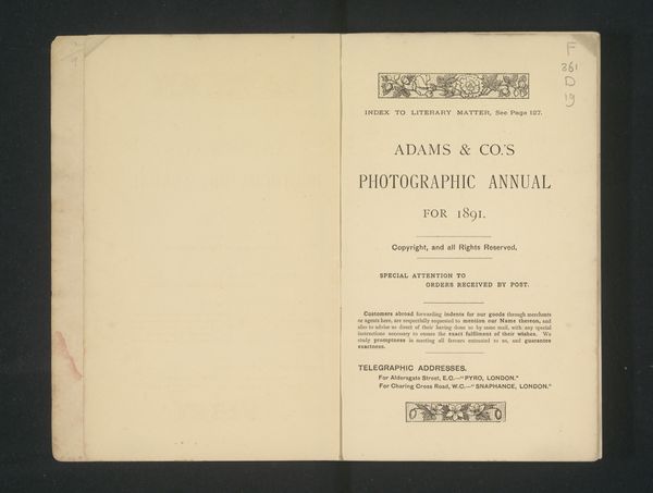
graphic-art, print, photography, typography
graphic-art
german-expressionism
photography
typography
Dimensions: height 267 mm, width 200 mm, thickness 50 mm
Copyright: Rijks Museum: Open Domain
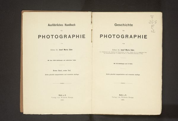
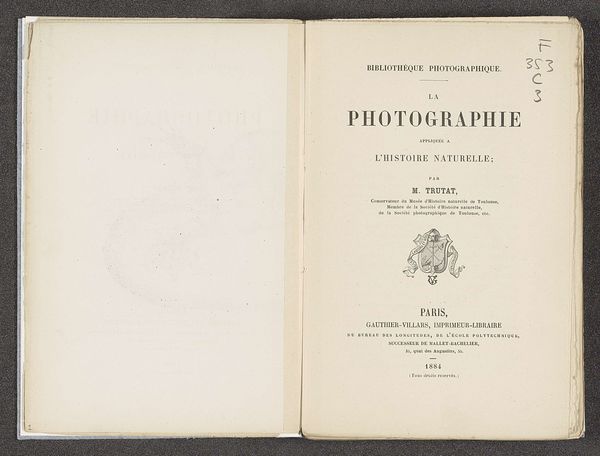
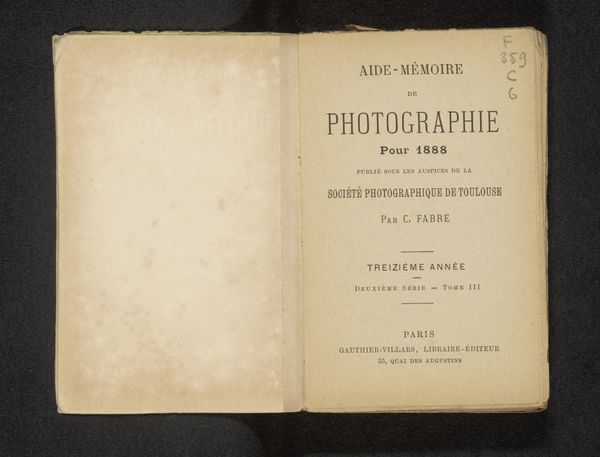
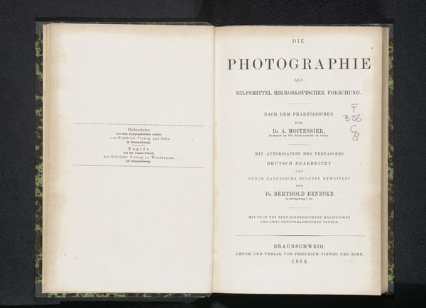
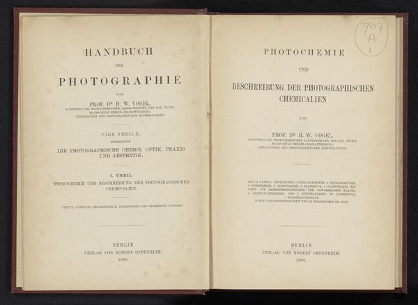
This is the cover of "Photographische Mittheilungen", a journal for amateur photography, edited by P. Hanneke in Berlin, 1903. The cover is dominated by the Fraktur typeface, or "broken script," a style laden with cultural significance. Notice the deliberate, almost architectural construction of the letters. This typeface, deeply rooted in German identity, resurfaces throughout history as a symbol of national pride, yet is later stigmatized. Such cultural symbols are like potent dreams, carrying layers of collective memory. The choice of Fraktur here evokes a sense of tradition, of grounding photography within a specific cultural context. It’s a visual anchor, connecting the new medium of photography with established German artistic and intellectual heritage. It demonstrates how symbols are never static; they evolve and are reinterpreted, reflecting our ever-changing relationship with the past.
Comments
No comments
Be the first to comment and join the conversation on the ultimate creative platform.
