Manuel théorique et pratique de photographie sur collodion et sur albumine / E. Robiquet 1859
0:00
0:00
print, photography
# print
#
book
#
photography
#
history-painting
Dimensions: height 182 mm, width 119 mm, thickness 26 mm
Copyright: Rijks Museum: Open Domain
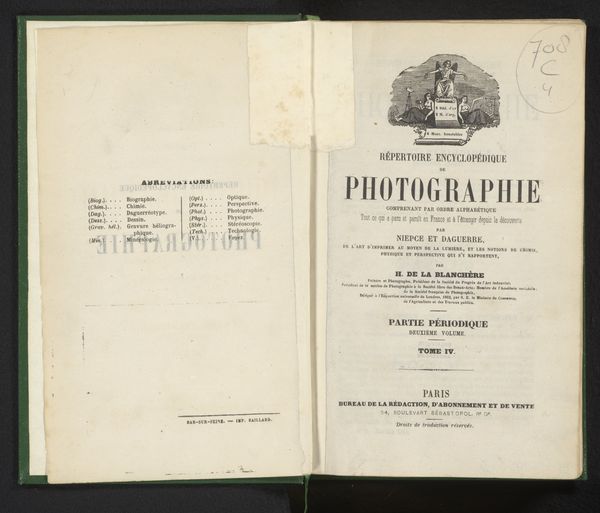
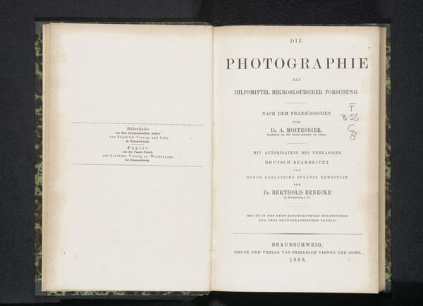
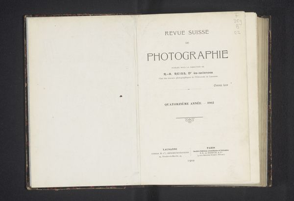
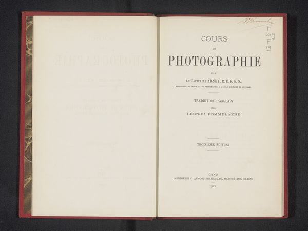
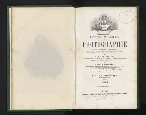
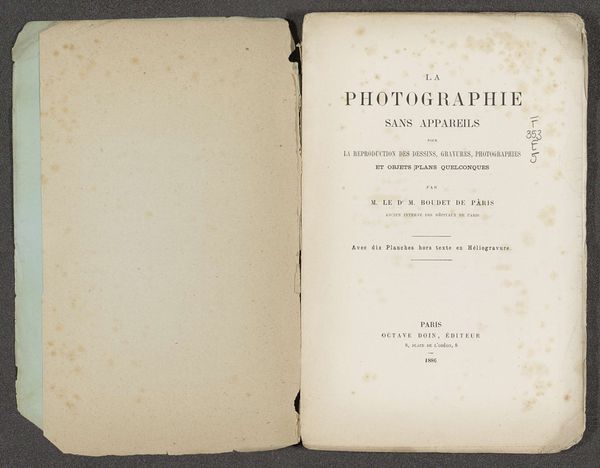
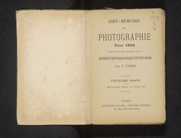
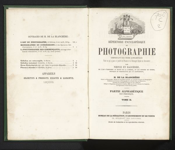
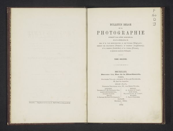
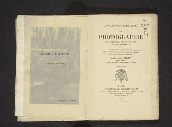
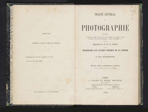
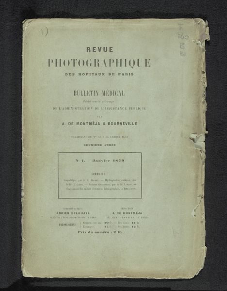
Editor: This is the book, "Manuel théorique et pratique de photographie sur collodion et sur albumine" by E. Robiquet, printed in 1859. The title page is so striking. It's very text-heavy but balanced. What do you see in its composition? Curator: I'm drawn to the spatial arrangement of the typography. Observe the deliberate hierarchy: "PHOTOGRAPHIE" dominates, a central anchor. Above, smaller fonts introduce and qualify, leading our eye downward. Below, similar techniques reiterate authorship and publishing details. The very subtle discolorations of the aging paper also become an intrinsic part of the work's composition, further contributing to its semiotic load. Editor: So you’re focusing on the shapes the words make and how they lead the eye. What about the fonts? Curator: Indeed. Consider the interplay between the serif typeface used for the title, suggesting a connection to established traditions of printing, and the sans-serif for the author and publishing information, introducing a more modern element. The texture, the ink saturation – all these material elements coalesce into a powerful visual experience. Editor: It's interesting how you’ve isolated these formal elements and drawn so much from them. I wouldn't have thought to look so closely at the font choices. Curator: Precisely. This structured approach unveils how formal components interact to generate meaning, moving beyond a purely functional reading. The subtle variations on each page also function to make it completely unique. Editor: This really shows me the depth a formal analysis can uncover! I see the choices more clearly now. Curator: It underscores how a focus on form can reveal artistic intention, even in a seemingly straightforward informational document like this.
Comments
No comments
Be the first to comment and join the conversation on the ultimate creative platform.
