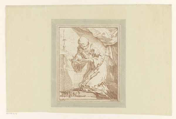
drawing, paper, ink
#
drawing
#
figuration
#
paper
#
ink
#
history-painting
#
academic-art
Dimensions: height 206 mm, width 264 mm
Copyright: Rijks Museum: Open Domain
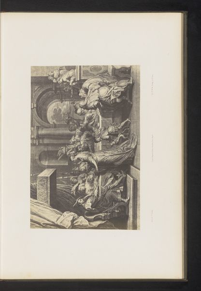
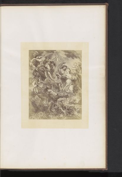
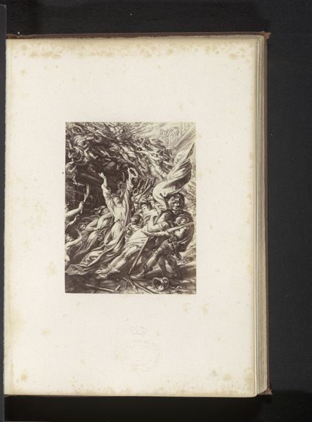
Curator: We’re looking at John Skippe's "Graflegging," a drawing from 1783 rendered in ink on paper. Editor: It feels both heavy and ethereal—the pale figures seem to float, yet their sorrow anchors them. The light and shadow are quite dramatic for what is essentially a drawing. Curator: Precisely. Skippe masterfully uses chiaroscuro to heighten the emotional impact, drawing on established visual tropes within academic art. Observe the carefully constructed composition; the bodies form a complex pyramid, directing our gaze to the lifeless figure being lowered. Note how the texture of the paper itself contributes to the somber mood. Editor: The descent from the cross, always fraught. The pallor of Christ mirrors a wider systemic denial and disenfranchisement. The work operates within a patriarchal, religious framework. But are there ways to read this with modern sensibilities and a critique of institutional power? Can we extract the compassion, empathy, for example, displayed towards marginalized communities? Curator: One can certainly argue that. Yet I'm drawn to how the bodies themselves express that pathos through pose and gesture. Consider the arm outstretched to catch the falling form. We could think of this arm and that of the man laying on the ground as forming a kind of visual bridge that communicates profound tenderness and mourning. It operates formally to create a visual network, yes? Editor: The artist, in 1783, operated within specific societal constraints which were inevitably embedded within this figuration. Exploring the perspectives of all actors impacted becomes part of understanding historical nuances. Curator: Perhaps so. I see instead an expertly rendered study of form and emotion through purely artistic means. Editor: Yes, there are certainly those elements. Regardless, it encourages us to reflect on the inherent tension of loss. Curator: A somber end indeed, even from just looking at Skippe's handling of tonal contrast and balanced forms.
Comments
No comments
Be the first to comment and join the conversation on the ultimate creative platform.
More like this