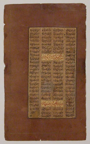
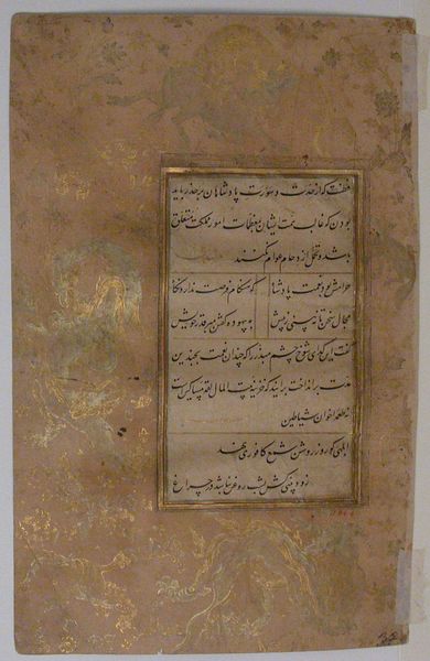
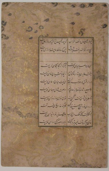
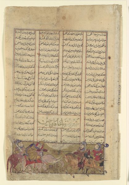
Page of Calligraphy from a Shahnama (Book of Kings) 1585 - 1635
0:00
0:00
drawing, paper, ink
#
drawing
#
paper
#
ink
#
coloured pencil
#
islamic-art
#
calligraphy
Dimensions: H. 8 1/8 in. (20.6 cm) W. 4 3/4 in (12.1 cm)
Copyright: Public Domain
Editor: Here we have "Page of Calligraphy from a Shahnama (Book of Kings)," created sometime between 1585 and 1635. It's ink, colored pencil, and paper. The detail in the script is striking, although I can't read a word of it! What draws your eye to this particular page? Curator: My attention is drawn to the overall balance. Note the confident framing; the outer border is not quite even but it still lends definition. See how the internal divisions of the text are balanced with their relation to the page? There's a careful calibration between script and void. The columns of text operate almost as architectural supports. Do you see that tension? Editor: I think so... It's like a building, each column is sturdy and holds up the page. I see the whole thing feels contained. But if it's supposed to be like architecture, shouldn't it be precise and neat? It’s clearly quite worn. Curator: The slight asymmetry only heightens the visual experience. The page is a testament to surviving through time. The damage to the outer border reminds us of its materiality, its physical existence. If it were pristine, would it have the same impact? Editor: I see what you mean. The imperfections make it feel real. The design still works, even after all this time and damage! I focused on the script at first, but the framing really makes it feel complete. Curator: Exactly. Form and function united through careful balance. What started as simply script became art.
Comments
No comments
Be the first to comment and join the conversation on the ultimate creative platform.
More like this