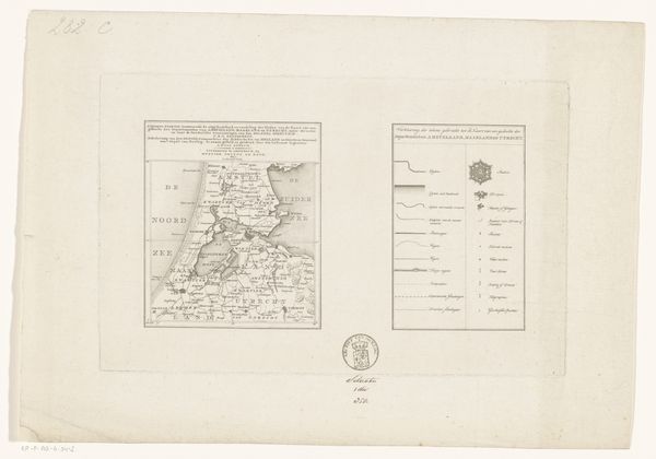
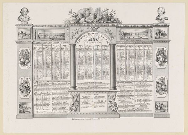
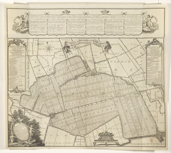
Register van de wapenkaart van de heren veertigen van de stad Leiden 1758
0:00
0:00
abrahamdelfos
Rijksmuseum
graphic-art, print, paper, typography, engraving
#
graphic-art
#
old-fashioned
#
aged paper
#
dutch-golden-age
#
parchment
# print
#
old engraving style
#
hand drawn type
#
old fashioned
#
paper
#
typography
#
hand-drawn typeface
#
golden font
#
engraving
#
historical font
#
columned text
Dimensions: height 428 mm, width 542 mm
Copyright: Rijks Museum: Open Domain
Curator: Let's discuss Abraham Delfos' "Register van de wapenkaart van de heren veertigen van de stad Leiden," created in 1758. It's a print and engraving on paper, currently held at the Rijksmuseum. Editor: It has the look of aged parchment. The columns of tiny, meticulously etched names and numbers create such an intense visual texture! What jumps out at you in terms of form and structure? Curator: Observe how Delfos employs the grid structure to organize the information. This arrangement prioritizes order and clarity. Do you see how the use of line weight and spacing establishes a hierarchy, guiding the viewer's eye? Editor: Yes, the bold lettering of "REGISTER" immediately draws the eye, while the smaller text below provides context, though difficult to read without closer inspection. How do you think this work reflects the artistic and philosophical thinking of its time? Curator: Consider the period—the Enlightenment. Reason and order were paramount. The print's systematic layout embodies this. The precision of the engraving suggests a belief in the power of categorization and knowledge. Do you notice any asymmetrical aspects, anything that breaks from the grid? Editor: Not initially, but now that you mention it, the subtle variations in line thickness in the border feel almost like a natural, organic contrast to the rigid grid within. What can you tell me about how semiotics might offer some interpretative insight here? Curator: The numbered listing assigns symbolic value to individuals. The columns visually equate all names regardless of length. The lettering styles contribute to its legibility and decorative function, each form holds intrinsic design properties, which combined with the structure adds the cultural value we associate with historic artefacts of that time. What have you observed overall about the organization, weight and arrangement? Editor: I see now how every component—from the typography to the columned text—works together to reinforce a sense of Enlightenment order, making what I thought was simply "old" appear deliberate, balanced, and rationally structured! Curator: Exactly! Form informs meaning, a valuable concept to keep with you.
Comments
No comments
Be the first to comment and join the conversation on the ultimate creative platform.
More like this