1884 - 1952
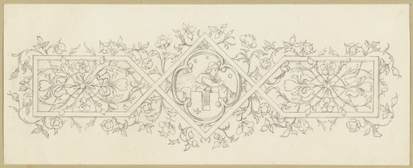
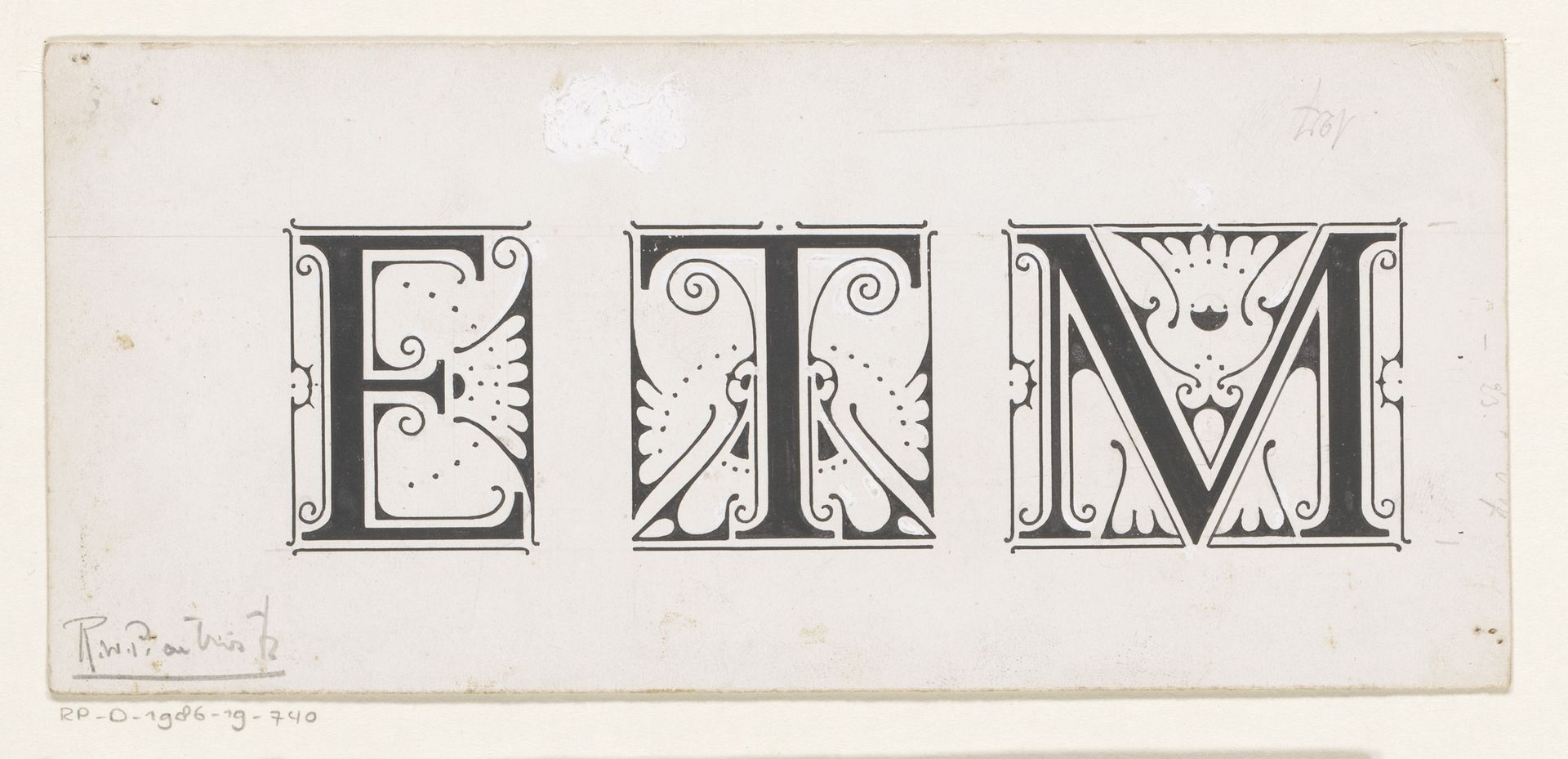
Ontwerp voor de initialen E, T, M
Listen to curator's interpretation
Curatorial notes
Reinier Willem Petrus de Vries made this drawing for the initials E, T, and M. The letters stand side by side, contained within delicate borders, like little stages, each with its own performance. I see how the negative space dances with the thick lines, creating this rhythm, a silent typography. The ink sits flat on the page, confident and matte. In the letter E, there are these little curls and a burst of geometric flora, all carefully balanced. It’s like Vries is saying, "Even letters can be little gardens." The T is steadier, more architectural, while the M, with its regal crown, it's the diva of the trio. It reminds me a bit of Hilma af Klint's early drawings, that same kind of search for hidden languages. But here, Vries is playing with the known, taking something as straightforward as initials and turning them into a visual symphony. It’s a reminder that art is everywhere, even in the ABCs, if you know how to look.