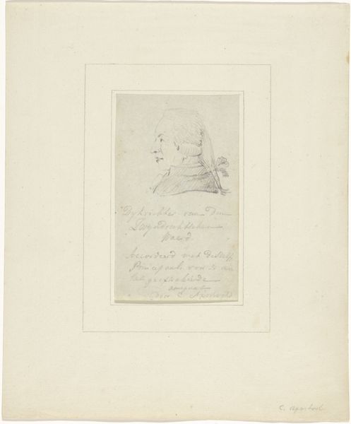
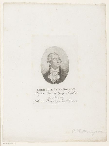
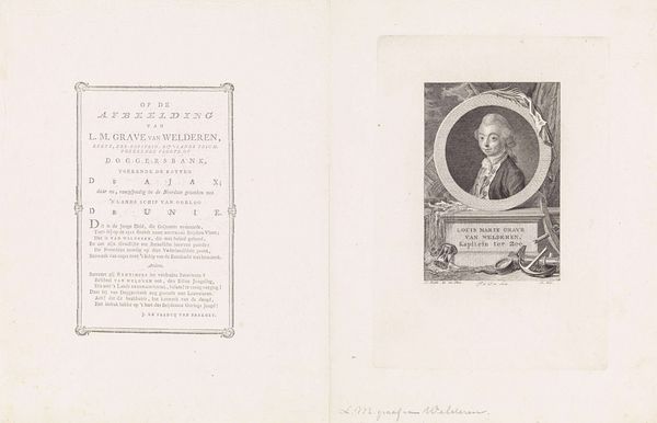
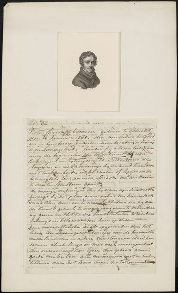
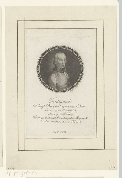
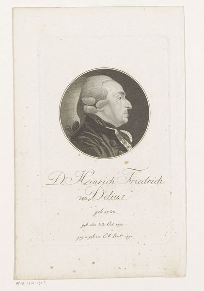
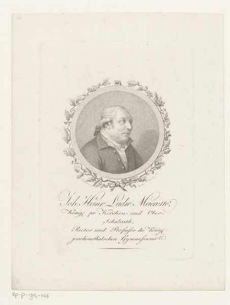
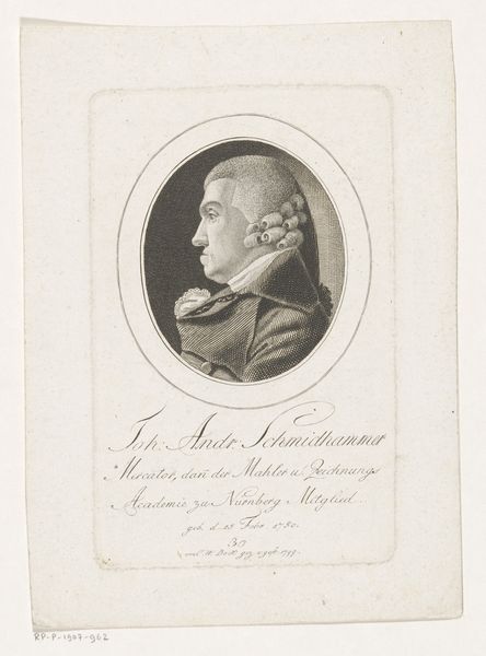
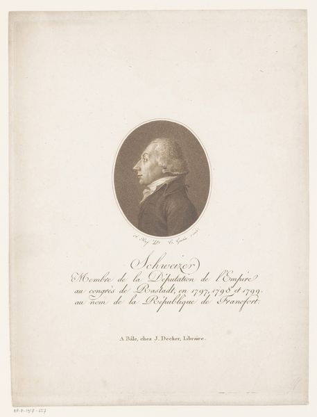
drawing, paper, ink
#
portrait
#
drawing
#
paper
#
ink
#
calligraphy
Copyright: Rijks Museum: Open Domain
Curator: Here we have a curious artifact—a calling card gifted to Jan Veth, rendered in ink on paper, dating from around 1874 to 1925. The inscription, dominated by exquisite calligraphy, informs us that this is the card of Dr. Wilhelm Bode. Editor: There’s a subdued elegance to the design, a visual austerity only broken up by the flourishes in the calligraphic script. The card is a fascinating miniature stage for language, compositionally, and, it looks like some words have faded. Curator: Yes, the effects of time are palpable, indeed. However, note the carefully considered hierarchy of the script. Observe how Bode's name takes precedence, executed with the grandest and most ornate strokes, setting him apart within the established codes of representation. Editor: Exactly, the calligraphy becomes a symbol of status and formality, crafted by artisanal hands using very specific tools – paper of a particular weight, ground pigments. These cards are crafted labor, not mere automated print! Think of the labor investment—each card representing a significant allotment of time, skill, and materials. Curator: I would add that the inscription goes on to list Bode's positions, further reinforcing a sense of his esteemed status, “Director bei den Konigl. Museen, Geheimer Regierungsrath,” hinting to his influential standing in Berlin. The semiotic weight carried by these elements transcends the mere transmission of information. Editor: Indeed, we must acknowledge what the exchange of these cards implied socially in that era. It would function as more than contact information—a measure of social standing, economic stability, or just proof of membership within artistic or professional circles. It says volumes about access to materials and the value placed on artisanal inscription within a burgeoning modern state. Curator: This "Visitekaartje aan Jan Veth" is far more than an old card, it’s a tiny tableau loaded with symbolism and social stratification. Its intrinsic properties, the line work, balance and calligraphic gesture work harmoniously. Editor: And when thinking through a material lens, this unassuming rectangle can lead us down historical avenues and consider production value or even something as intimate as the ink stains.
Comments
No comments
Be the first to comment and join the conversation on the ultimate creative platform.
More like this