graphic-art, typography, poster
#
graphic-art
#
art-nouveau
#
typography
#
abstract pattern
#
geometric
#
intricate pattern
#
pattern repetition
#
poster
Copyright: Public domain
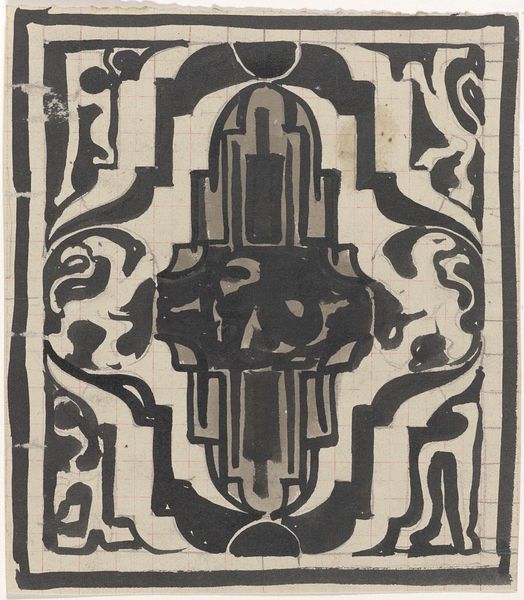
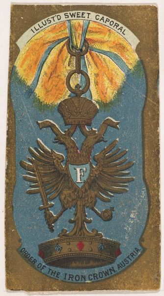
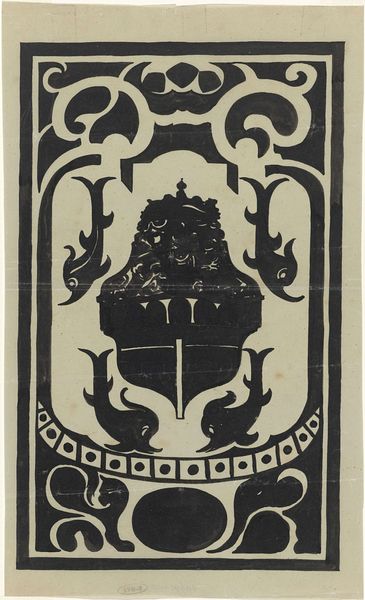
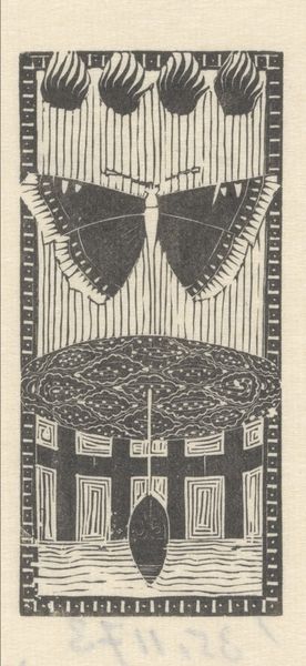
Curator: Koloman Moser created this graphic art piece around 1908, a postage stamp design that, fascinatingly, was never actually issued. Editor: It strikes me as intensely formal, almost severe, with that limited palette of black and cream. The geometric patterns bordering the central emblem give it a sense of weight, a certain unavoidable authority. Curator: As a "not issued" postal design, the stamp raises many questions. The use of typography here merges functional communication with the decorative aspirations of Art Nouveau. I see Moser consciously pushing the boundaries of graphic design as mere utilitarian function, hinting toward mass production, but without being produced. Editor: I am immediately drawn to that double-headed eagle at the stamp's core. It's such a potent symbol of empire, power, and dual authority, staring both East and West, loaded with imperial meaning but with these swan-like necks and stylized feathering almost undermines the strict visual economy you've mentioned before. Curator: Exactly! The choice to stylize such a traditional emblem, the material simplicity and monochrome pallet, suggests the push and pull between tradition and the avant-garde characteristic of the Wiener Werkstätte where Moser worked. Remember, their aim was to elevate craft to the level of fine art. Editor: And that coat of arms held by the eagle... I'm picking up symbols of past empires—each carefully rendered object relays history. The sword, the orb, these aren't mere decorations; they are condensed narratives, symbols of sovereignty. But, they feel also divorced from it at the same time. Curator: Agreed. Also, notice how the repetitive geometric patterns around the edges of the stamp draw the eye—a celebration of industry that served a specific purpose, to connect places and to raise national income through production and labour. Editor: For me, I am also thinking about the individual. Despite that potential "mass production", someone, an artisan, hand-rendered this artwork! All of these signs, symbols and geometric configurations come down to someone's specific intent and vision. Curator: Seeing Moser's intricate play with craft and geometry against symbols of governance provides unique historical context about a postal service and stamp that, strangely, did not come to be. Editor: Considering those potent, timeless emblems within such modern forms leaves me to ponder: can we ever truly escape the weight of history when forging a new aesthetic identity?
Comments
No comments
Be the first to comment and join the conversation on the ultimate creative platform.
