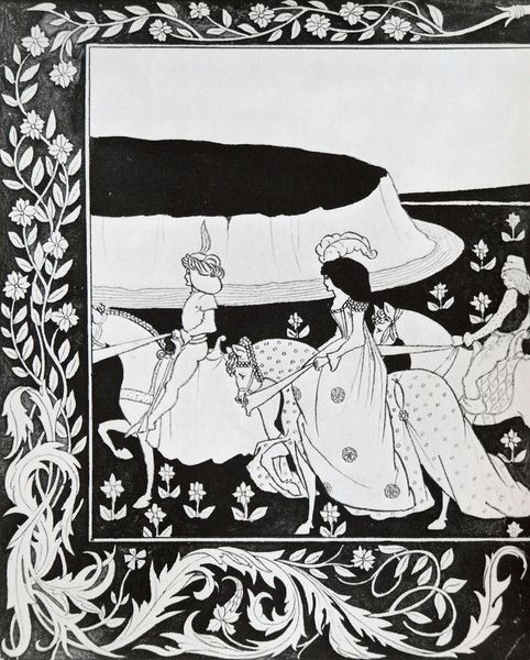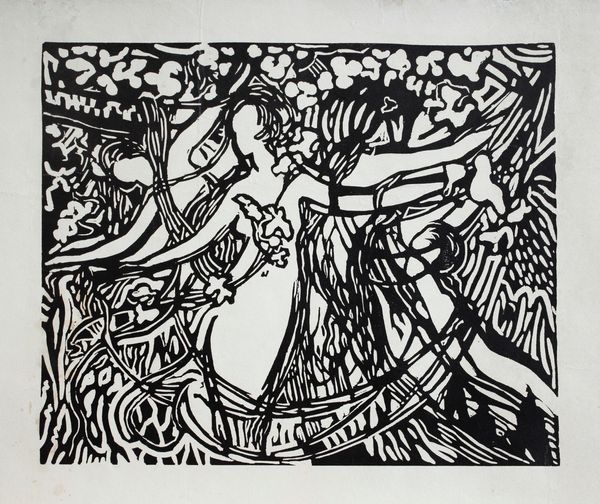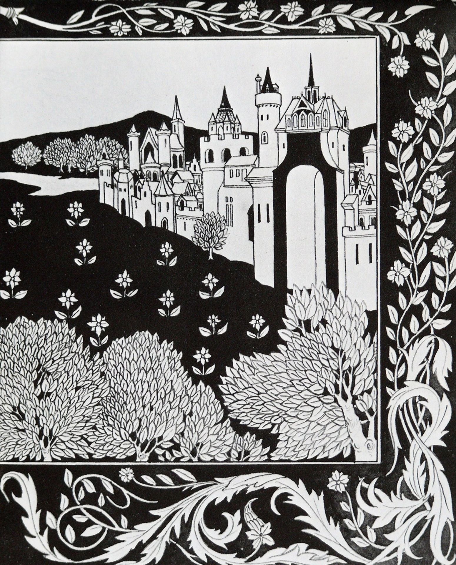
1894
How Queen Guenever rode on Maying II
Aubrey Vincent Beardsley
1872 - 1898The Victoria and Albert Museum
Victoria and Albert Museum (V&A), London, UKListen to curator's interpretation
Curatorial notes
Editor: Right, so this is *How Queen Guenever Rode on Maying II*, a print made with ink by Aubrey Beardsley in 1894. I’m immediately struck by how graphic it is, the sharp contrast, almost like a woodcut… It’s incredibly detailed. The patterns and shapes feel quite stylised, almost playful against the dark backdrop. How would you interpret this work? Curator: Playful is an interesting word! Beardsley does embrace a certain aesthetic decadence, a winking nod to Arthurian romance but steeped in fin-de-siècle sensibility. The black and white, for me, isn't just graphic, it’s theatrical! Imagine this as a stage set – stark lighting, sharp costumes. It also feels…private. The floral details, like whispered secrets around a scene of supposed grandeur. Don’t you think that contrast pulls us in closer? Editor: Definitely! And I get the "theatrical" connection you're making. It reminds me a bit of stage design. So, the image is a reimagining of a medieval story, but rendered with these really modern, almost shocking sensibilities? Curator: Precisely! He is rewriting history in the visual language of his time. The stylization, those arabesques and flattened perspectives – it’s all incredibly modern. Remember, the Pre-Raphaelites had their Guenevere – swooning and sentimental. Beardsley's Guenevere? She probably smirks. What is striking about Beardsley is that this image is also like something from a dream… Editor: That makes sense. I didn’t quite appreciate the tension between the subject matter and the style. Curator: Art is full of interesting juxtapositions. Did you find any unexpected features in this image, anything you initially may have not have spotted? Editor: Initially I assumed all flowers were similar, then noticed how much they varied. So next time I will know to appreciate a whole artwork even more. Thanks. Curator: Wonderful. The more you spend time looking, the more you'll see, trust me.