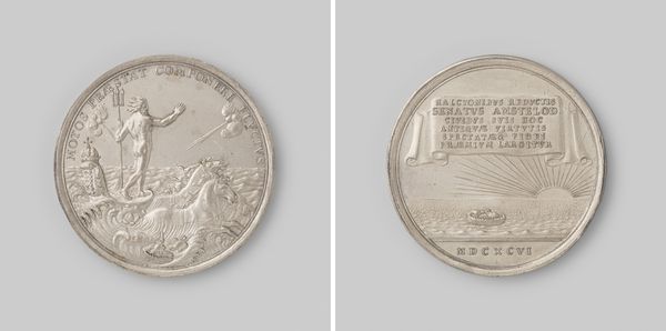
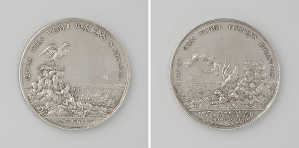
metal, engraving
#
baroque
#
metal
#
cityscape
#
history-painting
#
engraving
Dimensions: diameter 6.2 cm, weight 75.27 gr
Copyright: Rijks Museum: Open Domain
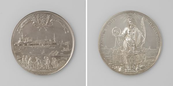
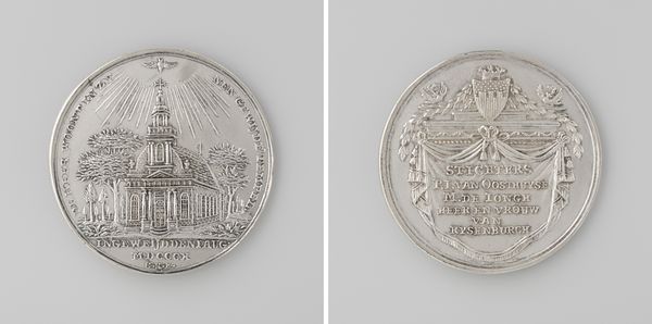
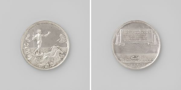
Editor: This is a medal from 1736 by Martin Holtzhey, celebrating the Stichting van de beurs te Rotterdam—the foundation of the Rotterdam stock exchange. It is rendered in metal engraving, which really emphasizes its detail. What strikes me is the symmetry across the two sides. How do you approach understanding a piece like this, given it's not a painting or sculpture in the conventional sense? Curator: My initial reaction rests on the interplay between the two faces. The visual rhythm between allegorical scene and architectural rendering is a compelling aspect of its construction. Consider how the die-cutter deployed light and shadow, achieving depth despite working within such a constrained space. Editor: It’s like a tiny world captured on metal! So you're focusing on how the engraving itself conveys information. Curator: Precisely. Note the contrast in textures: the smooth surfaces representing the building’s facade, set against the more textured areas depicting the allegorical figures and the distant city. These decisions inform our viewing. The contrast, the arrangement – is this persuasive in creating visual meaning? Editor: Definitely! It makes me wonder if the intention was to elevate the importance of the building with a strong representational method. The lettering too... Curator: Yes! Note how the script acts as a border. It adds to the composition. Its function underscores the medal's purpose— to codify and memorialize a specific event within the history of Rotterdam’s commerce. A function-forward reading opens doors to further interpretation. Editor: That is so helpful. Now I see it less as a historical document and more as a deliberate artistic statement. Curator: Exactly! It shows that every mark has a purpose, both aesthetically and functionally. Understanding the choices, not just recording history. Editor: Well, that really has changed my perspective; the detail and careful choices definitely show a level of artistic intent I missed at first glance. Curator: Indeed! Form and function intertwined can make the seemingly mundane exceptional.
Comments
No comments
Be the first to comment and join the conversation on the ultimate creative platform.
More like this