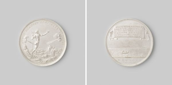
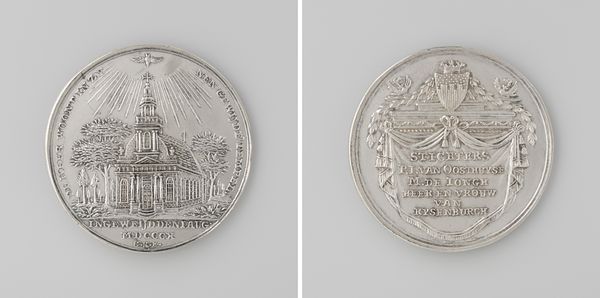
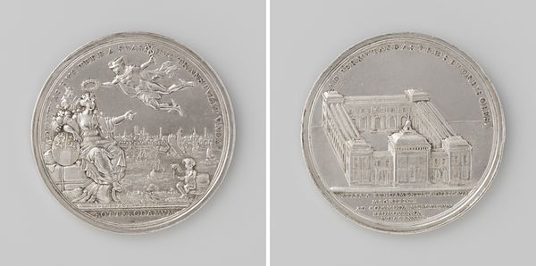
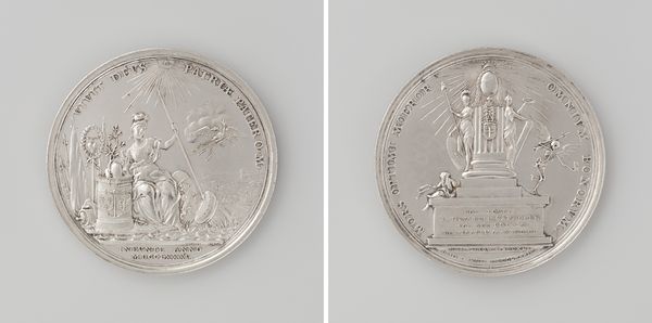
Stillen van het aansprekersoproer te Amsterdam, ter ere van Jan Buste, adelborst onder Gilles van Heemert, kapitein in wijk 23 1696
0:00
0:00
metal, relief, sculpture, engraving
#
allegory
#
baroque
#
dutch-golden-age
#
metal
#
relief
#
sculpture
#
history-painting
#
engraving
Dimensions: diameter 3.8 cm, weight 259 gr
Copyright: Rijks Museum: Open Domain
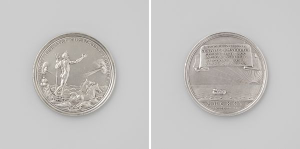
Curator: This is a fascinating metal relief from 1696 by Reynier Arondeaux entitled, "Stillen van het aansprekersoproer te Amsterdam, ter ere van Jan Buste, adelborst onder Gilles van Heemert, kapitein in wijk 23." Editor: Immediately, I am struck by the allegory employed and the stark, contrasting realms depicted on each side. The dynamism feels classical, yet restrained, reflecting the tension of the event it commemorates. Curator: The work adheres quite closely to the stylistic principles we associate with Dutch Golden Age Baroque art and contains so much visual information; on one side, we have a maritime scene complete with what appears to be Neptune while the reverse displays the dawning sun over a calm sea below a lengthy inscription. Editor: Given that the work's name includes the mention of quelling a riot—specifically regarding "ansprekers," who were tasked with informing the community about deaths—one could argue that the seemingly triumphant imagery masks a less celebrated and more politically complex historical moment in Amsterdam’s social fabric. Who was Jan Buste, and what social position did he inhabit to merit the commemoration of his role? Curator: Well, as an artwork made from metal, in this case likely silver or a similar material, we might think about the way this circular relief can be held in one’s hand—admired up close as a testament to the skillful design and carving and even the tactile feel of the surface. The circular form leads the eye around, constantly engaging the viewer. Editor: But consider also the inscription’s function in the image, since legibility and literacy were far from universally distributed, in late 17th century Amsterdam. This becomes then a rarefied message intended to appeal to a specific circle of power and status. How did those social distinctions affect lived experiences within the 23rd ward of Amsterdam? The relief hints at far broader stories of inequity, wouldn't you say? Curator: Undeniably. Reynier Arondeaux's craftsmanship allows the material and design to sing, though, revealing a clear intention to engage the viewer regardless of these complex power dynamics at play. Editor: Despite the classical allusions, I feel that positioning the work through the lens of civic duty makes us look carefully at how it both reflects and possibly distorts realities that must have included profound social ruptures, now elegantly reduced to symbolism.
Comments
No comments
Be the first to comment and join the conversation on the ultimate creative platform.
More like this