Curatorial notes
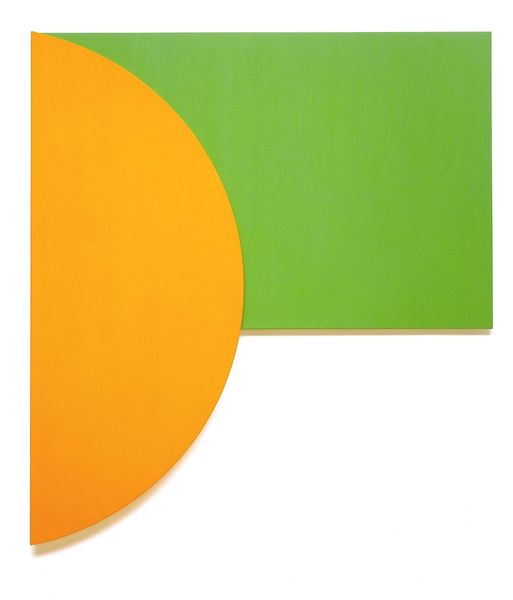
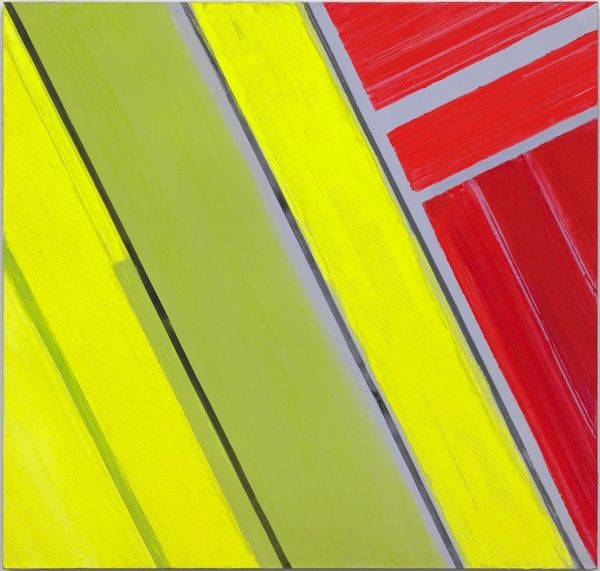
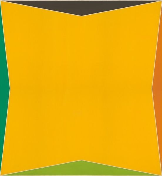
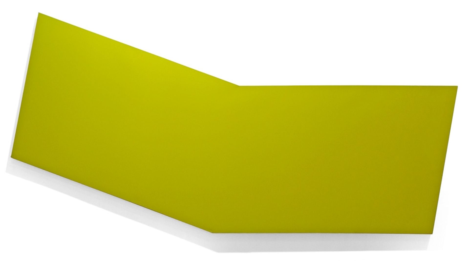
Ronald Davis made this piece, "Large Chartreuse," and I’m really interested in how he's handled this color. It's so pervasive, you almost don't notice the nuances at first, but they're there. The surface is super smooth, right? You can’t really see any brushstrokes or textures, which gives it this kind of calm, meditative feeling. It’s like looking at a still pool of water. I like how the chartreuse isn’t just one flat tone; there are subtle variations that make it feel alive. Like, maybe it’s reflecting light in different ways? It almost vibrates, right? The precise edges feel like they could be fabricated in a factory, a bit Pop Art, Warholian even. It reminds me of the hard-edged color field paintings by someone like Ellsworth Kelly, in that way it’s all about the shape and the color and not much else, but with Davis I sense he's also playing with illusionism, and with our perception of color. Ultimately it's about keeping the possibilities open, not nailed down.