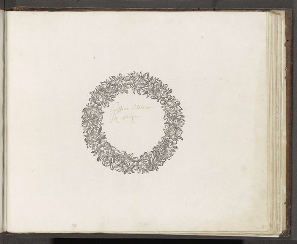
1836 - 1912
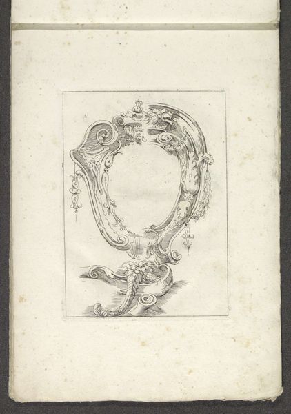
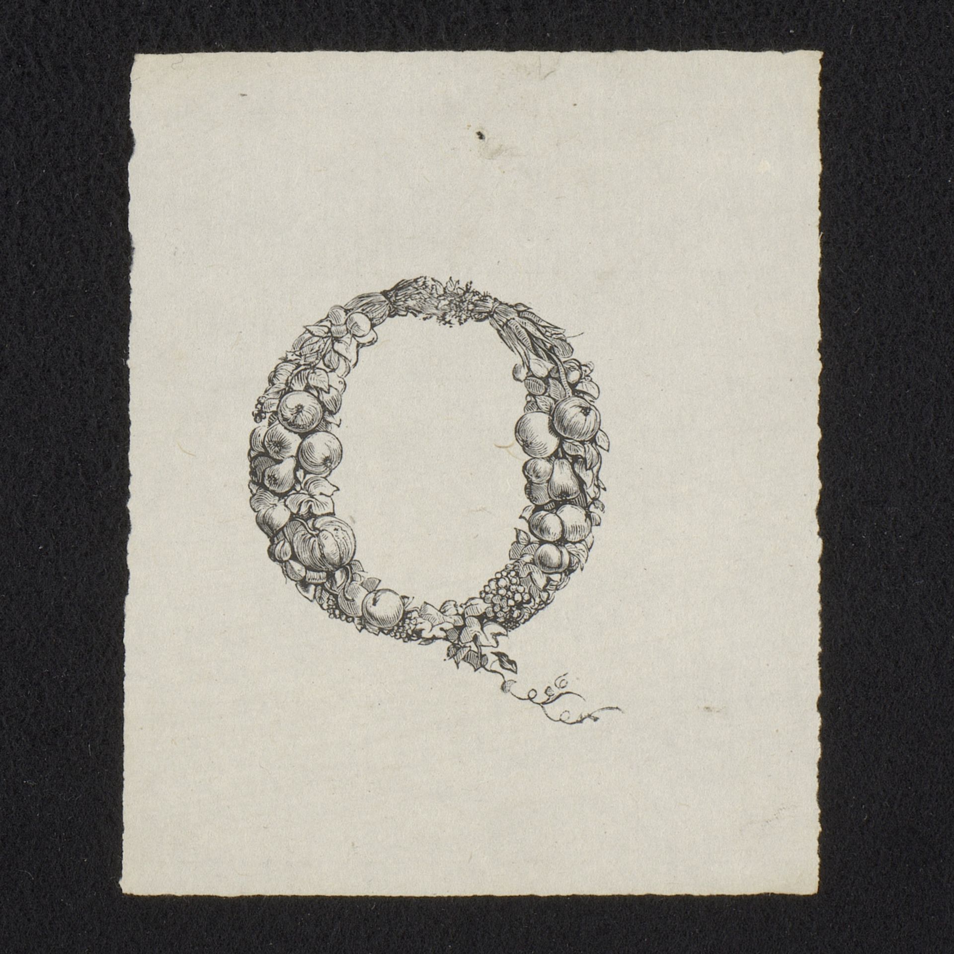
Krans van fruit en wortels
Isaac Weissenbruch
1826 - 1912Location
RijksmuseumListen to curator's interpretation
Curatorial notes
Editor: This ink drawing, "Krans van fruit en wortels," or "Wreath of Fruit and Roots" by Isaac Weissenbruch, dating sometime between 1836 and 1912, caught my eye. It’s like a quirky illuminated manuscript initial – a letter "Q" composed entirely of fruits, veggies, and what looks like root vegetables. It feels so…whimsical. What do you see in it? Curator: Whimsical is spot on! For me, it sings a quiet song of abundance, almost a meditative celebration of nature's gifts. I imagine Weissenbruch meticulously arranging these humble items – apples, grapes, maybe some parsnips? – then, translating their textures and forms into ink with such care. Have you ever noticed how artists often imbue everyday objects with a sense of the sacred? Editor: Sacred? That’s interesting. I mostly thought of it as a clever design. Almost like a logo. Curator: Exactly! Think of it as the original "eat your greens" campaign logo! Seriously, though, this drawing connects to a broader artistic tradition where artists found inspiration in the simple beauty of nature. Do you see how the fruits and veggies create this looping pattern? Almost an Ouroboros? Editor: Ouroboros... the snake eating its own tail? Wow. I didn't make that connection, but that adds another layer, doesn't it? It speaks to the cyclical nature of life, harvest, and renewal. Curator: Precisely! It transforms the letter “Q” from a mere character into a miniature universe, reflecting a deeper understanding of natural cycles and interconnectedness. I always feel that looking at this. Editor: I’ll never look at the letter Q the same way again. Curator: Me neither. These images, especially in their simple presentation, allow us to rethink these basic notions of alphabet or form in fine arts. Food for thought and art for food!