Dimensions: 46 x 55 cm
Copyright: Public domain
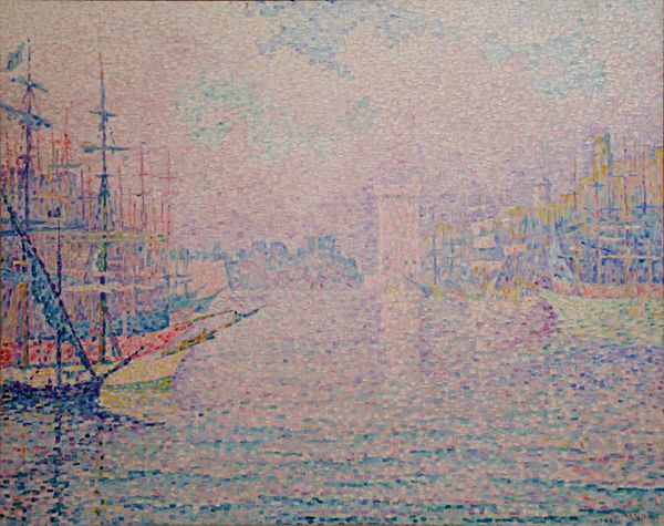
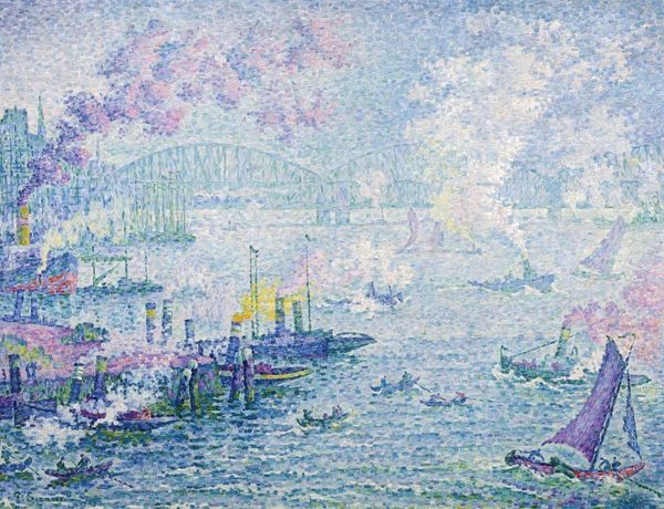
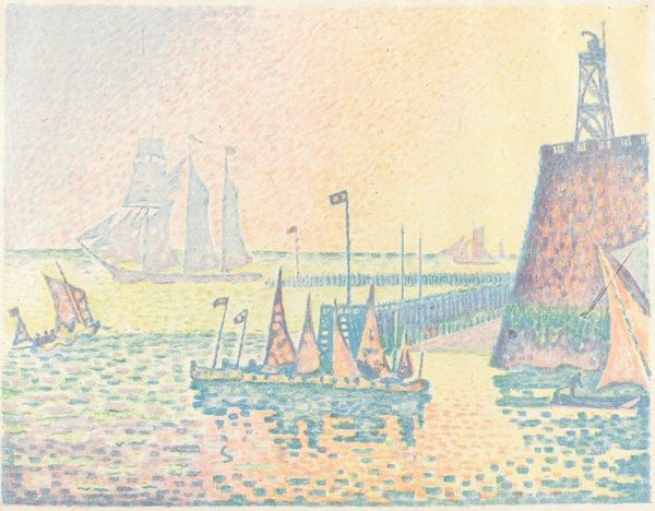
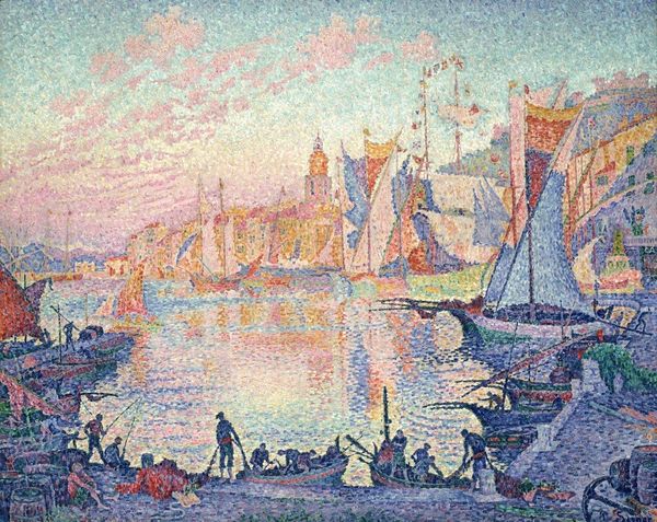
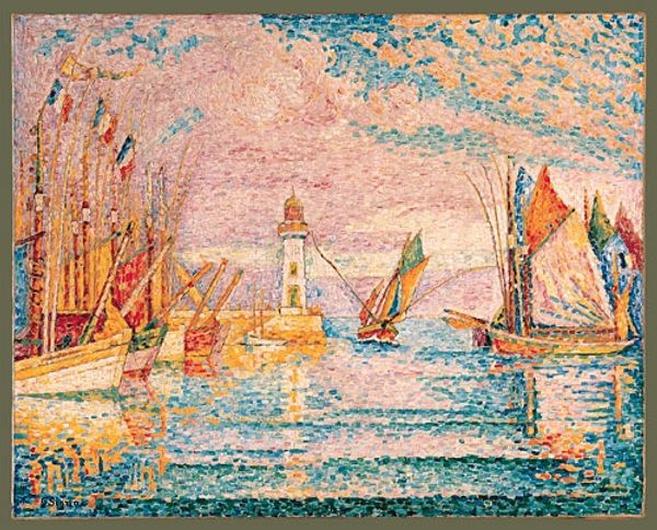
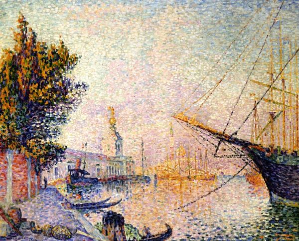
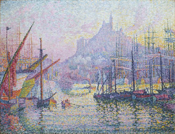
Editor: Paul Signac’s "The Harbour at Marseilles," painted in 1906, presents this French port with such a dreamlike hazy quality. The colors are pastel, and it's so light! What can you tell me about Signac’s approach in this piece? Curator: Dreamlike is perfect! He’s using pointillism, a technique he developed with Seurat – tiny dots of pure color that blend in the viewer’s eye. Notice how this breaks down the scene, almost abstracting the light. Signac isn't just painting a harbor; he's exploring how we *perceive* a harbor. It is a very sensual rendering. You feel you could dive right in, no? Editor: It’s like the air itself is made of colored light! I know Signac was into color theory, so how did he pick which colors to use? Curator: Absolutely. Color theory was key. Signac aimed for "optical mixtures," juxtaposing complementary colors for maximum vibrancy. That means reds next to greens, blues next to yellows, but so subtly rendered. It is there in that gentle, sun-washed boat! It gives this Marseilles view its shimmer, but there's also something…deliberate, isn’t there? Like he's engineered this sensory experience? Editor: Engineered sunshine, that sounds right! Did his other seascapes employ a similar methodology? Curator: He obsessively sketched and painted en plein air, which provided the raw material. Back in the studio, he’d meticulously construct his pointillist compositions from these sketches. Remember that! All of these little brushstrokes were quite well-thought-out! I bet he dreamt in dots... I know I will tonight! Editor: Well, that changes how I see it! I was only experiencing it, now I admire how deliberate it is. Curator: Exactly! It's both intuitive and meticulously planned! And now, hopefully, a little more unforgettable for you.
Comments
No comments
Be the first to comment and join the conversation on the ultimate creative platform.
More like this