![Schiller-gallery / from the original drawings of William Kaulbach (...) [et al.]; with explanatory text by Erwin Foerster by Erwin Foerster](/_next/image?url=https%3A%2F%2Fd2w8kbdekdi1gv.cloudfront.net%2FeyJidWNrZXQiOiAiYXJ0ZXJhLWltYWdlcy1idWNrZXQiLCAia2V5IjogImFydHdvcmtzLzgzYWNlYzNkLWFmNjItNDVmZi04NGIxLWUxMzUwZGRlMjE1OS84M2FjZWMzZC1hZjYyLTQ1ZmYtODRiMS1lMTM1MGRkZTIxNTlfZnVsbC5qcGciLCAiZWRpdHMiOiB7InJlc2l6ZSI6IHsid2lkdGgiOiAxOTIwLCAiaGVpZ2h0IjogMTkyMCwgImZpdCI6ICJpbnNpZGUifX19&w=3840&q=75)
Schiller-gallery / from the original drawings of William Kaulbach (...) [et al.]; with explanatory text by Erwin Foerster c. 1875
0:00
0:00
print, typography, poster
# print
#
typography
#
poster
Dimensions: height 485 mm, width 360 mm, thickness 40 mm
Copyright: Rijks Museum: Open Domain
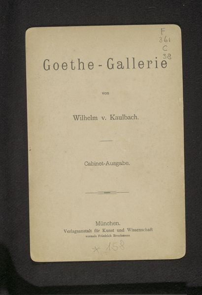
Curator: Here we have what looks like a title page, "Schiller-Gallery / from the original drawings of William Kaulbach (...) [et al.]; with explanatory text by Erwin Foerster," dating back to around 1875. What catches your eye initially? Editor: Immediately, it’s the type face. It feels so… assertive, but also quite elegant. The red ink on the aged paper is a lovely combination, somber, even a bit defiant for a gallery title page. There is something heavy, dark academia about it. It promises something both elevated and intense. Curator: Absolutely, and note how many artists were involved, but only Kaulbach’s name gets special billing. Erwin Foerster, as well, receives credit as author of explanatory texts. Why all of them, you think? Editor: Well, I’d wager each artist contributed drawings representing scenes or characters from Schiller’s works—his poems, plays, perhaps even his historical writings. The title page functions as a collaborative herald, announcing the assembly of multiple interpretations, with Förster acting as guide. But I wonder about Kaulbach’s prominence... was he like, the superstar illustrator? The one everyone knew and loved? Curator: He was indeed a major figure! Think of him as a 19th-century influencer in visual storytelling. Editor: Gotcha. And thinking about that collaborative aspect – the weaving together of so many creative hands to pay homage to a literary titan like Schiller...it makes me think of community, artistic reverence. But it also hints at the complexities of artistic vision and interpretation. How much did each artist’s individual style bend to fit a cohesive vision of Schiller's work? Curator: Exactly. What I like about it is how a title page—meant to be functional—becomes a glimpse into the artistic values of the era: celebrating literature, lionizing certain artists, while showcasing different talents under one thematic roof. Editor: It also gives the artist their credit--to sign their works. So the symbols multiply, both homage to an icon, and advertisement of the makers themselves. Well, after considering all that, I think that a very attractive cover it is indeed. Now, onward and inwards!
Comments
No comments
Be the first to comment and join the conversation on the ultimate creative platform.
