1833 - 1911
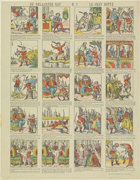
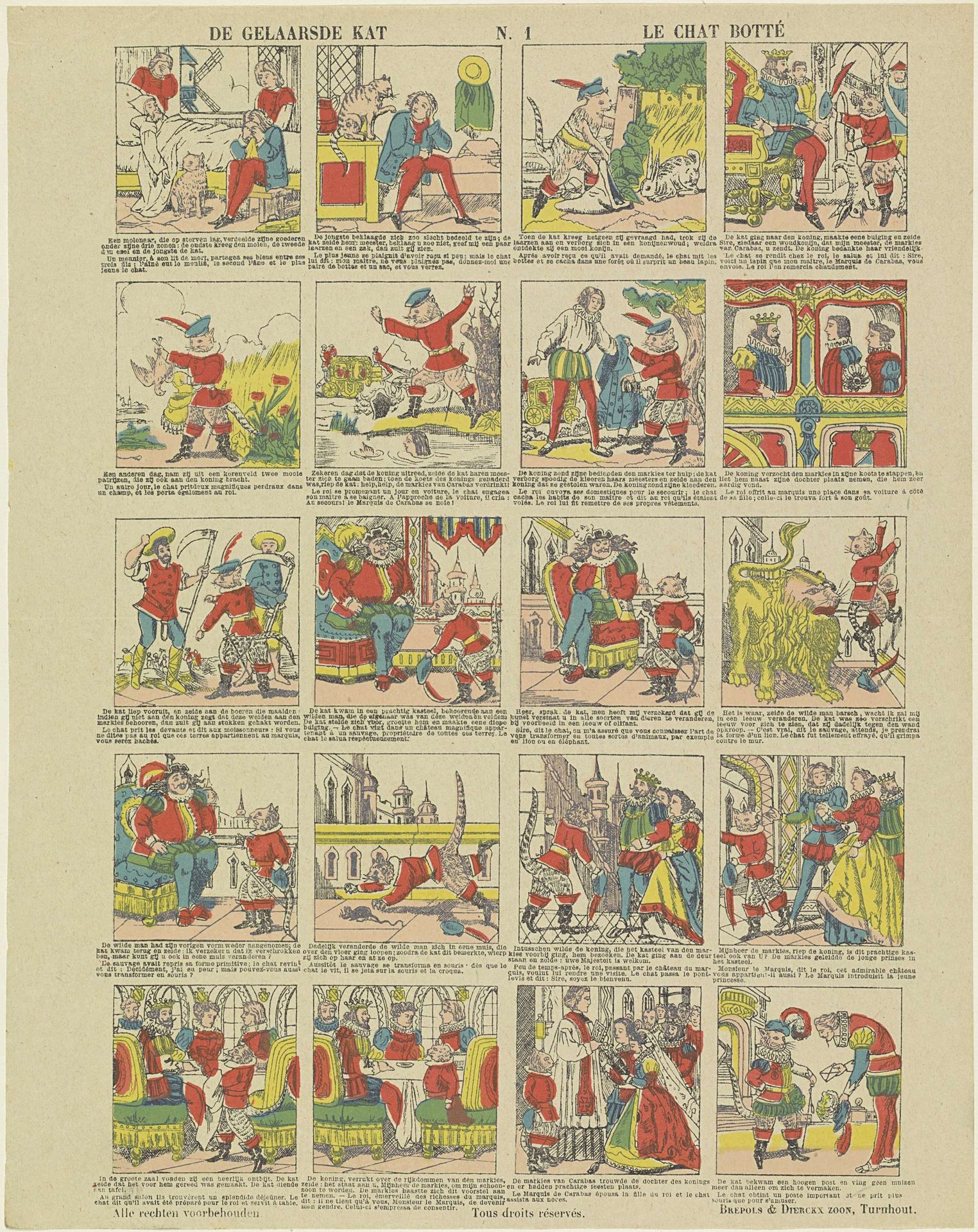
De gelaarsde kat / Le chat botté
Brepols & Dierckx zoon
@brepolsdierckxzoonLocation
RijksmuseumListen to curator's interpretation
Curatorial notes
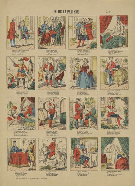
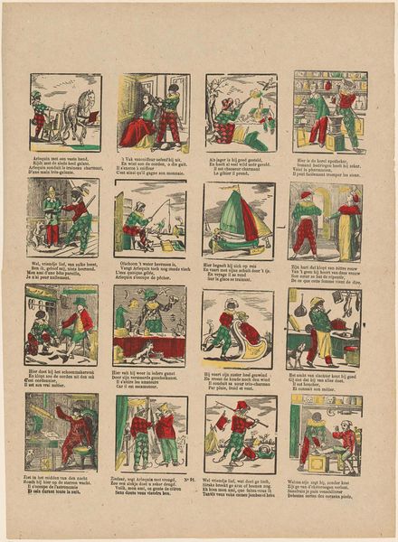
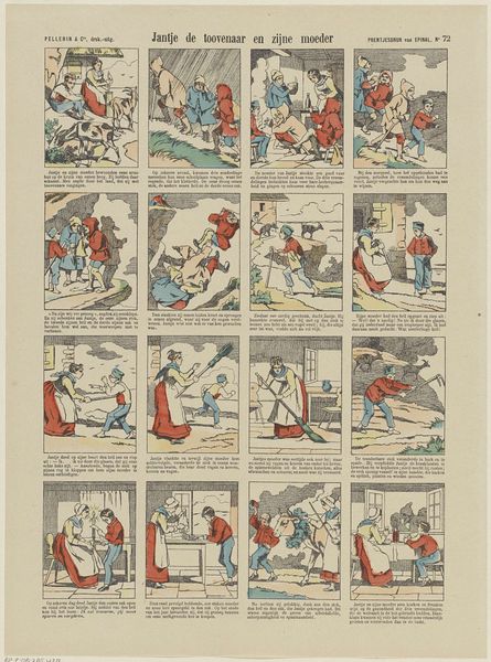
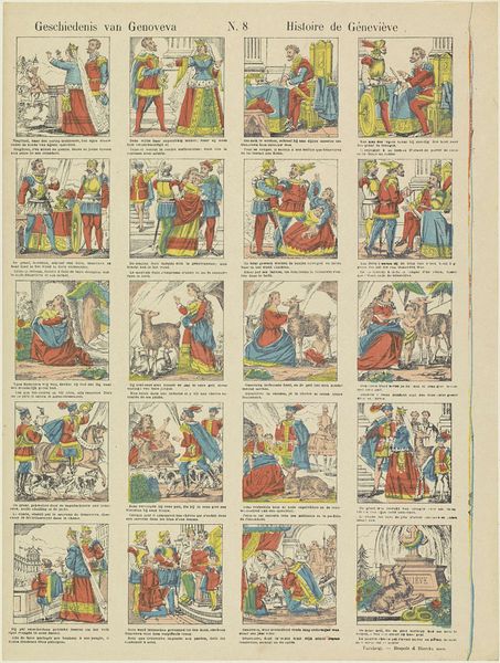
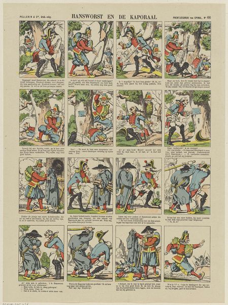
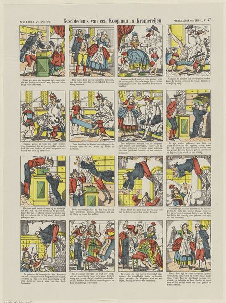
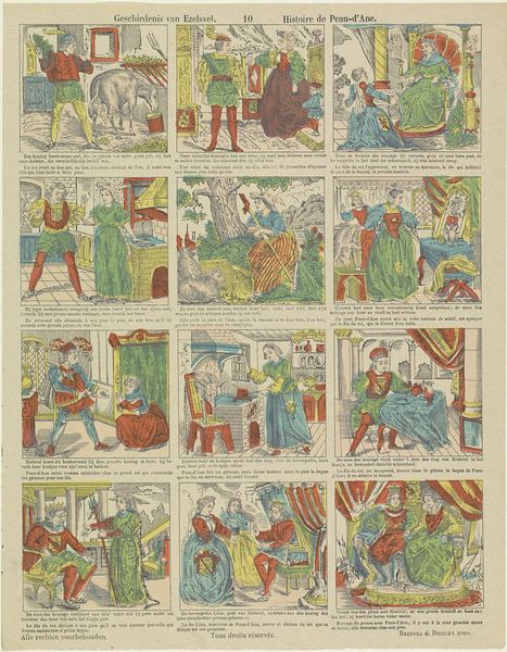
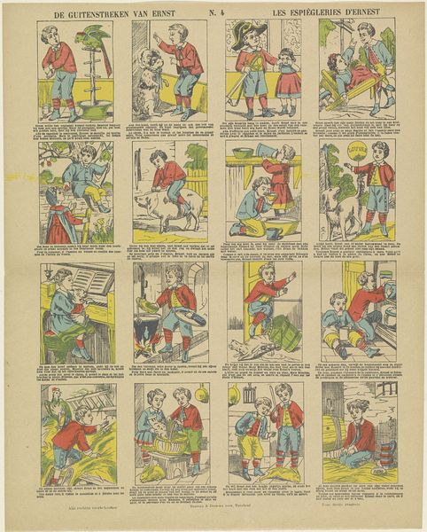
Editor: Here we have "De gelaarsde kat / Le chat botté," or "Puss in Boots," a print dating from 1833 to 1911, attributed to Brepols & Dierckx zoon and housed in the Rijksmuseum. It is laid out like a comic strip. It has an innocent, storybook feel, though I’m curious how we should read these panels sequentially. What do you see in this work? Curator: Observe how the artist uses line. The clarity and consistency of the ink work define each scene, dividing the composition into these ordered compartments. Each panel gains its own distinct character through slight alterations in line weight and hatching, directing the eye in specific ways. Notice the varied approaches to shading, lending depth. Editor: I see what you mean. Each panel almost operates as an individual composition despite forming one unit. How do you think the artist intended us to engage with the comic strip's composition as a whole? Curator: Consider the distribution of color. The repetition of reds and yellows creates visual rhymes between different narrative moments, while the varying intensity and placement generates a pleasing optical rhythm. Note the starkness of certain outlines and blocks of color—where the artist deviates from this, does it denote a shift in meaning? Editor: That’s fascinating! Thinking about it structurally helps decode how the images are arranged. Curator: Exactly. And do the different perspectives chosen in each panel create a sense of movement? What does it suggest that we are not dealing with a traditional sense of linear perspective, as in Renaissance painting? Editor: I suppose it pulls you back from any illusionistic space and emphasizes the surface, underscoring that these are separate panels rather than scenes from real life. Curator: Precisely. It reinforces the flatness, highlighting its inherent qualities as an object to be analyzed. This was insightful, how do you see it now? Editor: Now, examining the arrangement of color, line, and form helps me view the panels both individually as structured images, and holistically, as one print. Thank you.