print, typography
#
script typeface
#
script typography
# print
#
hand drawn type
#
hand lettering
#
typography
#
hand-drawn typeface
#
fading type
#
stylized text
#
thick font
#
handwritten font
#
academic-art
#
classical type
#
calligraphy
Dimensions: height 290 mm, width 752 mm
Copyright: Rijks Museum: Open Domain
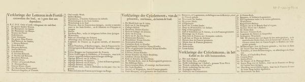
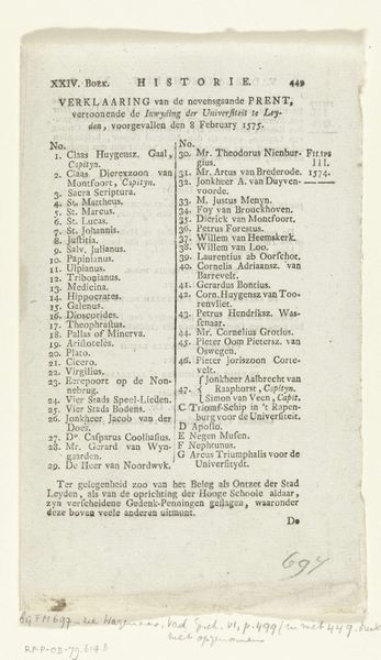
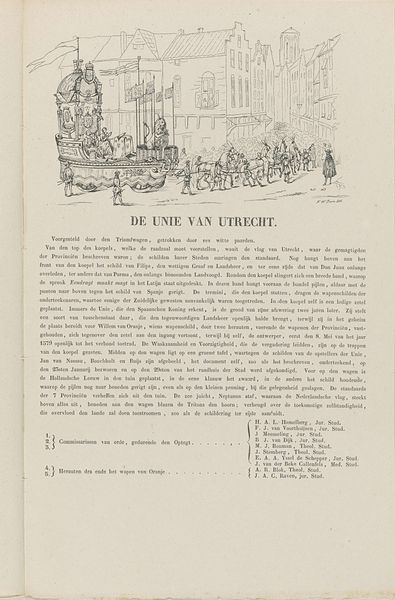
Curator: This print, created by J.L. Beijers in 1886, is titled "Utrechtse maskerade van 1886 (verklaring)." At first glance, it looks like an official document, but what strikes you? Editor: It's surprisingly understated. The neutral ground with neatly arranged columns of dense, tiny type feels very orderly. There's almost a feeling of quiet restraint, like a historical record striving for objectivity. Curator: Precisely! The print details the declarations and names of participants involved in various pivotal historical moments centered in Utrecht—the Union of Utrecht in 1579, the founding of Utrecht University in 1636, and the Peace of Utrecht in 1713. These events are crucial to understanding the development of Dutch national identity and its relationship to European power structures. Editor: The commitment to rendering information is evident in its typographic choices. The stylized and hand-drawn letterforms suggest a conscious decision to evoke a sense of historical authenticity and weight. Each event, each list, has a slightly distinct personality within that consistent, formal framework. Curator: And each of those historical moments speaks to very specific ideological concerns. The Union of Utrecht was foundational to Dutch independence, representing a break from Spanish rule. The University solidified Utrecht as an intellectual hub, contributing to the shaping of humanist thought. The Peace of Utrecht redrew the map of Europe. Listing participants enshrines their contributions. Editor: Though primarily textual, I find it aesthetically pleasing. The artist clearly prioritized legibility through clear spacing and consistent letterforms. One could find aesthetic pleasure simply studying and comparing those. Curator: Yes, but what's also interesting to consider is the date of this print – 1886. Why revisit these historical declarations at that moment? What social or political function might this "maskerade," this masquerade, have served in the context of late 19th-century Dutch society? Was it an attempt to reinforce national unity? To critique contemporary issues through the lens of the past? Editor: I suppose that we may never truly determine the intentions, but in observing its composition, one can definitely admire the execution. It provides historical grounding through its use of formalized aesthetics, a stark difference in some ways to modern abstraction. Curator: An intriguing juxtaposition for viewers to reflect upon as they delve deeper. Thank you for illuminating its unique character!
Comments
No comments
Be the first to comment and join the conversation on the ultimate creative platform.
More like this