drawing, paper, ink, pen
#
drawing
#
paper
#
ink
#
hand drawn
#
pen
#
calligraphy
Copyright: Rijks Museum: Open Domain
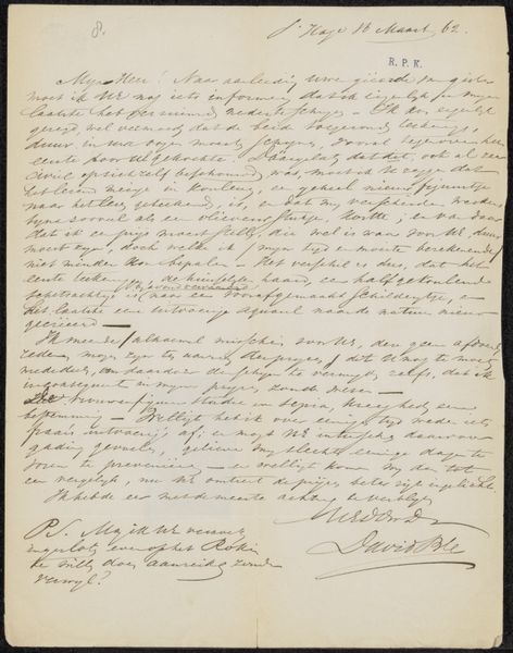
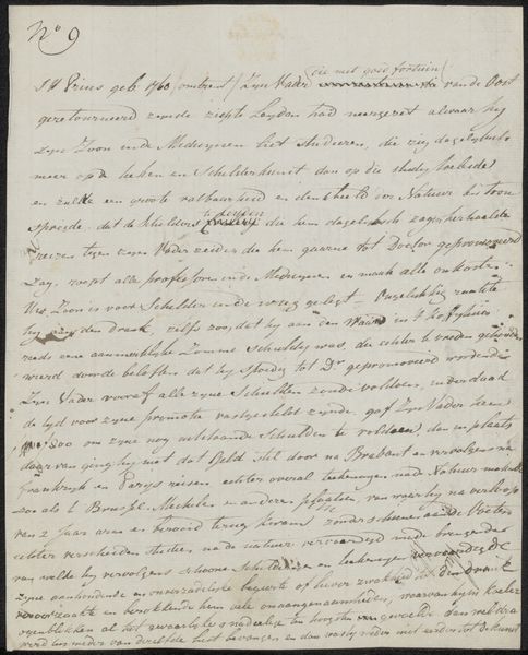
Editor: This drawing, possibly from 1925, is a letter titled "Brief aan Philip Zilcken" by Cato l' Hôpital, rendered in ink on paper using a pen. The overall feeling I get is one of intimacy, due to the personal nature of a letter. What draws my eye is the calligraphy itself, the density of the script filling the page. What do you see in this piece? Curator: Indeed, the visual impact stems significantly from the artist's control over line and form. Look closely at the varying weights of the lines and the spatial relationships between the words themselves; notice how these qualities imbue the work with an intrinsic rhythm. Editor: I can see that now, but I initially focused on the letter’s literal content. Curator: Precisely, the content acts more as a field upon which these formal qualities play. While we don’t ignore the text entirely, it's more useful to examine the interplay of dark and light, the texture created by the ink on paper. This density is quite fascinating. Editor: It’s interesting to consider how the *how* of the letter's creation, the arrangement on the page and the mark making, becomes more central than the message *of* the letter. Curator: Yes! And, from this perspective, we might even question the conventional separation of “writing” from “drawing”. The artist merges them into a new form here. What have you gathered about this piece, looking at it now? Editor: Now I recognize it is more than communication; it is about the art of making a handwritten piece. Curator: Exactly. Close analysis allows the viewer to discover hidden structures in works, allowing for greater understanding of intrinsic qualities and new, rich interpretations.
Comments
No comments
Be the first to comment and join the conversation on the ultimate creative platform.
More like this