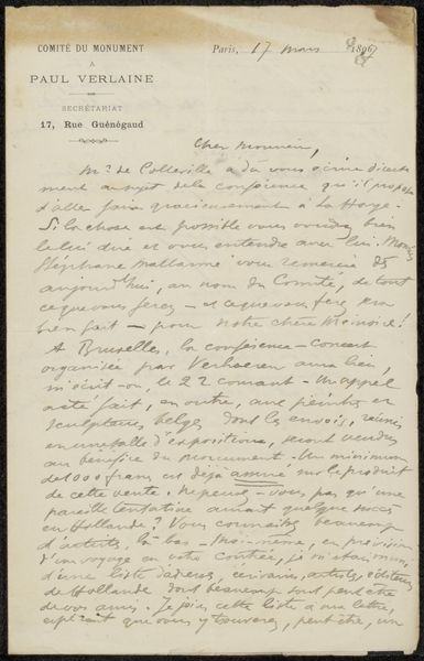
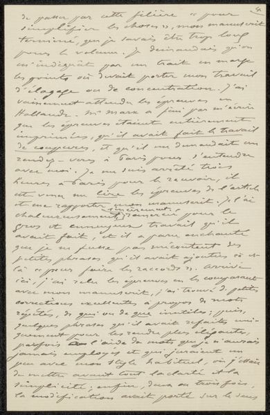
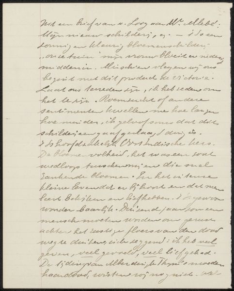
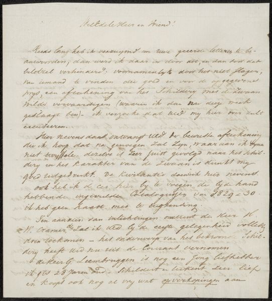
drawing, textile, paper, ink
#
drawing
#
textile
#
paper
#
ink
#
modernism
Copyright: Rijks Museum: Open Domain
Editor: Here we have Anton L. Koster's "Brief aan Philip Zilcken," likely from 1918. It’s ink on paper and textile – a letter, it seems. There's something very intimate about seeing someone's handwriting like this. How do you interpret this work? Curator: It's fascinating how Koster uses the letter format itself as a Modernist composition. Notice the density of the ink, how it creates areas of visual weight and darkness contrasted with the bare paper. It's almost sculptural, the words forming abstract shapes. Editor: So you're saying the letter isn’t just about the information it conveys, but also about how it looks? Curator: Precisely. We can look at it as a constellation of marks, lines, and forms, which operate beyond mere communication. Consider the textural contrast between the smoothness of the paper and the strokes of the ink. This activates our perception. Editor: Do you think the content of the letter plays any role in our experience, even if we can't read it fluently? Curator: Subconsciously, yes. The presence of writing signals intent, a human presence. It invites speculation and creates another layer in which our gaze may explore its shapes and forms. It serves as a framework of personal space in which to think about abstract notions. Editor: I hadn’t thought of it that way. I was so focused on the letter as a document, I hadn't really considered it as a purely visual object. Curator: Exactly. By focusing on its inherent qualities like the tonal variations and rhythmic arrangement of text, the essence of the letter transcends a mere message. Editor: This perspective completely changes how I look at it. It's made me reconsider how the visual elements influence the work’s feel beyond its literal subject matter. Curator: Indeed. Exploring its physicality gives us richer engagement and is more rewarding.
Comments
No comments
Be the first to comment and join the conversation on the ultimate creative platform.
More like this