Title Page: Illustrations of the Book of Job 1825 - 1826
0:00
0:00
drawing, print
#
drawing
#
treasure map
#
aged paper
#
toned paper
#
light pencil work
#
ink paper printed
#
parchment
# print
#
old engraving style
#
warm-toned
#
golden font
#
gold element
#
angel
Dimensions: plate: 8 1/4 x 6 3/8 in. (21 x 16.2 cm) sheet: 16 1/8 x 10 7/8 in. (41 x 27.6 cm)
Copyright: Public Domain
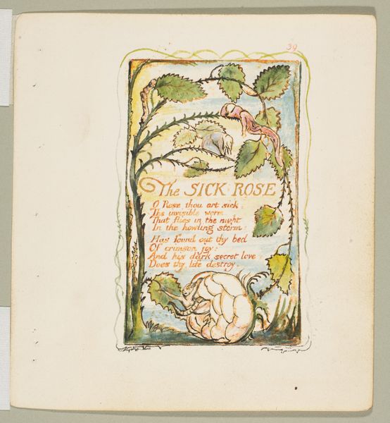
Editor: This is the title page to "Illustrations of the Book of Job," created by William Blake between 1825 and 1826. It's a print, and it strikes me as very ethereal, almost like looking at a dream. The angels encircling the text are delicate. What do you see in this piece, particularly concerning its design? Curator: The intricate design immediately calls to mind the formal structure. Consider the hierarchy of visual elements: the strong, gothic typeface for "Book of Job" establishes a clear focal point, balanced by the lighter, more delicate script of "Illustrations of" and other descriptive text. Note the deliberate contrast between the textual elements and the illustrative border populated by angels. How do these elements interact, in your opinion? Editor: It seems like the angels are almost holding up the text, like they're supporting the story itself. Their placement is so interesting too - carefully spaced around the lettering and words. Curator: Precisely. Blake is not simply illustrating a title page, he's constructing a visual theology. The symmetry, the careful arrangement of figures and text, speaks to a highly structured system of belief. What about the linear qualities and tonal variations contribute to your interpretation? Editor: Well, the light pencil work creates a sense of lightness and airiness, which, combined with the warm-toned paper, makes the image feel antique. Maybe like something from another time and plane of existence, given the number of angelic forms here. Curator: The use of line and tone certainly evokes a sense of historical depth, and those angelic forms can be considered through the lens of semiotics. Consider, that angel can act as signifiers for divine presence or intervention. By examining those pictorial and textual contrasts, one can unlock deeper understanding of Blake’s visual language. Editor: I never really thought of breaking it down that way, it’s cool how different techniques and placements shape the piece and the overall sense that you get from it. Thanks! Curator: A keen formalist examination yields rich insights! The exercise lies in perpetual questioning.
Comments
No comments
Be the first to comment and join the conversation on the ultimate creative platform.
More like this