drawing, print, paper, ink, pen
#
drawing
# print
#
pen sketch
#
landscape
#
paper
#
form
#
ink
#
line
#
pen
#
cityscape
#
realism
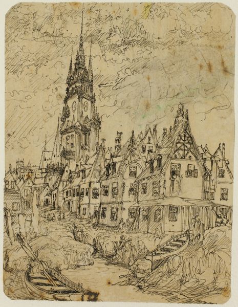
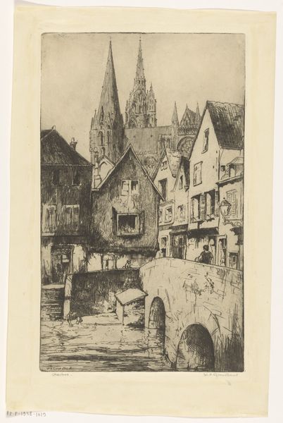
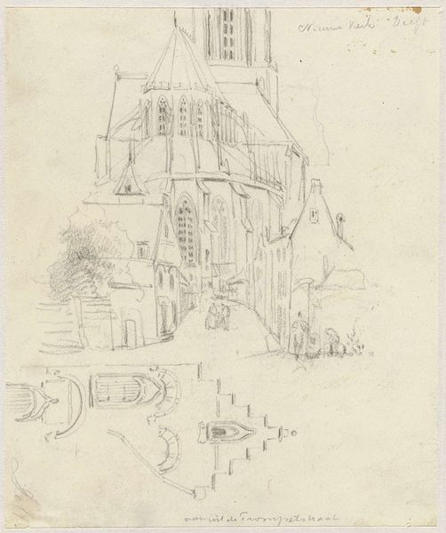
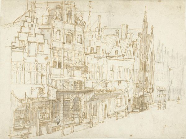
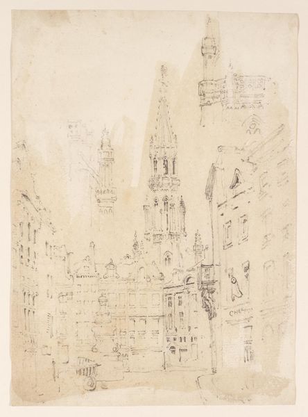
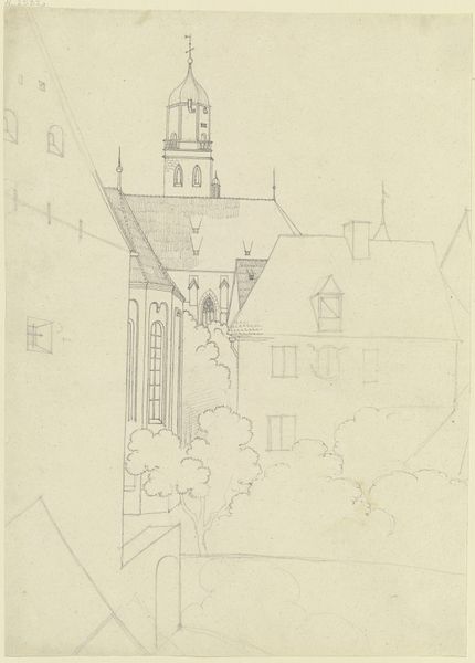
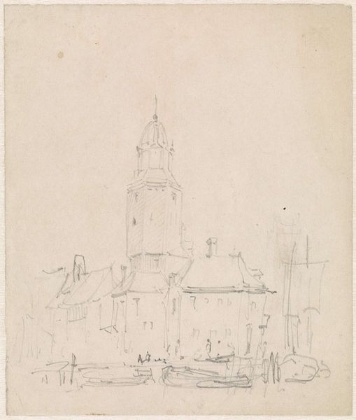
Dimensions: 155 × 102 mm
Copyright: Public Domain
Editor: So, this is Rodolphe Bresdin's "The Flemish Belfry," materials include pen, ink, and paper. It strikes me as very detailed, almost architectural, yet quite raw because of the sketchy lines. What can you tell me about this print? Curator: Let's consider the process of making prints. Think about the paper Bresdin used. Its tone, its absorbency – how does it affect the appearance of the ink? Also, consider the kind of pen nib. Did it allow for thick, dark lines or fine, feathery ones? The social context is also important: who would buy this print, how would it be used or displayed? Editor: I see what you mean. The lines are so deliberate, especially in the tower, yet also quick and a bit messy lower down, hinting that perhaps this artwork has a sense of immediacy about the materials used, and about what the working classes may feel about this environment. Does that fit within the consumption of these artworks at the time? Curator: Absolutely! Look closely. How does the labor of creating this print influence our perception of the architecture itself? Are we meant to admire the grandeur of the belfry, or reflect on the human effort needed to build and maintain it? And beyond that, we have to consider the role that such materials may have had in society and economics at the time, since print media and similar was becoming widespread in that time period. Editor: That's fascinating! I never thought about it that way before, but thinking about the labor and consumption really adds a new layer of depth to it for me. Thanks for this interpretation. Curator: My pleasure! Approaching art through the lens of its production and materiality always reveals interesting things about a work and its relationship to the society from which it emerged.
Comments
No comments
Be the first to comment and join the conversation on the ultimate creative platform.
More like this