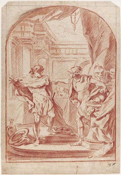
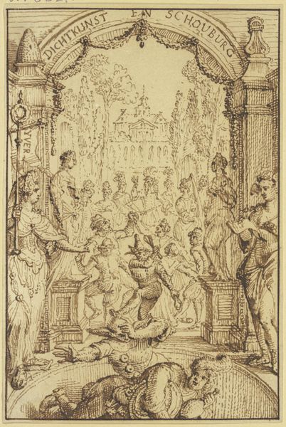
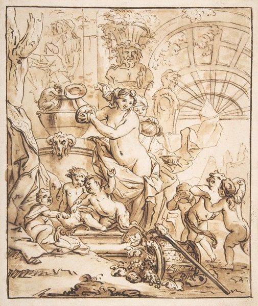
Ontwerp voor titelpagina voor: Aloude Staat der Verenigde Nederlanden 1782 - 1784
0:00
0:00
drawing, paper, ink
#
drawing
#
neoclacissism
#
allegory
#
pen illustration
#
figuration
#
paper
#
ink
#
history-painting
Dimensions: height 136 mm, width 91 mm
Copyright: Rijks Museum: Open Domain
Curator: What a whimsical piece! Immediately, I'm drawn to the sheer abundance of cherubic figures. Editor: It's playful, isn't it? Sort of organised chaos with all these little cupids tumbling about. It feels... joyful, almost excessively so. Like a sugary treat that might give you a stomach ache afterwards. Curator: It is certainly interesting. What we have here is a drawing by Engelbertus Matthias Engelberts, dating back to 1782-1784. It’s titled “Ontwerp voor titelpagina voor: Aloude Staat der Verenigde Nederlanden," which translates to "Design for a title page for: Ancient State of the United Netherlands." It’s currently held at the Rijksmuseum. Crafted with pen and ink on paper, it very clearly embraces neoclassicism, as we can tell from the clear classical forms like the column. Editor: A title page design! That’s a curveball. I was picturing some over-the-top garden party in the clouds. Knowing that shifts things... Those mischievous sprites probably symbolize something serious, right? Maybe political ideals dressed in cute baby drag? Curator: Precisely. The abundance of putti are employed allegorically. What is really remarkable, and typical of neoclassicism, is the artist’s clear intent to link the newly formed state with the grandeur and authority of classical antiquity, something also visible in the carved figures. This visual vocabulary granted legitimacy in a time of major political upheavals. Editor: So, it's propaganda, but make it cute? I find it compelling how the rigid classical structure contrasts so vividly with all those squirming babies. There’s an inherent tension, a wink and a nudge suggesting that even grand institutions can’t help but be a little… messy, a little unruly, very human. Curator: The artist makes the very political almost palatable. He draws in the viewer with appealing imagery, carefully constructed. Note how the cherubs, while playful, are also meticulously rendered, demonstrating a mastery of line and form reflective of its Neoclassical ideals. Editor: I like how it subverts itself a little; a stoic message cloaked in infant laughter and the rustle of overgrown foliage. As though it were trying hard to forget whatever troubles plague it. Curator: Yes, even designs of title pages become powerful mirrors to reflect sociopolitical trends of their day, leaving traces of their values behind them, like fossils in the art history record. Editor: A sugar-coated pill. Still a potent way to get your message across, I imagine. Alright, off to the next sugar rush then.
Comments
No comments
Be the first to comment and join the conversation on the ultimate creative platform.
More like this