1911 - 1915
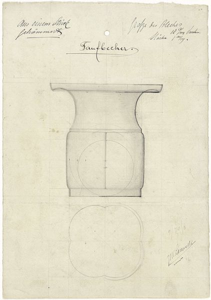
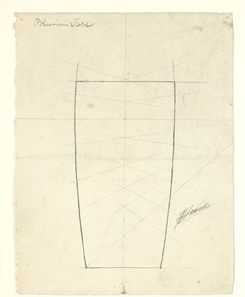
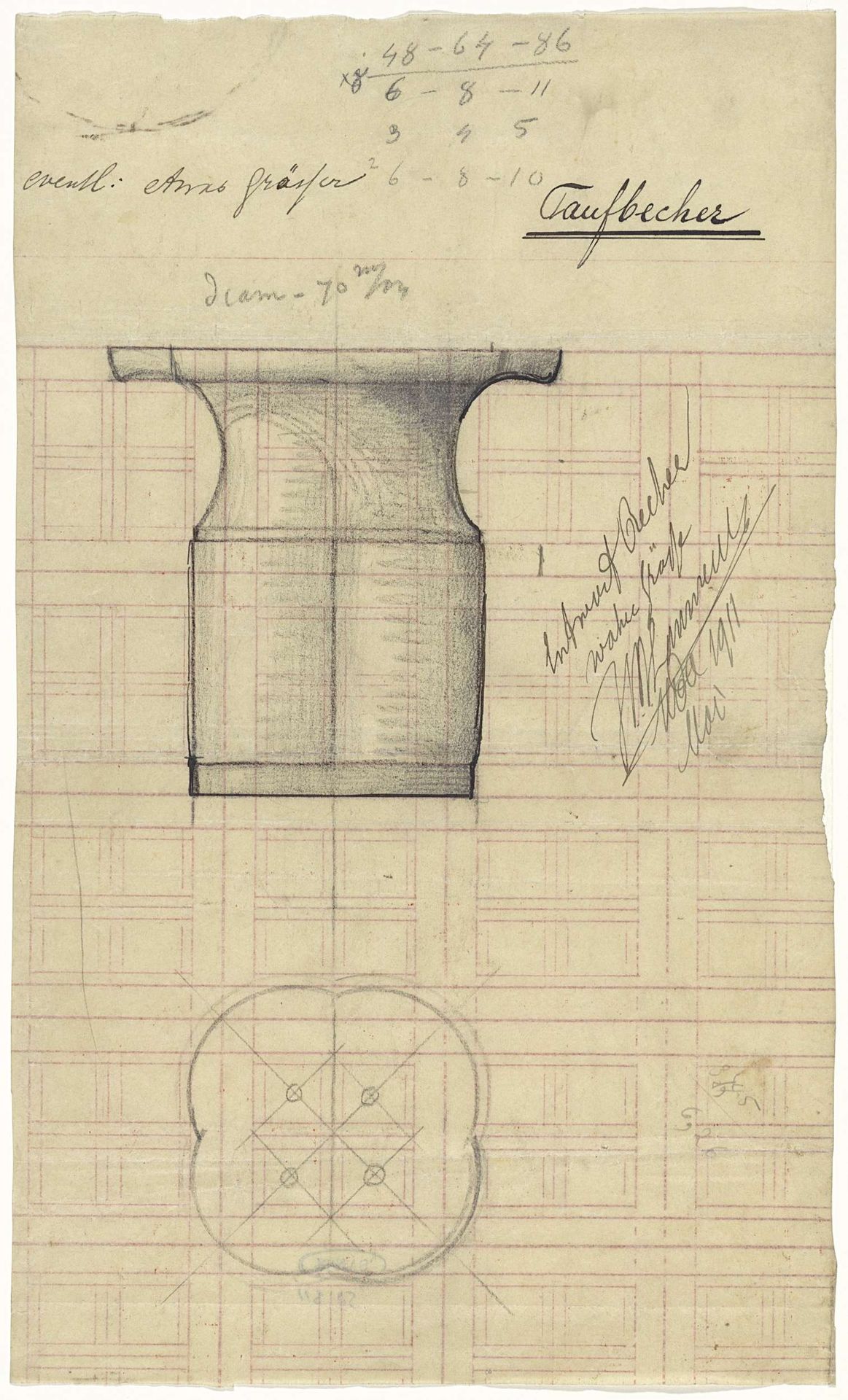
Ontwerp voor een doopbeker
Listen to curator's interpretation
Curatorial notes
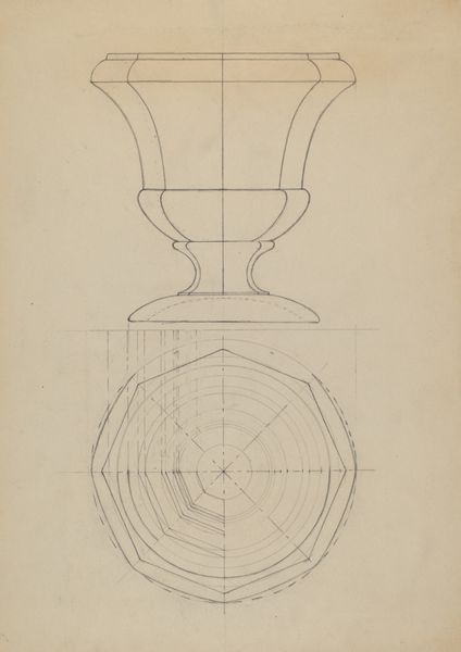
This is a design for a baptismal font, or "doopbeker" in Dutch, by Mathieu Lauweriks. It's rendered in pencil, a process of building up tone and form in a study or preparatory drawing. I find the linear structure so appealing, how Lauweriks uses the grid as a foundation to build out the softy rounded shape of the font, from the bowl to the base. The bottom of the drawing reveals a four-leaf clover shape set within the grid. There’s a real tension here, this beautiful mix of mathematical rigidity and organic, curving forms. Look at the top of the font. See how the pencil marks are darker around the rim? It creates a sense of depth, pulling the form forward. You can almost feel the weight of the material, the coolness of the metal. And the slight imperfections in the drawing, those wobbly lines, make it feel so human. Lauweriks's blending of line and form reminds me of Hilma af Klint's drawings. Both artists were working with geometric vocabularies to uncover deeper truths. Ultimately, this drawing invites us to consider art as a space where structure and spontaneity, precision and intuition, can coexist and enrich each other.