Voorbericht voor: De Standvastige Monarchye des Doods, ca. 1707-1708 1707 - 1708
0:00
0:00
abrahamallard
Rijksmuseum
print, textile, paper, typography
#
baroque
# print
#
textile
#
paper
#
typography
#
historical font
Dimensions: height 315 mm, width 200 mm
Copyright: Rijks Museum: Open Domain
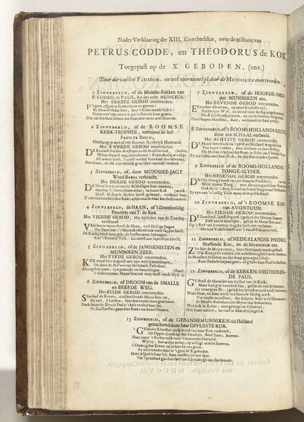
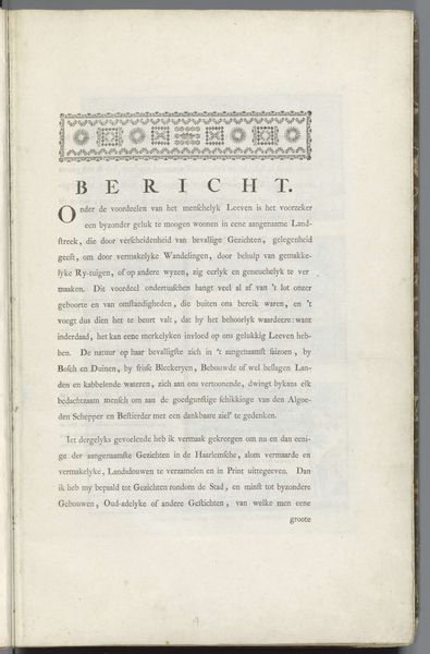
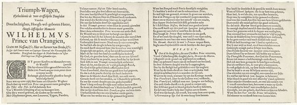
Curator: Here we have a page from "Voorbericht voor: De Standvastige Monarchye des Doods," created around 1707-1708 by Abraham Allard. It's currently held in the Rijksmuseum. Editor: It appears to be an open book with old Dutch typography. The script, with its intricate letterforms and dense layout, gives it a very serious, academic feel, almost severe. It's quite different from modern typefaces. How would you interpret this piece through a Formalist lens? Curator: From a Formalist perspective, the initial impact arises from its arrangement of textual elements. We can look at the way Allard organizes space through typographic hierarchies. Observe the variations in font size, the weight of the letterforms, and how they interact to create a visual rhythm. Note the interplay between the decorative initials and the dense blocks of text. Editor: It seems almost like a tapestry, given how densely the text is woven together. What about the Baroque style listed in the metadata, how would you say it expresses itself? Curator: Precisely. Consider, too, the Baroque period, which often emphasized dynamism and ornamentation. Do you notice how those characteristics could apply even to something like typography, pushing the boundaries of the printed word, charging text with expressive and symbolic meaning beyond simple conveyance of linguistic messages? The texture and arrangement serve aesthetic functions and underscore inherent textual meaning. Editor: So you're suggesting that by studying the letterforms themselves, their size and arrangement, we can decode deeper meanings in this printed page. I had not considered the letters this way before. Curator: Precisely. Our focus should be on internal structure. Editor: It’s been truly enlightening. The visual elements communicate as much as, if not more than, the literal words themselves. Curator: Indeed. Seeing typography as a designed form opens up a completely new way to view its aesthetic intent.
Comments
No comments
Be the first to comment and join the conversation on the ultimate creative platform.
More like this