Curatorial notes
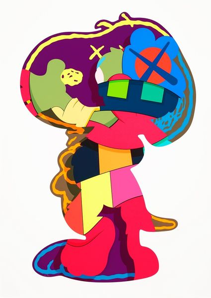
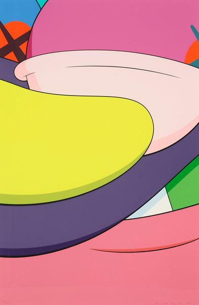
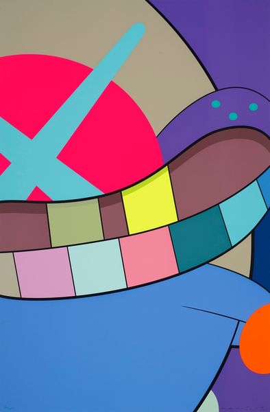
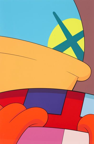
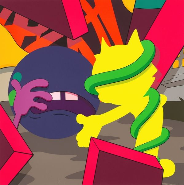
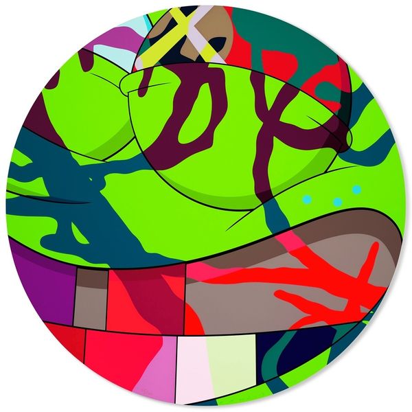
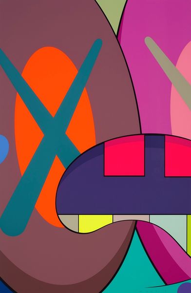
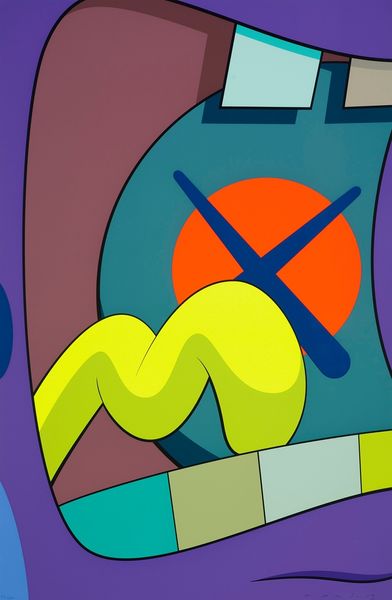
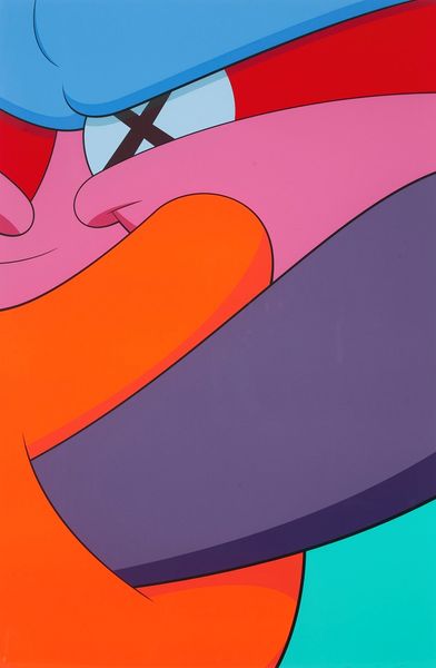
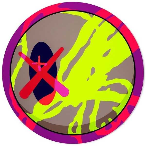
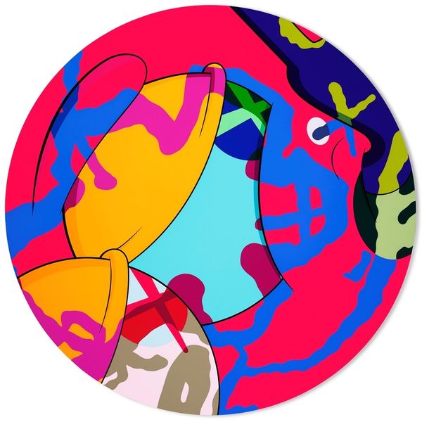
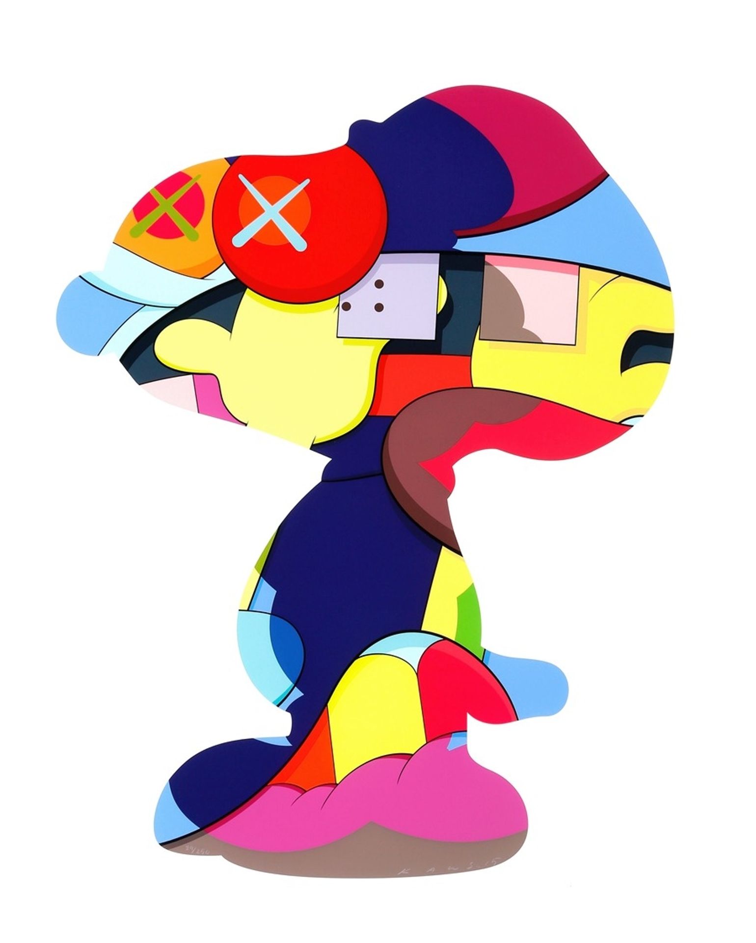
Curator: KAWS, born Brian Donnelly, created this acrylic painting "No One’s Home" in 2015. Editor: It's strikingly disjointed. The bright, almost playful colors clash with the crossed-out eyes, lending a peculiar sense of unease. It's simultaneously inviting and alienating. Curator: Indeed. The composition clearly utilizes Snoopy, Charles Schultz’s famous character, as the primary recognizable visual reference. KAWS takes this image from mass culture and distorts its familiarity through deconstruction. Considering the influence of Pop Art, it is fair to assume KAWS uses commodified cartoon icons and readymade forms, as an explicit commentary of the late capitalist art market, and consumption’s role within culture. Editor: Looking at the formal elements, notice how KAWS simplifies the form of Snoopy to basic shapes. He fragments Snoopy’s figure, reducing the visual representation of the figure, thus deconstructing legibility and coherent form. The flattening of the image plane also directs us to a deeper analysis about cartoon representation itself and, frankly, challenges notions of “high” and “low” art. The "X"s replacing the eyes serve as the artist's trademark, erasing any sense of personality, and instead imbuing this childhood friend with this sense of absence. Curator: This erasure you mentioned becomes a recurring theme within KAWS practice, doesn't it? What about the method of production? These flattened planes of vivid, graphic colors imply techniques tied directly to mechanical reproduction and design processes. Are these paintings the result of factory work? This, for me, prompts questions about authorship. Editor: It's also worth pointing out the smooth application of color—very precise, seemingly machine-made, emphasizing surface over texture. Curator: Overall, KAWS seems invested in reflecting on a sense of cultural loneliness amidst hyper-commodification. What might feel familiar in these forms, in turn, is rendered unfamiliar in its totality of design and art historical influence. Editor: I agree. Its vibrant, flattened form offers an initial allure that slowly unravels into something melancholic, something hollowed out by those "X"ed-out eyes. There's more there, or maybe I should say "less there", than initially meets the eye.