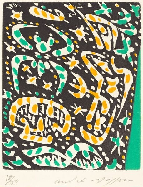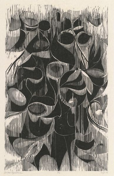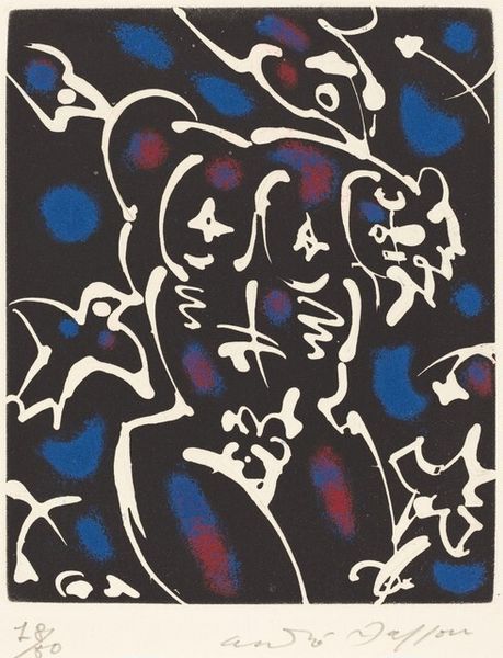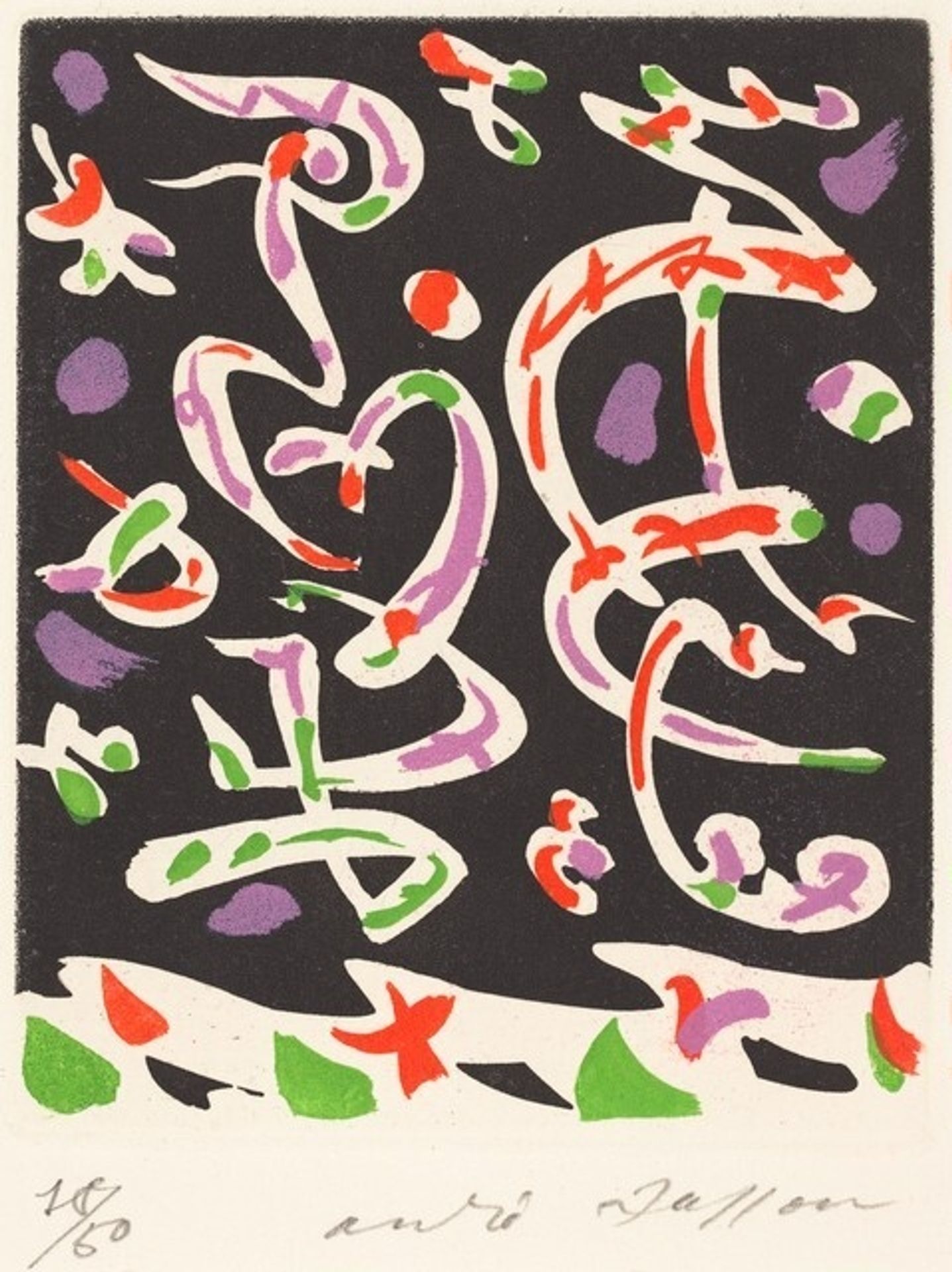
1960
Illustration for 'Mines de rien' by Robert Desnos
Listen to curator's interpretation
Curatorial notes
This is 'Illustration for 'Mines de rien'' by Andre Masson, a print on paper. Isn’t it interesting how a few marks can stir up so many associations? Masson was all about automatism – that idea of letting the hand move freely, bypassing conscious thought, and seeing what emerges. The palette here is really quite limited: black, white, red, purple and green and look how the different colours interact. You can almost feel the artist’s hand zipping around the page, creating these wiggly, wormy shapes. They remind me a little bit of Miro, but with a slightly harder edge. See how the black background pushes forward, making the other colours pop? I wonder what tools he used to make those marks, they feel a little uncontrolled, like his own little dance. I get a sense of Masson feeling his way, feeling the space. It’s not about perfection, it’s about the process, the energy, and embracing the unexpected. That’s what makes it so alive.