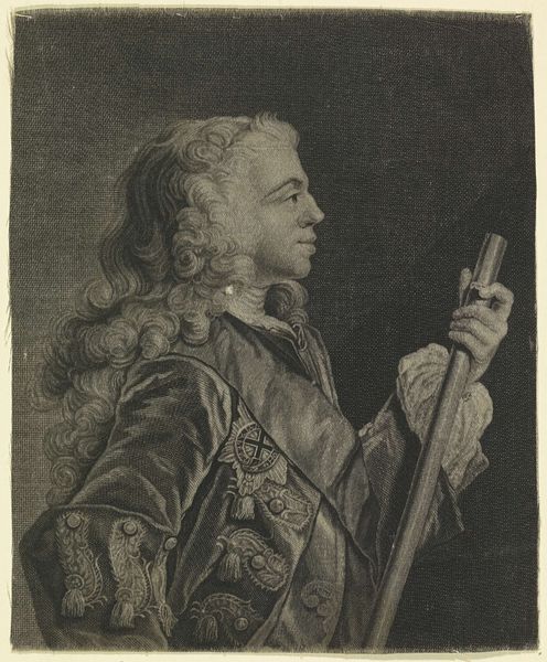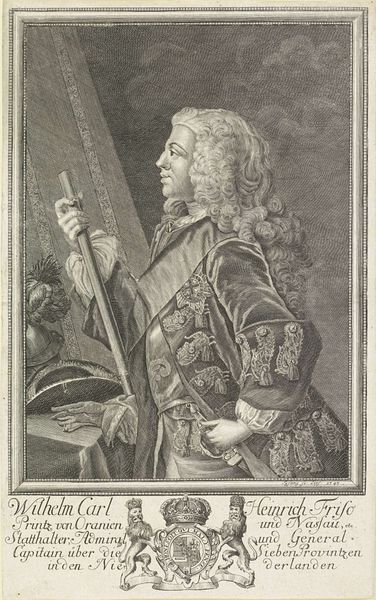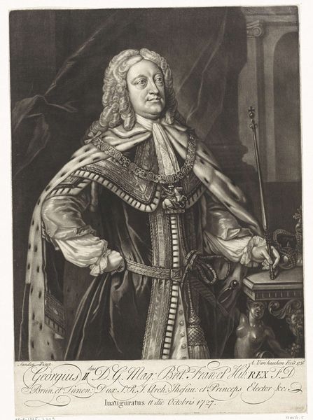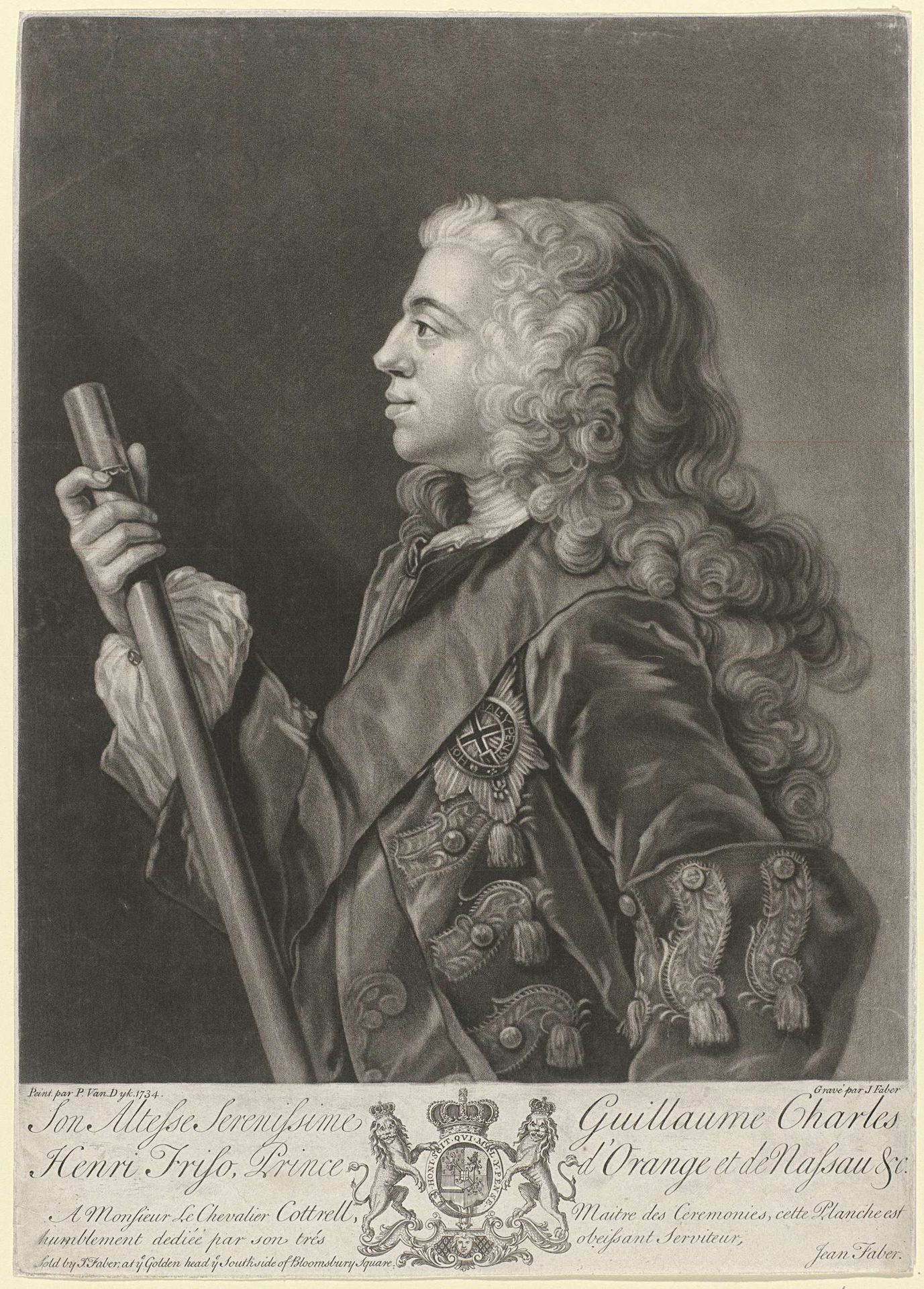
1734
Portret van Willem IV, prins van Oranje-Nassau
Listen to curator's interpretation
Curatorial notes
Curator: What catches my eye right away about this print is how the delicate rendering coexists with such an assertion of power. The subject, Willem IV, Prince of Orange-Nassau, rendered in 1734 by John (II) Faber, using etching and engraving techniques... he really pops, doesn’t he? Editor: Absolutely! There’s a cool, almost frosty detachment to him, but all that intricate detail around the Order of the Garter, that foamy wig… they seem designed to project unshakable authority. I find myself drawn to the textures, though. Look at how the light falls on the metal of the ceremonial staff, for instance. There’s something subtly hypnotic about it. Curator: I think the rendering of status is precisely the point, although "cold" wasn’t quite where my mind went initially. To me, that slight upward tilt of his chin suggests both pride and vulnerability. This print likely circulated amongst nobility, underscoring shared ideals through the visual language of power, which are pretty consistent: the regalia, posture, the composition itself. Editor: The symbols embedded within the regalia must carry specific significance. Can you decode some of it? That elaborate coat of arms there at the bottom, flanked by lions...they're not just decorative, right? Curator: Absolutely. Heraldry operated like a visual shorthand. The lions denote courage, nobility; the crowned shield presents Willem’s dynastic claim. Remember, portraits like these were never purely aesthetic objects. The intention was always about solidifying power. Also note how even in rendering fabrics Faber managed to simulate qualities we typically experience through touch, like silkiness or weightiness. All these touches coalesce. Editor: Yes, there's an alchemy happening. And what's particularly interesting to me is how Faber used fairly humble media-- etching and engraving--to make such a potent statement. The precision he displays in capturing the fine details feels almost devotional, doesn’t it? It's like the man, the office and the medium converge in service of power. Curator: Right? It's that layering, how Faber makes these humble materials meet with Baroque sensibilities... Makes you think about all the hands involved in propagating imagery of authority. Editor: This dive makes me look at printed portraits in a new light now. All that history and culture etched—literally etched— onto a single piece of paper. Curator: For me, it's how something rendered so deliberately, so precisely to fulfill a certain social role can still suggest the shadow of a human beneath it all.