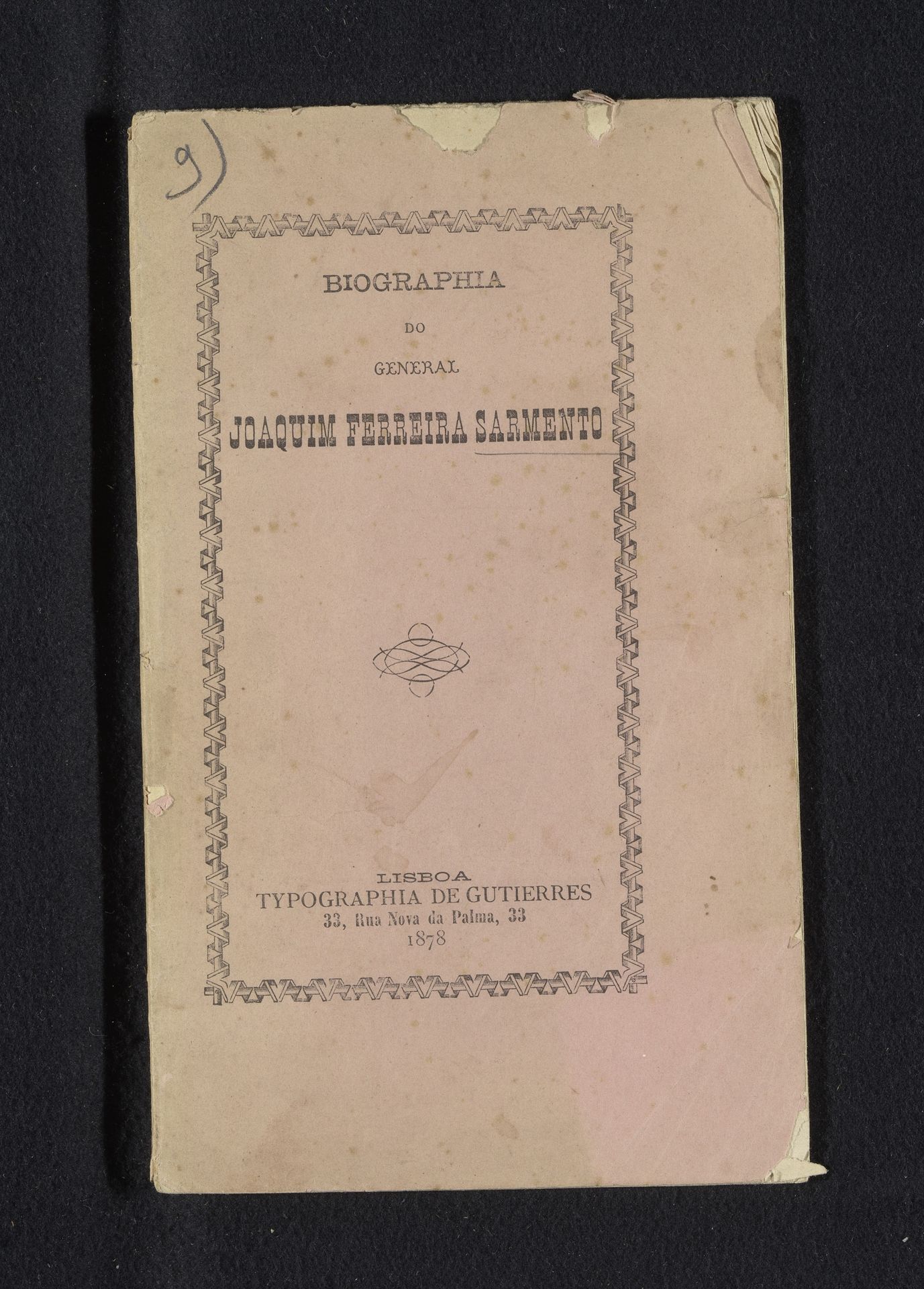
1878
Biographia do General Joaquim Ferreira Sarmanto
Listen to curator's interpretation
Curatorial notes
Editor: Here we have "Biographia do General Joaquim Ferreira Sarmanto," created in 1878 using print, paper, and typography by Melquiades Sobral. It appears to be the cover of a printed biography. What strikes me is the symmetrical arrangement of text and the patterned border—it has a very classical feel, almost like a monument. How do you read this work? Curator: Indeed. It is useful to examine the overall structure. The visual elements here can be decoded through their intrinsic qualities. Notice the typographical choices. The font evokes a specific period, a yearning for classicism, further reinforced by the border which functions as an architectural frame, like the pediment of a temple. Do you see how the typography emphasizes "BIOGRAPHIA," suggesting the construction of an identity? Editor: Yes, and the repetition of geometric patterns in the border almost creates a sense of rhythm, a visual pulse that enlivens what could otherwise be a very static composition. What about the deliberate fading or discoloration; does this textural aspect change how we approach its form? Curator: The material state--the wear and age of the paper--is critical. It points to the artwork as a historical object in itself, inviting a semiotic reading of its decay. The fading speaks volumes about the passage of time and its impact. Note that while the content conveys a biographical record, its physical form performs its own act of telling time, creating an interplay between content and the intrinsic qualities of the work. Editor: So, focusing on the visual elements and the materiality gives us a way into understanding this piece beyond just the biographical information it presents. Thank you. Curator: Precisely. And hopefully this deepened understanding encourages the pursuit of rigorous engagement, through the practice of decoding artistic signs in different compositions and materiality.