acrylic-paint, paper
#
op-art
#
op art
#
acrylic-paint
#
paper
#
geometric
#
abstraction
#
modernism
#
hard-edge-painting
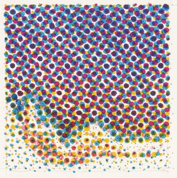
Copyright: David Annesley,Fair Use
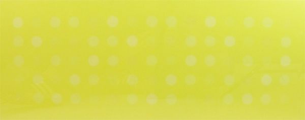
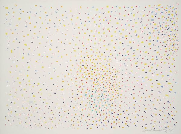
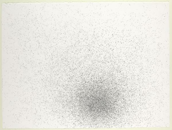
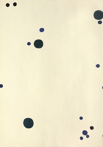
Curator: This is "Mauve, Orange, Yellow, Turquoise on Pale Blue," created by David Annesley in 1970. It's currently part of the Tate Britain collection. The piece is executed with acrylic paint on paper. Editor: It’s unexpectedly delicate. The scattered dots create a light and airy atmosphere. I wouldn’t have immediately guessed it was acrylic. Curator: Right? I think the material is really critical here. Consider the context: Annesley was deeply invested in process. Acrylic, with its capacity for layering and hard-edge effects, allowed him to meticulously orchestrate this all-over field. This pushes at definitions, right? Acrylic on paper edges fine art toward more accessible, industrial practices. Editor: And how would it have been received back then? Because it’s so… decorative? I'm curious about the institutions that first exhibited it, and how audiences interpreted such a playful work within a Modernist framework. Curator: That's fascinating! Galleries at the time, particularly those showing Hard-edge painting, would've framed it within ongoing debates around abstraction. It participates in an impulse that can be traced all the way back to, say, impressionism. You’re still showing something that you could argue mirrors optical experience. Editor: Yet unlike impressionism, any sense of depth feels suppressed. All these flattened colors operate on a single visual plane. Did Annesley mean to challenge traditional perspectival rendering? Curator: Exactly! This is also about undermining the art object's presumed specialness. Using a "common" material like acrylic on paper disrupts a hierarchy that privileges, say, oil paint on canvas as some pinnacle of artistic achievement. Editor: Thinking about it, perhaps it critiques this obsession with grand gestures so prevalent in mid-century art. Instead of profound statements, we get visual sensations. Almost a light, poppy wallpaper… Curator: Almost… but its careful arrangement prevents it becoming just decoration. It actively requires our attention. The dispersed shapes aren’t quite random – are they subtly gridded? The interplay between order and chance becomes significant. Editor: Well, seeing it this way provides me with food for thought. Thank you! Curator: Agreed. There is clearly much to unpack about Annesley's strategies when you dive deeper.
Comments
No comments
Be the first to comment and join the conversation on the ultimate creative platform.
More like this