drawing, pencil
#
drawing
#
quirky sketch
#
pen sketch
#
old engraving style
#
landscape
#
personal sketchbook
#
sketchwork
#
pen-ink sketch
#
pencil
#
pen work
#
sketchbook drawing
#
cityscape
#
sketchbook art
#
realism
#
initial sketch
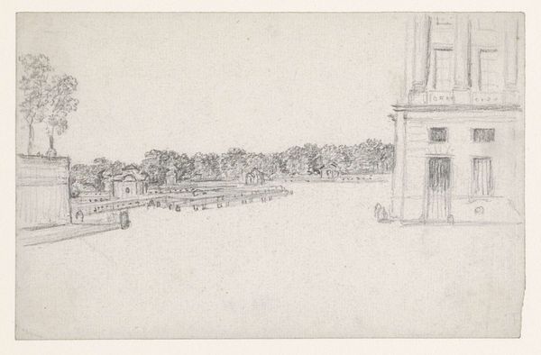
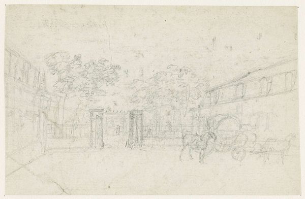
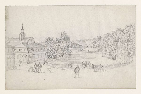
Dimensions: height 96 mm, width 141 mm
Copyright: Rijks Museum: Open Domain
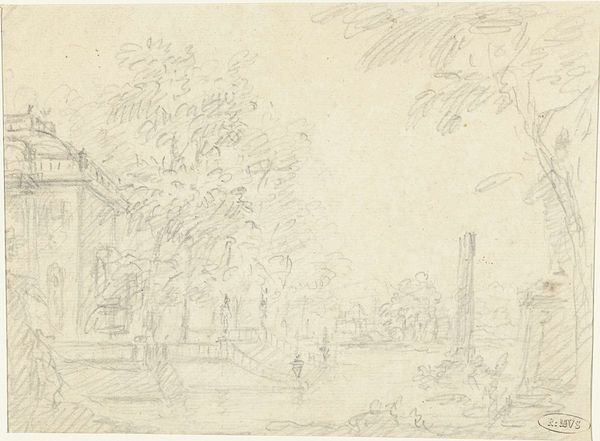
Editor: This is Georges Michel's "Courtyard of Barracks", dating between 1773 and 1843. It appears to be a pencil and ink drawing, a study maybe? It feels quite sparse and open; not a lot of detail but very linear. What draws your eye when you look at this work? Curator: Note the emphasis on spatial recession. The artist uses linear perspective to guide our eye from the foreground, dominated by indistinct shapes, to the background where architectural forms define the courtyard. Editor: So the building’s composition is a guide. Curator: Precisely. Michel's choice of line is also quite deliberate. Notice the delicate hatching used to create tonal variations, suggesting form and shadow, while maintaining an emphasis on the planar surface of the drawing itself. What sort of structure do you make of how he's arranged his shading choices? Editor: Heavier on the left building, lighter on the right - to show light, and how space impacts form perhaps? Curator: Interesting. He does create depth but in an unassuming way; almost like he does not want to pull you in too close, the tonal variation on the page emphasizes flatness which makes you aware that you are indeed looking at an image and not at a window. A rather modernist tension, would you say? Editor: Yes, I do see what you mean, I see now a strong interplay between depth and surface that I missed before, thank you. Curator: The piece serves as an interesting lesson on how visual languages communicate information with varying degree of effectiveness. Editor: Indeed, considering his careful construction of pictorial space in tandem with linear simplicity is helpful. Thanks again.
Comments
No comments
Be the first to comment and join the conversation on the ultimate creative platform.
More like this