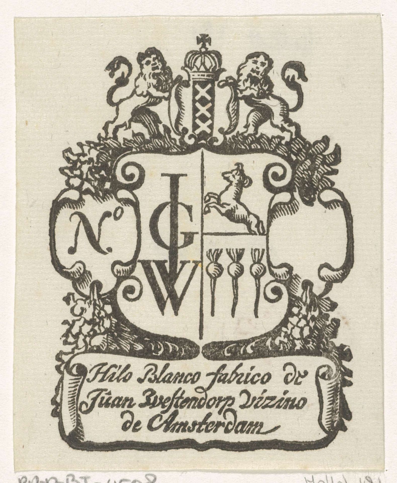
c. 1681 - 1740
Handelsetiket van Jan Westerhoven te Amsterdam
Listen to curator's interpretation
Curatorial notes
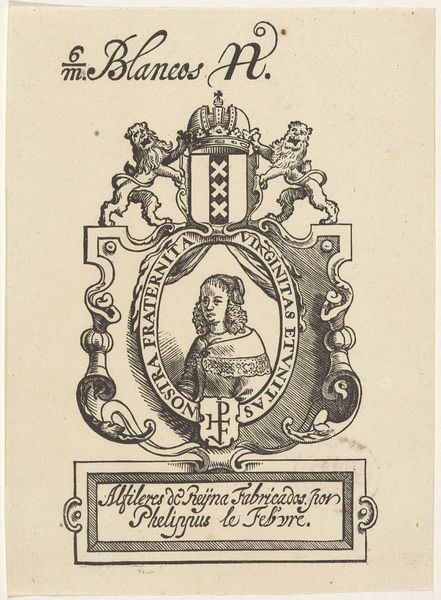
Curator: This little baroque trade card, titled "Handelsetiket van Jan Westerhoven te Amsterdam," created sometime between 1681 and 1740, has a quirky, slightly off-kilter energy. The artist was Isaac Vincentsz. van der Vinne, and the medium is listed as ink engraving. It's a surprisingly detailed and confident engraving for something so small. Editor: My initial thought? It's a visual feast, a bit overwhelming. It’s all emblems, lions, and… are those radishes? A peculiar mix of heraldry and root vegetables. What was this supposed to convey about Westerhoven's business? Curator: Good eye! Those are indeed radishes! You have to remember the prevalence of symbolism and heraldry in that era. The crest with the leaping dog and radishes alongside the "ICW" monogram indicates the trade, probably vegetables, and a kind of noble connection that alludes to quality, stability, and status in society. This would appeal to potential customers looking for reputable merchants. Editor: So, not your average farmers market flyer. The lions certainly elevate the produce. What I find compelling is the graphic design, especially the use of light and shadow to make the coat of arms look so prominent. Does the use of Spanish in the inscription indicate an international clientele or perhaps Jan's family? Curator: Interesting point. Amsterdam, especially in the Dutch Golden Age, was incredibly international, with a high influx of people from Iberian territories. The "Hilo Blanco fabrico de Juan Zvestendorp Vizino de Amsterdam" suggests Spanish merchants and potential patrons for linen fabrics. The visual elements cater to local norms, whilst its title strategically targeted the market demographic for Jan's Amsterdam enterprise. Editor: That commercial aspect changes everything. We tend to overlook the function of art in service of enterprise. Even in this miniature format, the push and pull between local tradition and international business are pretty dynamic, though. Curator: Exactly! It invites reflection. Editor: An unexpected discovery from something I first thought of as a funny radish ad!