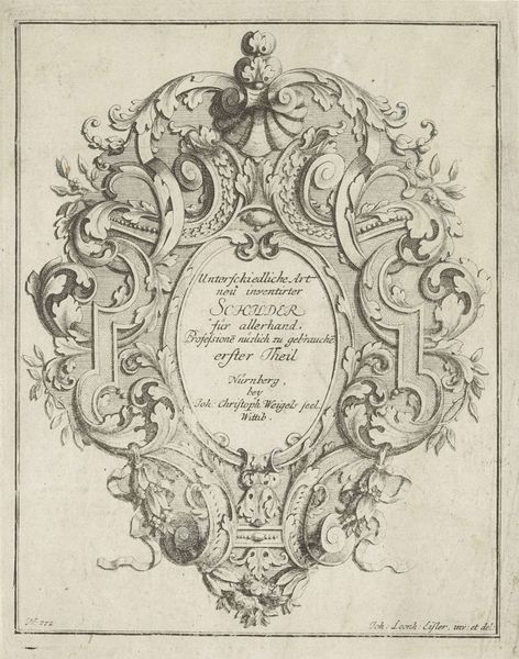
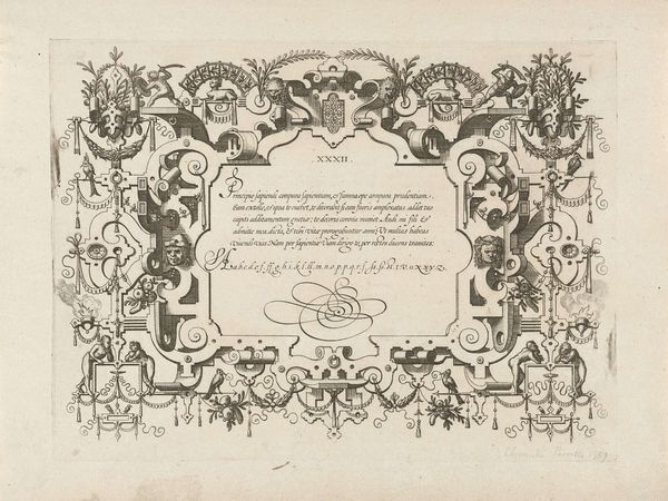
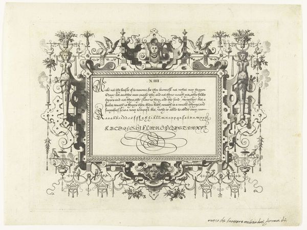
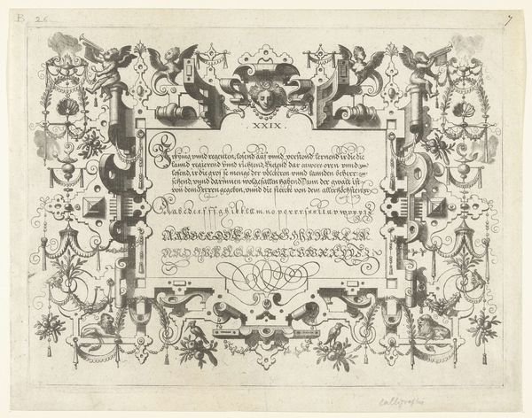
Titelblad: Des vor Schlosser aufgezeichnete neuen Bandel-Wercks anderer Theil (...) c. 17th century
0:00
0:00
johannconradreiff
Rijksmuseum
drawing, print, pen, engraving
#
drawing
#
baroque
#
pen drawing
# print
#
figuration
#
line
#
pen
#
decorative-art
#
engraving
Dimensions: height 360 mm, width 196 mm
Copyright: Rijks Museum: Open Domain
Curator: Let's delve into this print, "Titelblad: Des vor Schlosser aufgezeichnete neuen Bandel-Wercks anderer Theil (...)," created around the 17th century by Johann Conrad Reiff. Editor: What strikes me is how ornate and elaborate this title page is! It’s almost overwhelming. There are so many figures and swirling lines. What do you see in this piece? Curator: I appreciate the emphasis on line, a quintessential element. Notice how the artist employs varying thicknesses and densities to create depth and texture. Observe the curvilinear forms—the way they move and interact to define space, particularly within the cartouche and around the figural elements. Does the repetition and variation of line suggest anything to you regarding Baroque aesthetics? Editor: I guess it is an elaborate form of calligraphy to serve both textual and purely decorative purposes? It also contributes to the energy and drama I see. It's dynamic, for sure! Curator: Precisely. The visual rhythm is further accentuated by the use of light and shadow, though somewhat limited by the engraving technique. Where do you see the most dramatic contrasts, and what effect does that create? Editor: Hmm, near the top, especially around that central figure with the helmet, the engraving seems denser. The darker areas really pop out and make it feel weighty and powerful. The light seems to bounce off the curlicues of the frame. Curator: Exactly. And observe the relationship between the text and the decorative elements. Do you consider that there might be a balance in their composition, or are there hierarchies? Editor: Good question. Now that you mention it, the title definitely nests perfectly inside that elaborate design of volutes and people! Without all those flourishes, the whole thing wouldn't feel complete. It looks intentional. I appreciate now how integral line is to the structure of the whole artwork. Curator: Indeed. The visual language employed serves to elevate the importance of the title, reinforcing its presence within this intricate design.
Comments
No comments
Be the first to comment and join the conversation on the ultimate creative platform.
More like this