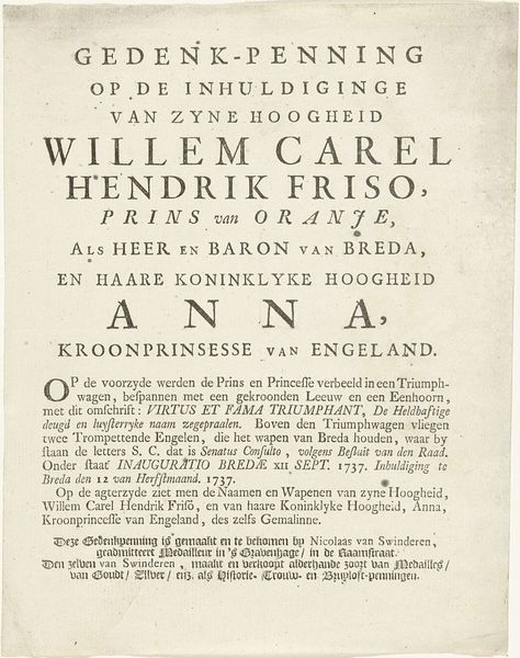
Typografische titelpagina voor: L. Smids, Oranjes overtogt naar Engeland : of beschryvinge van Romein de Hooges printen, 1689 1689
0:00
0:00
carelallard
Rijksmuseum
graphic-art, print, textile, typography
#
portrait
#
graphic-art
#
aged paper
#
hand written
#
hand-lettering
#
dutch-golden-age
# print
#
hand drawn type
#
hand lettering
#
textile
#
personal sketchbook
#
typography
#
hand-written
#
hand-drawn typeface
#
fading type
#
orientalism
#
handwritten font
Dimensions: height 157 mm, width 92 mm
Copyright: Rijks Museum: Open Domain
Curator: It’s fascinating how typography itself can become art, isn't it? Editor: Absolutely. My first impression is of controlled chaos—so much text, yet the lettering choices and layout feel surprisingly balanced. Almost like an intricate tapestry of words. Curator: Indeed. What we have here is a title page created in 1689 by Carel Allard. It's titled "Typografische titelpagina voor: L. Smids, Oranjes overtogt naar Engeland: of beschryvinge van Romein de Hooges printen." The Rijksmuseum holds this particular print. Editor: Ah, Allard! That clarifies the historical context somewhat. The piece promises a description of Romein de Hooghe’s prints, specifically those concerning the ascent of the House of Orange in England. A clear attempt to visually represent power and historical narrative through design. Curator: Exactly. You can see it wasn't simply about legibility. The various sizes and weights of the fonts surely would have signaled the hierarchy of information. The hand-lettering elements also speak to an intimate, handcrafted quality that's been mostly lost to digital typefaces today. Editor: The deliberate aging is powerful—the paper, the ink. The entire work exudes the weight of history, like a monument wrought in paper and ink, reflecting on the political shifts and consolidation of power occurring at the time. Does it subtly attempt to give that sense of established continuity by giving it this classical presentation? Curator: I believe that's part of it. It’s interesting to me how the floral flourishes add a decorative element but also remind me of the Dutch Golden Age obsession with symbolism—possibly alluding to themes of prosperity and divine blessing upon the House of Orange. Editor: I’m especially drawn to the contrast between the almost rigid structure of the main title and the flowing, descriptive text beneath. It mirrors the transition from abstract concept – the 'overtogt,' the crossing – to concrete representation in De Hooghe's prints. A clever interplay between idea and image. Curator: Reflecting upon our brief observation, this typographic page does more than just present information. It embodies a carefully constructed image, deeply rooted in both artistic conventions and socio-political aspirations of its time. Editor: Indeed. Looking at it through this lens, we can begin to see it not only as historical artifact, but as a testament to the subtle but effective art of visual persuasion.
Comments
No comments
Be the first to comment and join the conversation on the ultimate creative platform.
More like this