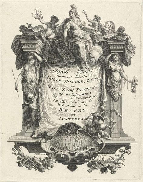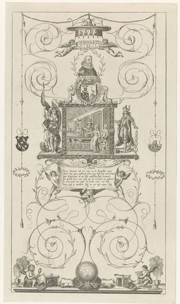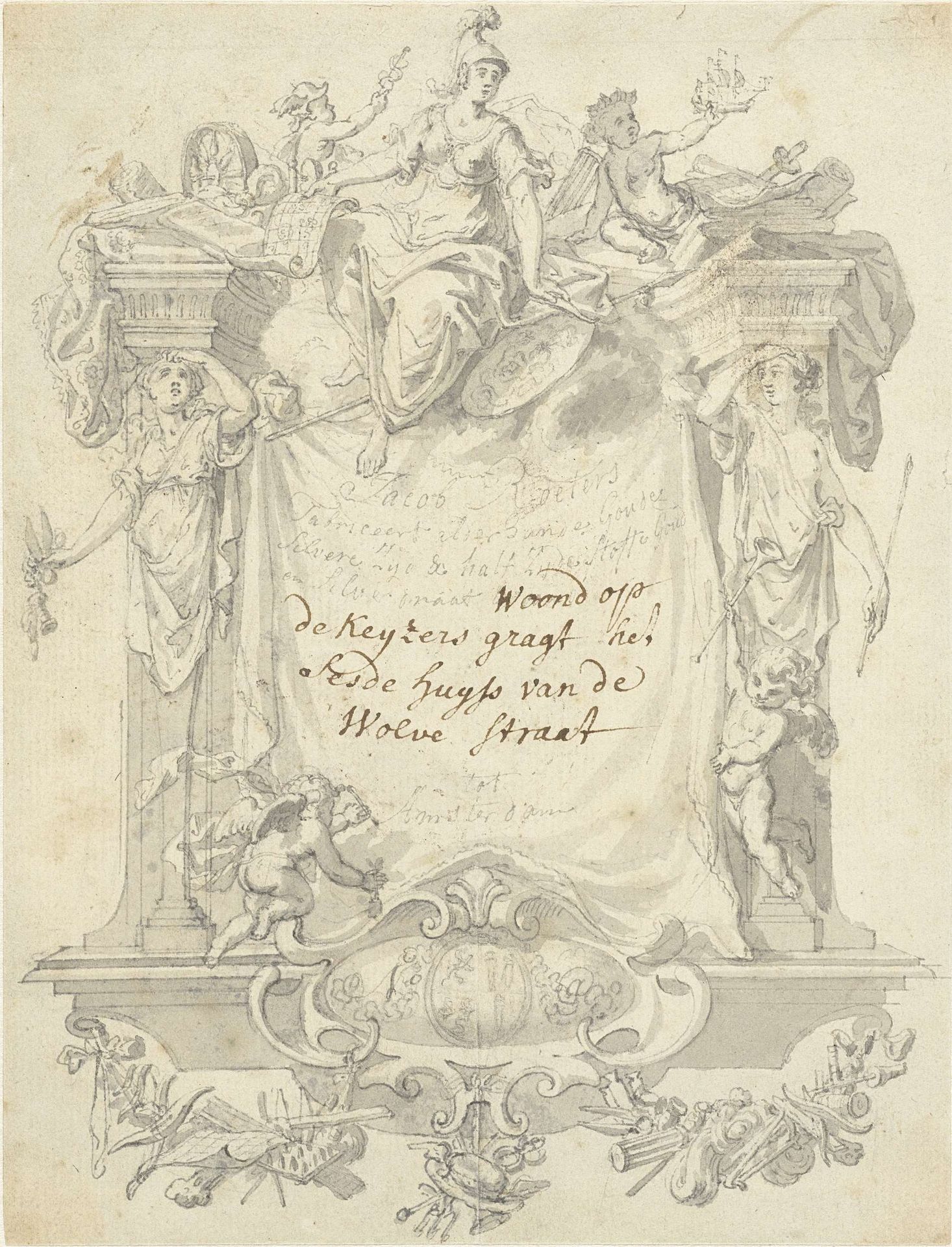
c. 1735 - 1741
Ontwerp voor de adreskaart van Jacob Roeters
Simon Fokke
1712 - 1784Location
RijksmuseumListen to curator's interpretation
Curatorial notes
Editor: Here we have Simon Fokke's "Ontwerp voor de adreskaart van Jacob Roeters," a drawing in pen and ink on paper from around 1735-1741. The figures and ornamentation are so elaborate! What statements do you think Fokke is making with this piece? Curator: I see a complex interplay of power and representation embedded within this seemingly simple address card design. Notice how the central figure, likely an allegorical representation of Amsterdam, dominates the composition. The architectural framework around the text, along with allegorical figures and cherubs, aren’t simply decorative, but speak to the aspirations of the merchant class, yes, but at what cost? Editor: At what cost? Curator: Precisely! These symbols of wealth and commerce are built, literally and figuratively, on the backs of colonial exploitation. Amsterdam’s Golden Age prosperity, which this address card subtly promotes, cannot be separated from the suffering and injustice inflicted upon colonized populations. Who are these merchants like Roeters making connections with, and what did they stand for? Editor: So, the drawing functions as more than just a business card; it also alludes to larger themes of wealth and privilege of that period. I’d been thinking of it from the perspective of aesthetics, but it actually holds so much more history than I understood on my first look. Curator: Exactly! And those aesthetic choices reinforce certain social hierarchies and power dynamics. It asks us to consider the role of art in perpetuating—or perhaps even challenging—these historical narratives. It invites you to really question everything. Editor: This definitely gives me a different lens to look through when examining Baroque art. Thank you. Curator: And it also pushes us to be hyper-critical in a good way. It changes the conversation around Baroque art, doesn't it?