1750
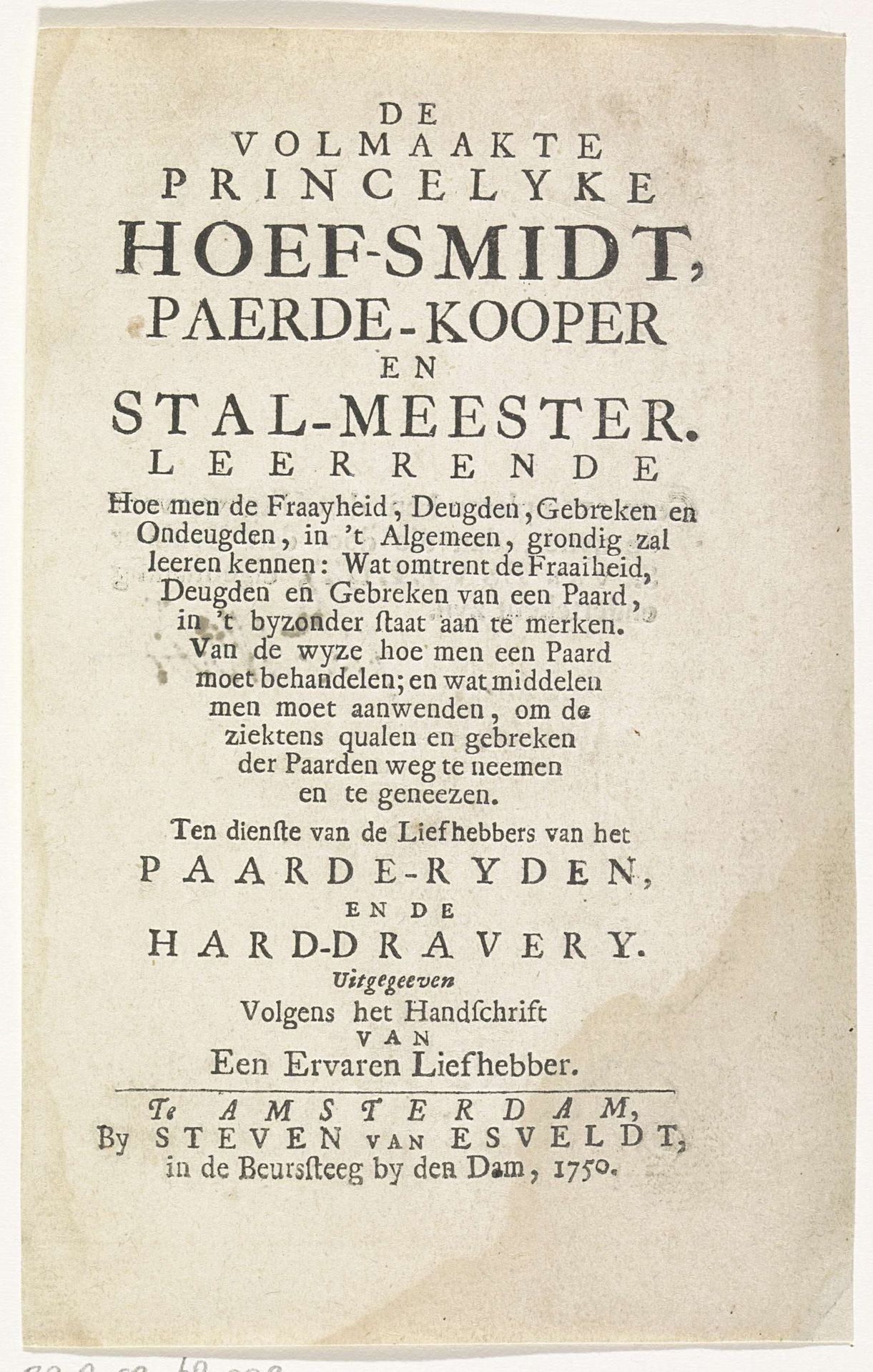
Titelpagina voor: De volmaakte princelyke hoef-smidt, paerde-kooper en stal-meester, 1750
Steven van Esveldt
@stevenvanesveldtLocation
RijksmuseumListen to curator's interpretation
Curatorial notes
Editor: So, this is the title page for "De volmaakte princelyke hoef-smidt, paerde-kooper en stal-meester," from 1750, by Steven van Esveldt. It's a print, so graphic art and typography as well, residing at the Rijksmuseum. I'm struck by the density of the text; it looks more like a legal document than an advertisement for a book about horses! What stands out to you? Curator: Well, that very density is precisely what grabs my attention! This isn't just a title page; it's a declaration. Consider the period: 1750, the Dutch Golden Age drawing to a close. The burgeoning middle class craved knowledge and social mobility. Editor: So the information was a commodity? Curator: Exactly. This title page promises specialized knowledge – farriery, horse trading, stable management – skills tied to prestige and even princely status, as it were. Notice the phrase "Volgens het Handschrift van een Ervaren Liefhebber," that translates to "According to the Manuscript of an Experienced Amateur." It attempts to bestow legitimacy to its claims of expertise in handling horses by asserting its origins from a private hand. Also consider who would display such a print. Was it solely for the literate elite? How would its message filter down, shaping public perception of horsemanship and perhaps even social hierarchy? Editor: I never thought of it as social commentary! The positioning of the text and claiming knowledge of princely value clearly indicates who this book is catered towards. Thanks, that helps a lot. Curator: Precisely! It reminds us that even seemingly simple objects can reveal complex social and political dynamics when we examine their historical context.