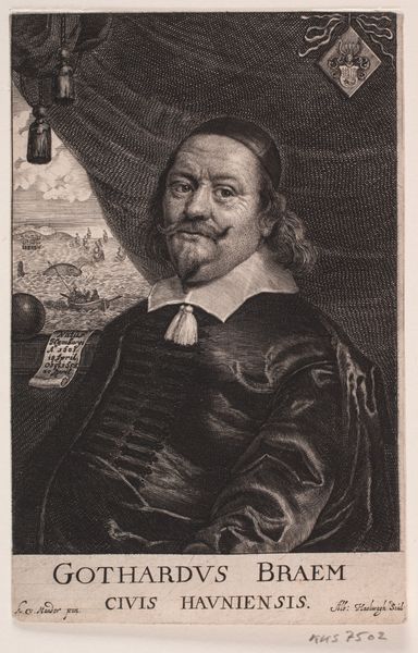
engraving
#
portrait
#
aged paper
#
baroque
#
old engraving style
#
personal sketchbook
#
portrait reference
#
limited contrast and shading
#
portrait drawing
#
history-painting
#
engraving
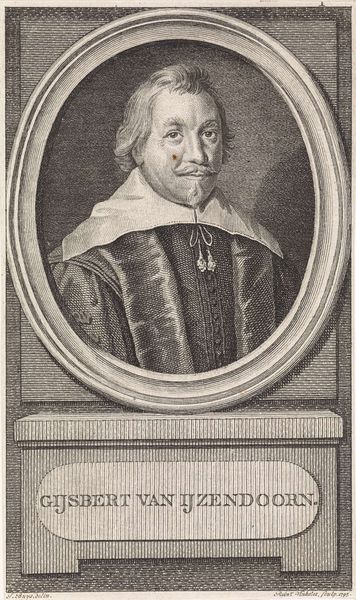
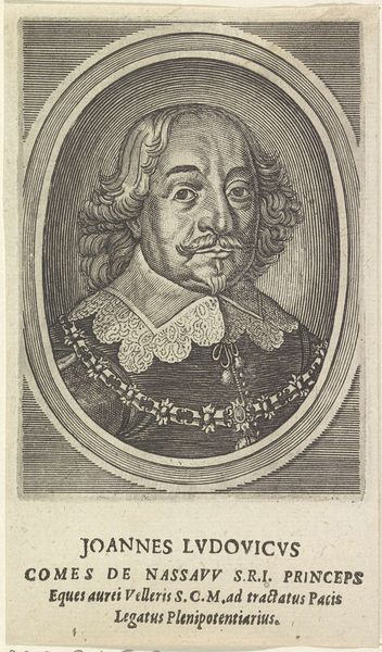
Dimensions: height 161 mm, width 122 mm
Copyright: Rijks Museum: Open Domain
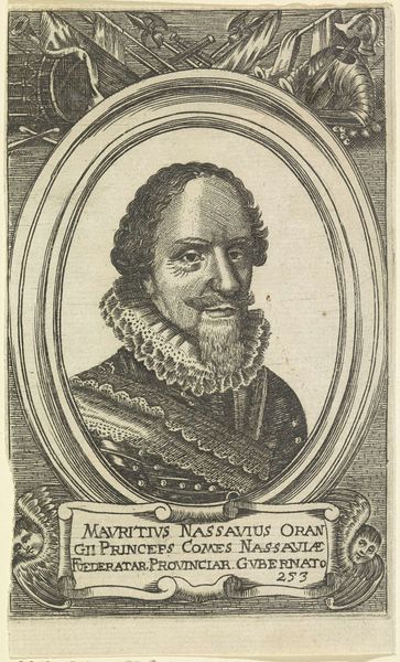
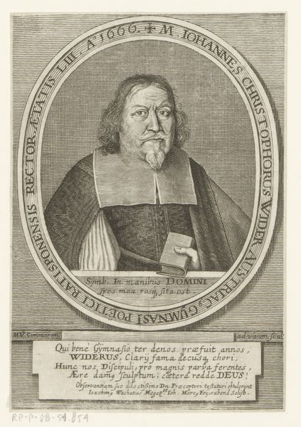
Editor: This is *Portret van Joachim van Graveneck* by Pieter de (II) Jode, made sometime between 1628 and 1670. It's an engraving, giving it this very detailed and linear quality. The crosshatching creates a really interesting texture. What do you notice about the composition? Curator: Primarily, I am struck by the insistent horizontality of the composition. The oval frame notwithstanding, the figure, the lettering above and below, even the sitter's moustache conspire to draw the eye inexorably from left to right. Does this strike you as significant? Editor: I hadn’t thought about it, but yes! Everything *does* seem to emphasize that horizontal plane. Is that typical for portraiture of this era? Curator: Perhaps. More relevant, however, is the relationship of line to form. Notice the unwavering quality of the engraved lines themselves. Do they waver? Are they broken? Do you see indecision in the rendering of form? Editor: No, they’re all very definite and consistent. Even in the shading, the lines are so deliberately placed. It creates a real sense of... stability? And authority, I guess. Curator: Precisely. The lines delineate the figure's form and the heraldry below and convey an unmistakable message of steadfastness. Perhaps this is its most noteworthy attribute. Editor: I see what you mean! Focusing on the structure like that really changes how I look at it. Thanks!
Comments
No comments
Be the first to comment and join the conversation on the ultimate creative platform.
More like this