Copyright: CC0 1.0
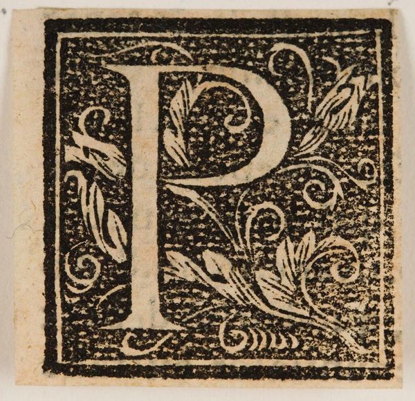
Editor: This anonymous artwork, "Letter P," showcases a beautiful ornamental design. I find the intricate linework and the contrast between the letterform and the surrounding foliage quite striking. What elements stand out to you? Curator: The interplay between positive and negative space is compelling. Note how the bold lines defining the "P" are echoed in the delicate tendrils and leaves, creating a visual harmony. The composition guides the eye inward, emphasizing the letter's structure. Editor: So, the success of this artwork lies mainly in its skillful use of lines and shapes? Curator: Precisely. The artist's command of form and line dictates the reading of this artwork, allowing us to consider the letterform as both signifier and signified. Editor: I see what you mean. Analyzing the visual relationships reveals so much. Curator: Indeed. There is always more to discover.
Comments
No comments
Be the first to comment and join the conversation on the ultimate creative platform.
More like this