Copyright: CC0 1.0
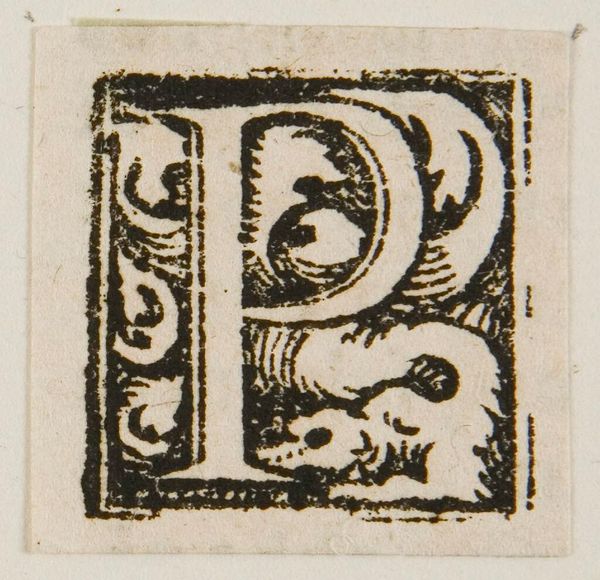
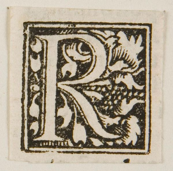
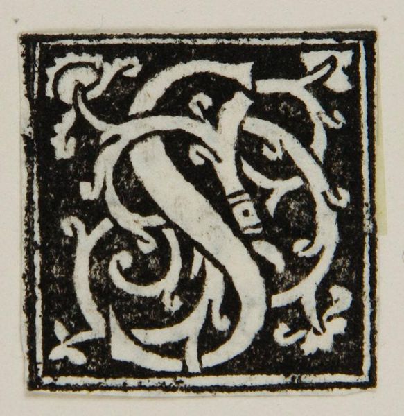
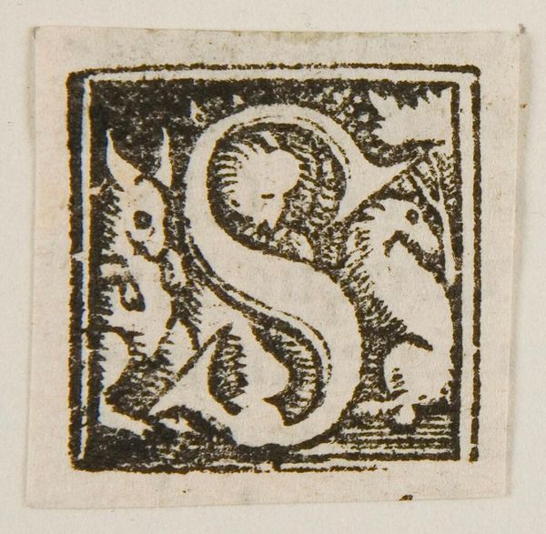
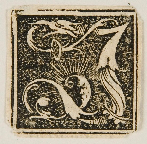
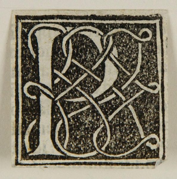
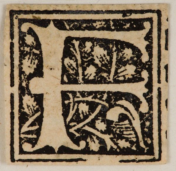
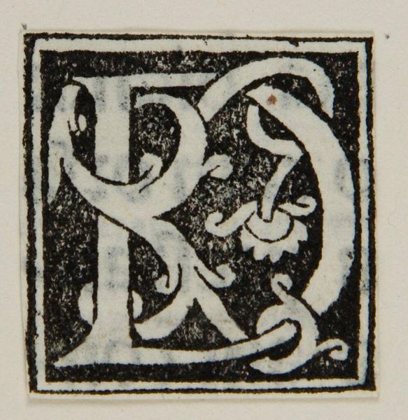
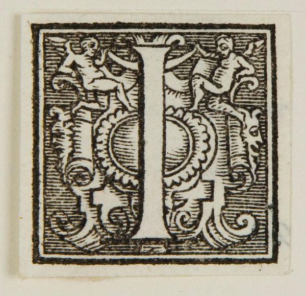
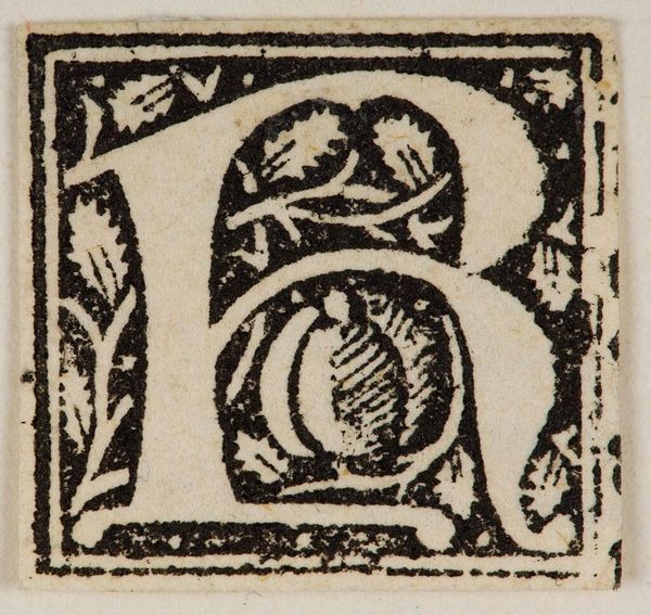
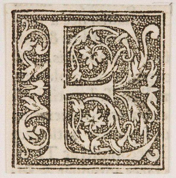
Curator: The initial 'I', an anonymous work, presents a striking study in contrasts. The rigid linearity of the letter itself is softened by the organic, almost unruly floral embellishments. Editor: Yes, there's a tension here. The letter asserts itself, while the surrounding forms seem to want to consume it. I wonder what impact that might have had on its original audience? Curator: It speaks to a period when letters weren’t merely functional but also symbolic, visually rich elements within a text. Consider the semiotic weight carried by these illuminated initials. Editor: And what messages they projected about literacy, wealth, and power. Who commissioned it, what text was it intended for, and how would it have been received? Those social contexts are critical. Curator: A compelling observation. But the balance here – the black against the white, the tension between form and chaos - those are the core elements that lend the piece its visual dynamism. Editor: Agreed, but I'm still left pondering its original social function, and how this simple letter may have reinforced or even challenged prevailing norms. Curator: Perhaps it served to reflect both: tradition and evolution, order and expression, function and embellishment. Editor: Yes, in a society undergoing significant change, such an image may have reflected that social flux.
Comments
No comments
Be the first to comment and join the conversation on the ultimate creative platform.
